Design Concept
Mizan is the Arabic word for balance, and in its name lies the core of the concept. This typeface is meant as a balance of traditions and modernity, familiarity and novelty, seamlessness and strong personality, modesty and elegance.
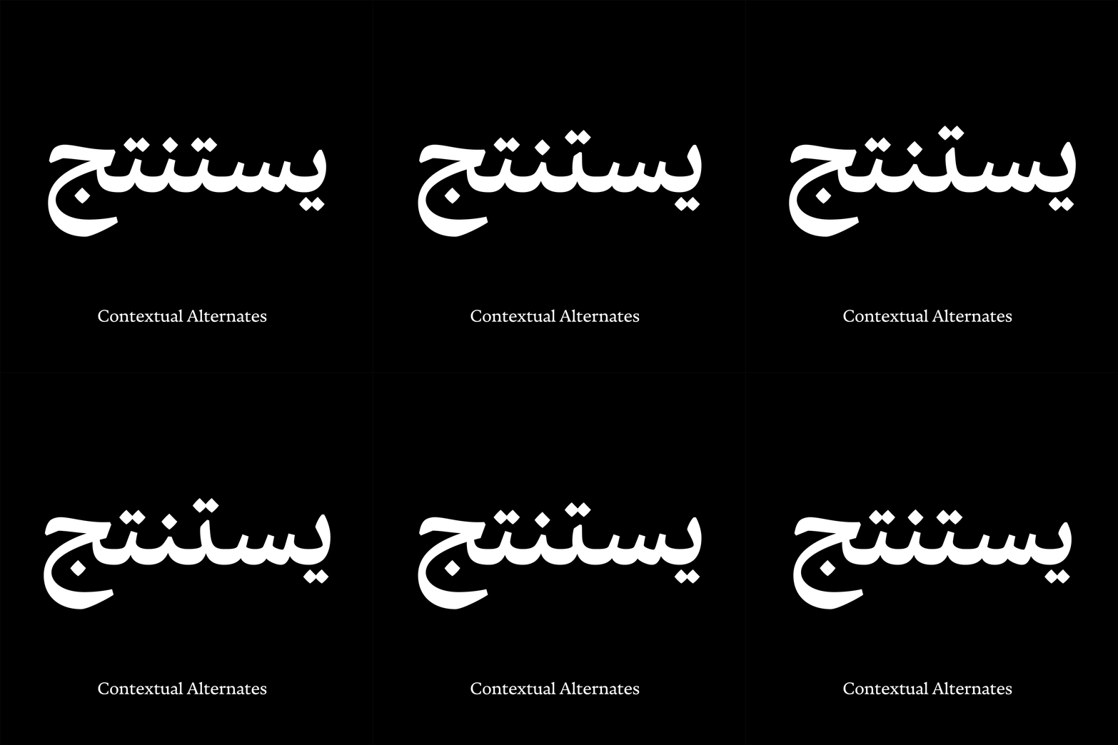
It takes its main cues from the Naskh writing style while sporting a contemporary character and texture. Its moderate stroke modulation, comfortable proportions, clear and disambiguated forms by means of its extensive sets of ligatures and alternate forms make Mizan ideal for an ultra smooth uninterrupted reading experience for long texts. Its fluid nature, soft stroke connections, open and rounded counterforms make Mizan's texture soothing and friendly.


Weights & Multi-script support
Mizan comes in four weights: Regular, Medium, SemiBold and Bold. For multi-script contexts, Mizan is paired with a customized version of Nocturno from Typotheque.
Mizan & Co Type System
Mizan is the first and central family of a large type system that will follow, one family at a time. The Mizan & Co type system studies different methods of creating information hierarchy. On one hand it looks at how, in the history of the Arabic script, as far back as the 10th century, hierarchy was achieved by creating substantially different sets of letters (calligraphic styles) for large versus small sizes or for emphasis. On the other, it explores the method used in printed letters where different cuts of the same set were created for different purposes.
Authors
Mizan was designed between 2017 and 2018 by Kristyan Sarkis. Nocturno was designed by Nikola Djurek and published by Typotheque in 2016.


