Design Concept
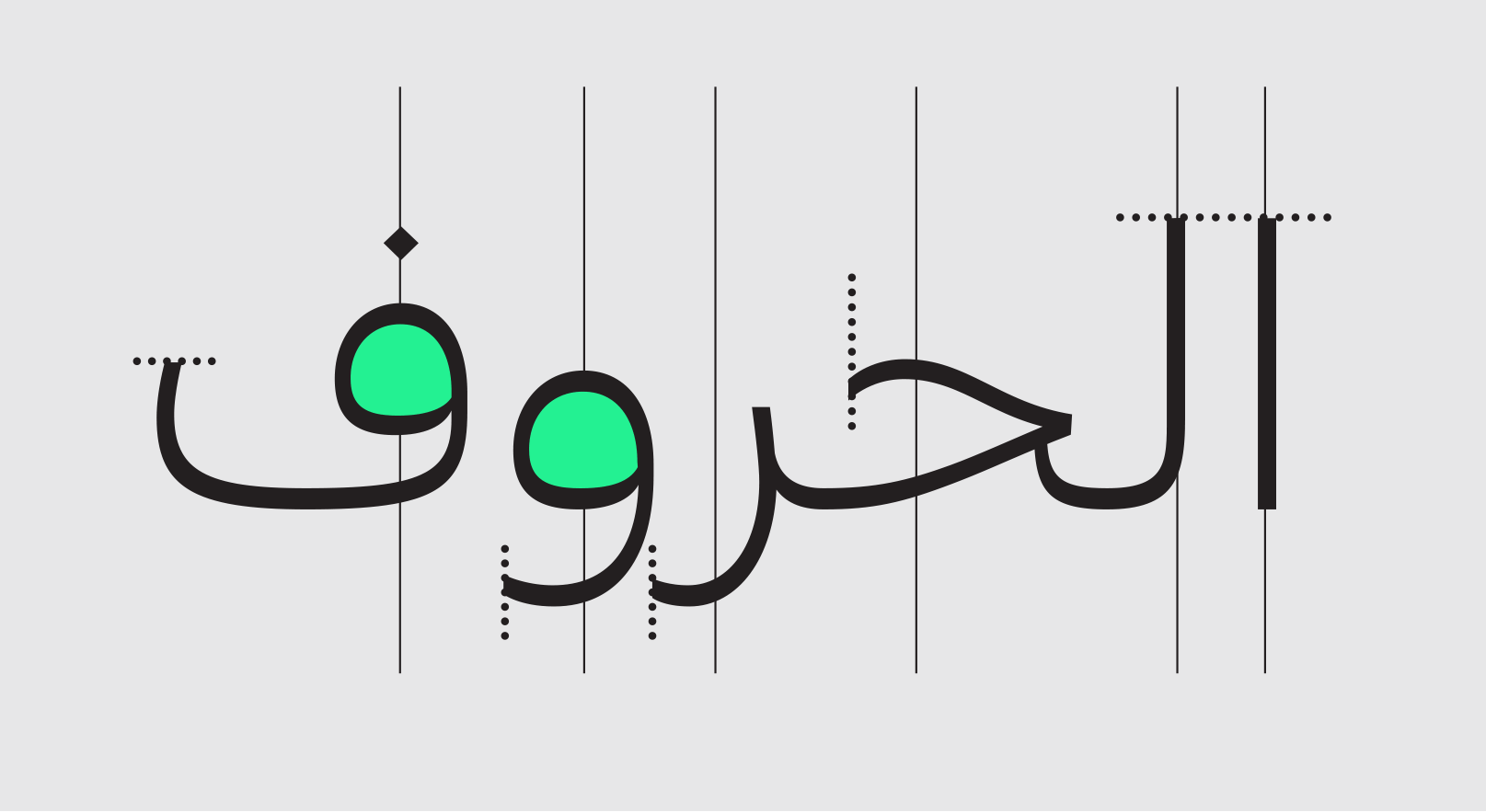
Kanun is an Arabic signage type family carefully crafted to also handle long texts. With its rational character, pure and clear forms, it is present but not too imposing. The straight-cut terminals, perfectly vertical axis and large counters make for a comfortable rhythm and a compact texture.

Icons & Arrows
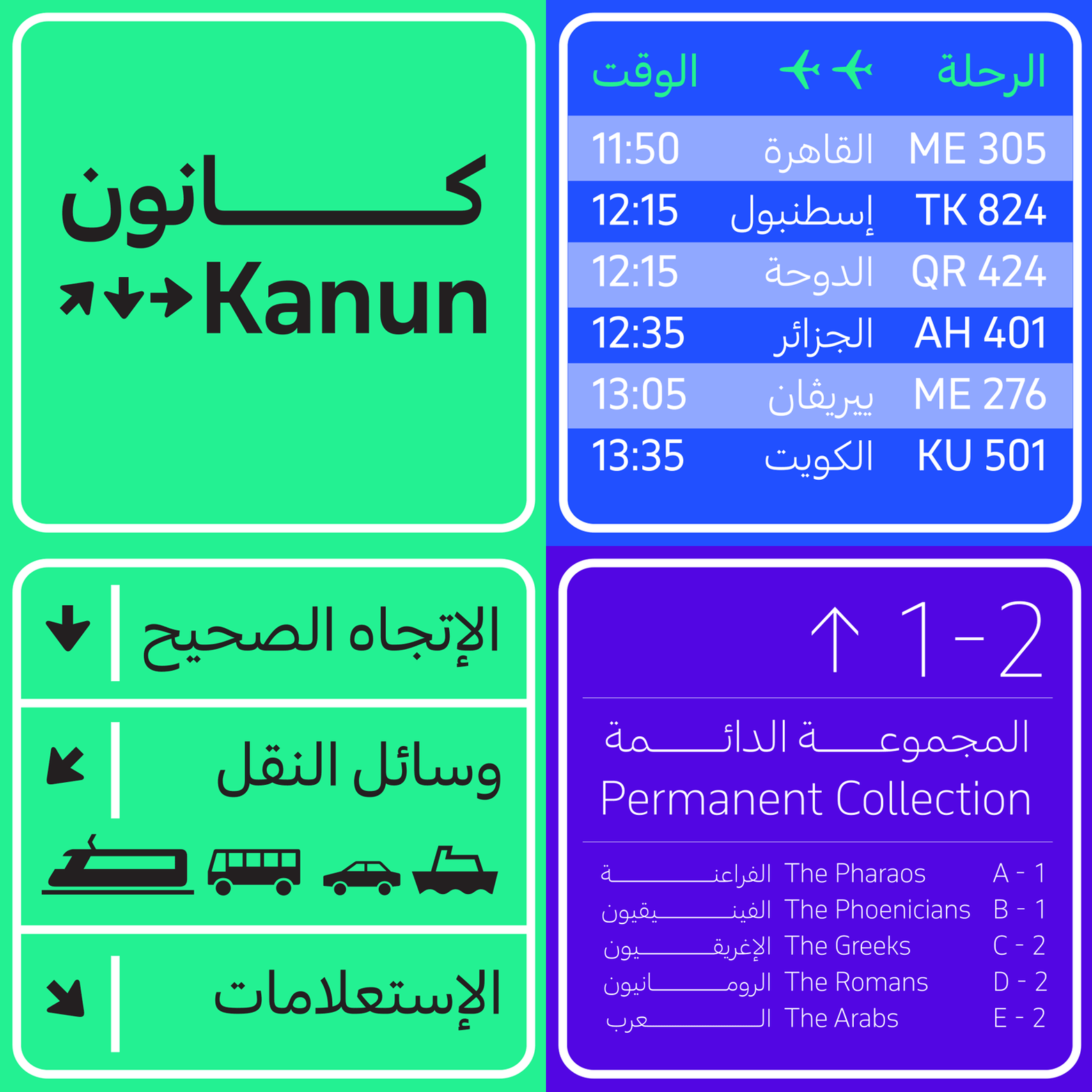
Kanun is ideally suited for the information signage and wayfinding projects, and includes a collection of transportation and travel-related signs, symbols, icons, and various sets of arrows.
Kanun & November
Kanun is the Arabic counterpart of Typotheque's November. Kanun and November draw from different inspirations. While November is inspired by street signage in Europe, the standards of street signage in the Arab world do not offer a solid starting point. Instead, Kanun explores the idea of rational and mechanic Arabic forms. It builds on different structures of the Arabic script rather than referring to a specific style.

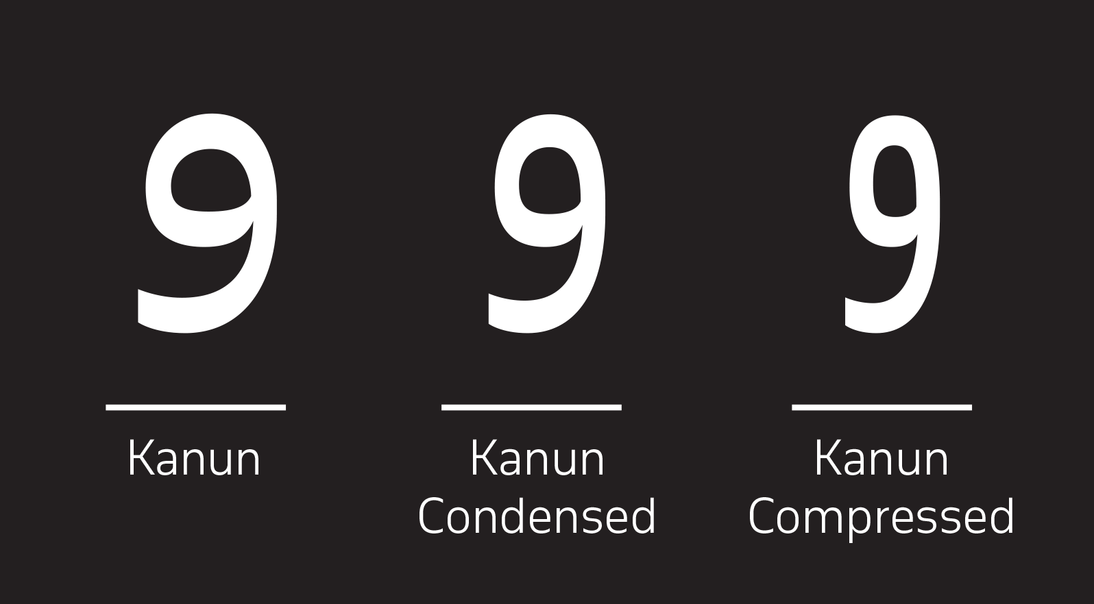
Like its Latin counterpart, the full Kanun type system includes, in addition to the normal width family, Compressed and Condensed widths in 9 weights each.

Authors
Kanun was designed between 2016 and 2017 by Kristyan Sarkis. November was designed by Peter Bilak and published by Typotheque in 2016.


