Design Concept
A couple of years ago, we published Kanun, a cold and rational signage typeface and counterpart to Typotheque's November. It was followed by Teshrin, the warmer rounded sibling of Kanun and counterpart to October. The third family of the type system is Kanun Stencil, a playful layered typeface with an industrial flair, suitable for signage and short paragraphs.
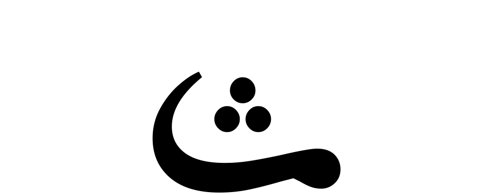
Kanun Stencil is inspired by industrial signage and mechanical stencilling. However, while the gaps are generally systematically positioned on the central vertical and horizontal axis, they also largely follow the stroke order and the direction of Arabic writing, paradoxically to its industrial nature, thus creating a human and machine amalgam.

Layers
Kanun Stencil is available in nine weights. Each weight is also available in three separate layered styles that create exciting possibilities for the use of colours and animation.

Icons & Arrows
Like Kanun and Teshrin, Kanun Stencil is equipped with a collection of transportation and travel-related signs, symbols, icons, and various sets of arrows for signage and wayfinding systems.

Authors
Kanun Stencil is designed by Kristyan Sarkis and Maha Akl. Rainer Erich Scheichelbauer wrote a script that made it much faster to split the strokes into separate layers. The Latin, November Stencil was designed by Peter Bilak with the help of Nikola Djurek. Andy Clymer wrote the original script for the Latin.