The ATDB Story... or planting a seed
ATDB or Arabic Type Design - Beirut is the first intensive program entirely dedicated to Arabic type design. Its first rendition took place between July 11th and August 19th 2016. Below is an account of why the program came about and how it happened.
Beginning
On an Autumn day in 2014, we were having one of our long conversations on Arabic type at TPTQ Arabic’s previous studio in The Hague. The topic was concerned with the current state of the Arabic type design practise and education. The practise is struggling with identity, belonging and a blind fascination with everything Western (Latin script). The reasons are many, from post-colonialist residues to the current socio-political map. They are however outside the scope of this article. Type design education is almost completely absent, lacking a single educational program concerned with the subject. And while there is a multitude of books about the Arabic script, they are almost consistently told from an art historical perspective. There are hardly any books, resources or standardised information that offer precious knowledge to potential or established type designers.
At one point Kristyan exclaimed let’s start an Arabic type design program! To which Lara excitedly and enthusiastically agreed.
On that day, we decided to embark upon this adventure because we believe that education has the power to open new horizons for our generation and the generations to come. And in sharing the knowledge we’ve gathered, we would be able to create a community and collectively lay foundations of Arabic type design that are grounded in a scientific, systematic and critical approach to design.
It would take two years of preparation and planning before the first edition would take place.
ATDB announcement
Philosophy
As most Arabic type designers, we’ve struggled in finding a base from which we can start designing type. How do we begin? With which letters? What set of proportions to adopt for which kind of application? Where does Arabic type come from? Why are we making the type we make today? The questions are endless in all areas connecting to type: its history, its formal characteristics, its mechanisation and that is why we believe that it is time to sketch the building blocks of the discipline.
Foundations are the backbone of any field, they give its practitioners a reference from which they can move forward. With the Arabic script as our backbone, the ATDB program seeks to advocate type as a natural evolution of script (including calligraphy, handwriting, stone carving…), and aims at encouraging designers to explore the wealth of the Arabic script tradition while experimenting with different design directions and technologies to create informed contemporary Arabic type.
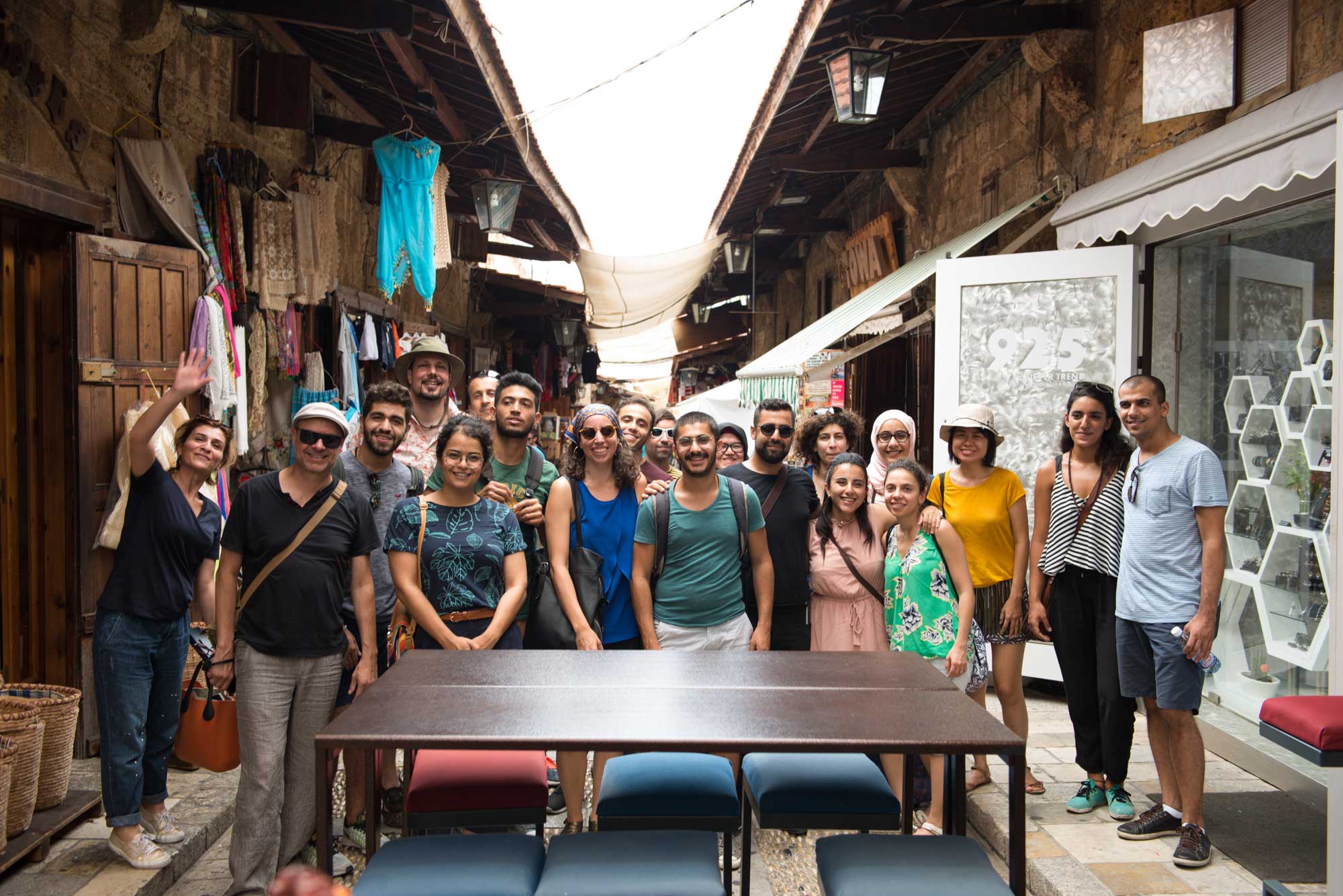
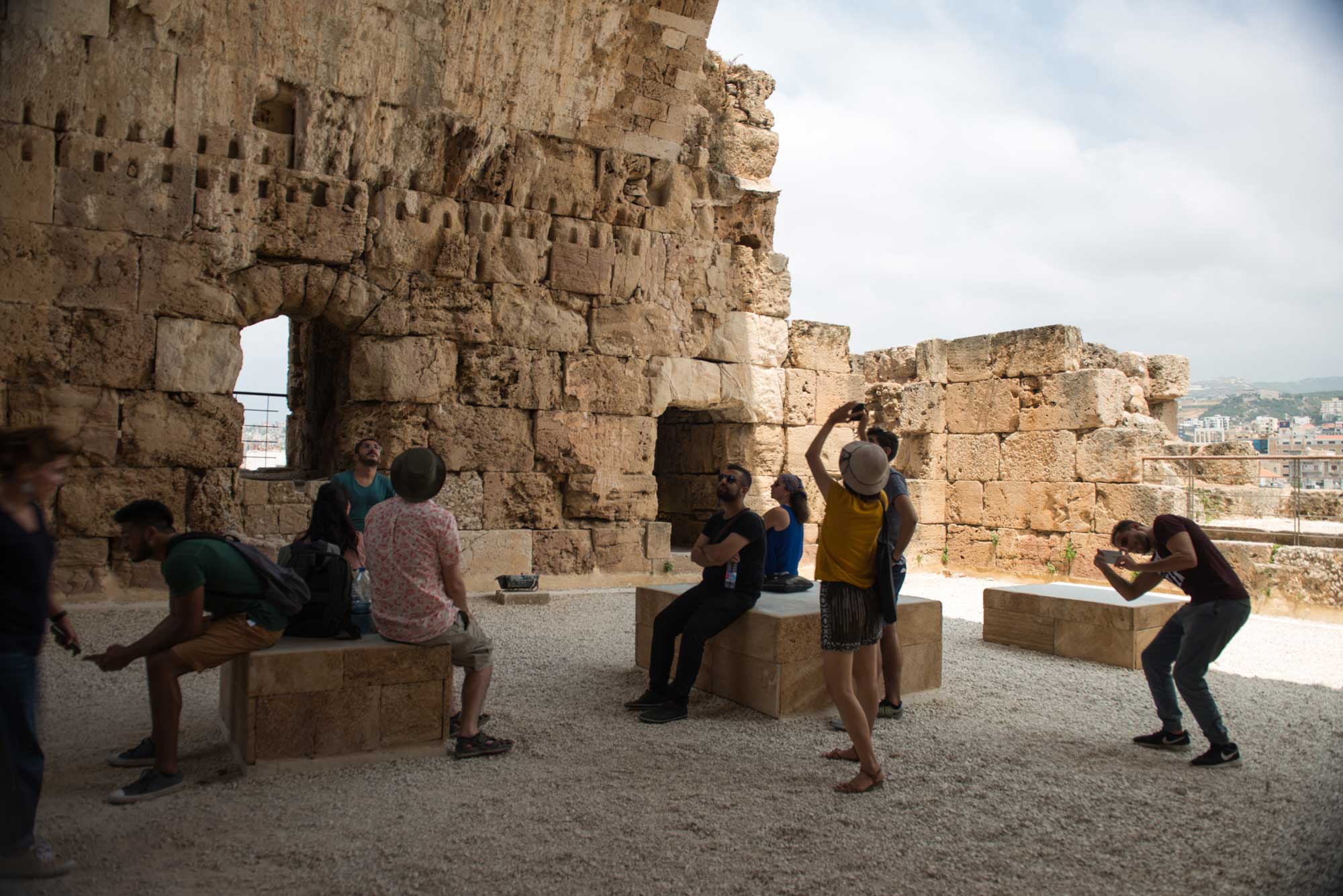
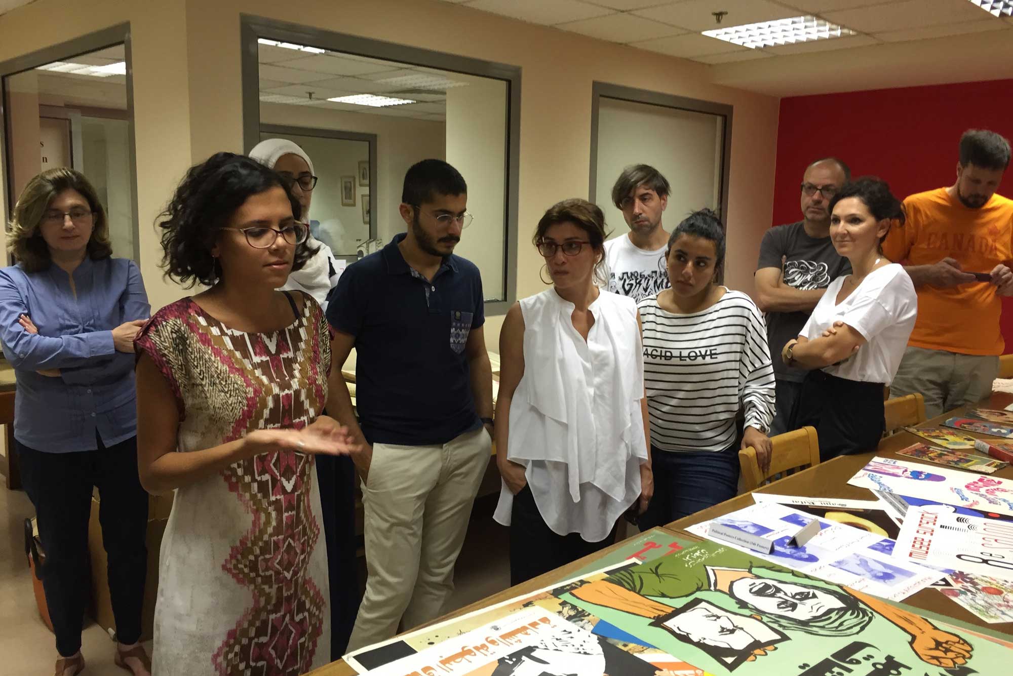
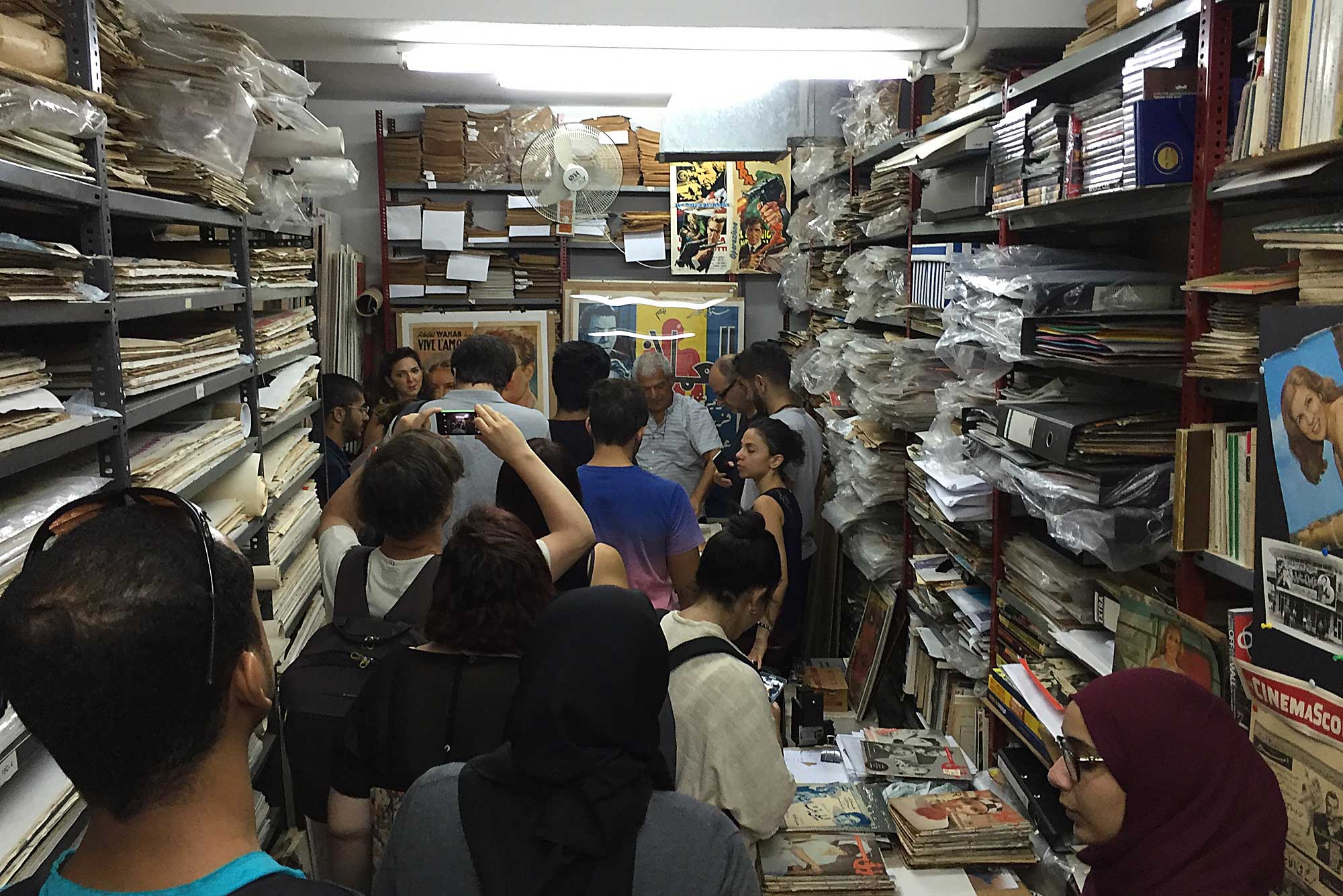
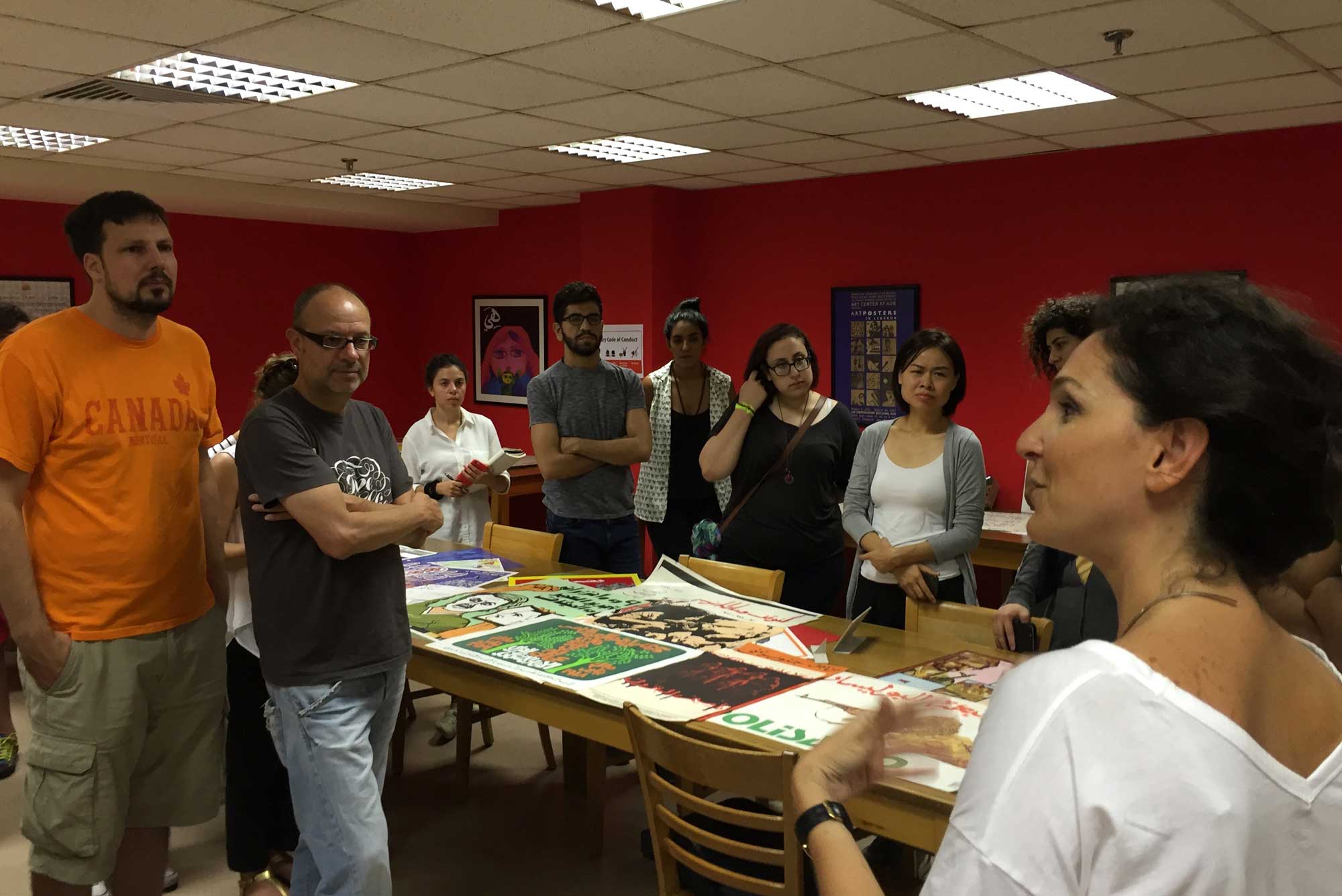
Field trips in the history of type and writing
The Program
In 2016, the first edition of ATDB saw the light as a six-week intensive program in Arabic Type Design. Classes were held at the American University of Beirut (AUB), five days per week. We chose AUB mostly for its strong position on education in the importance of Arabic type in Graphic Design and Visual Communication. The Department of Architecture & Design at AUB is also the home of the first Graphic Design program in the Arab Middle-East and was at the forefront of experimenting with the challenges of Arabic typography and bilingual (Arabic/Latin) design. Leila Musfy's help was instrumental in making this program happen in the right place.
Choosing the location was essential to create a full immersion into local Arab culture and the largely unexplored territories of the Arabic script.
Process
From script to digital type the students were about to embark upon a detailed progressive journey of informed analysis and abstraction.
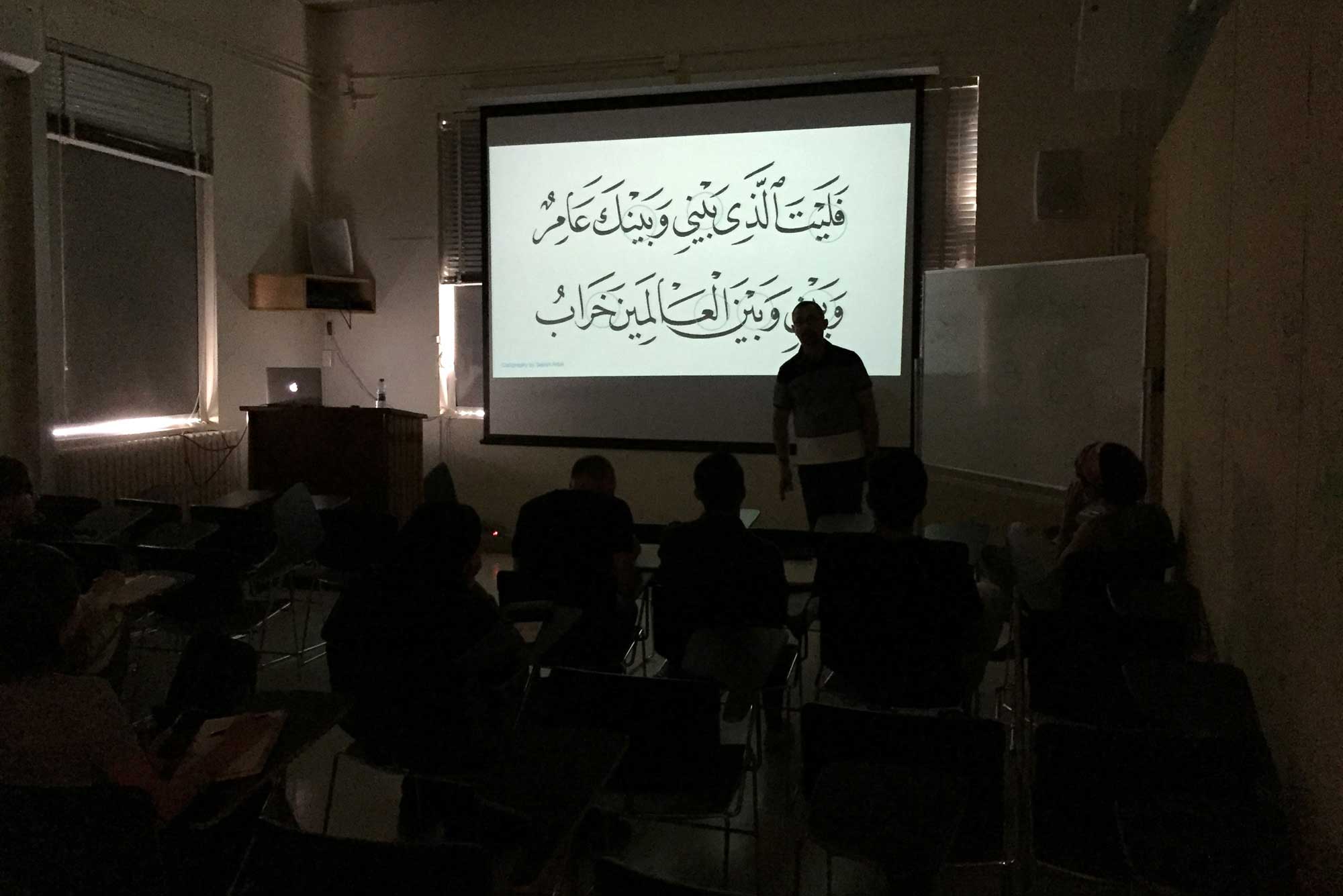
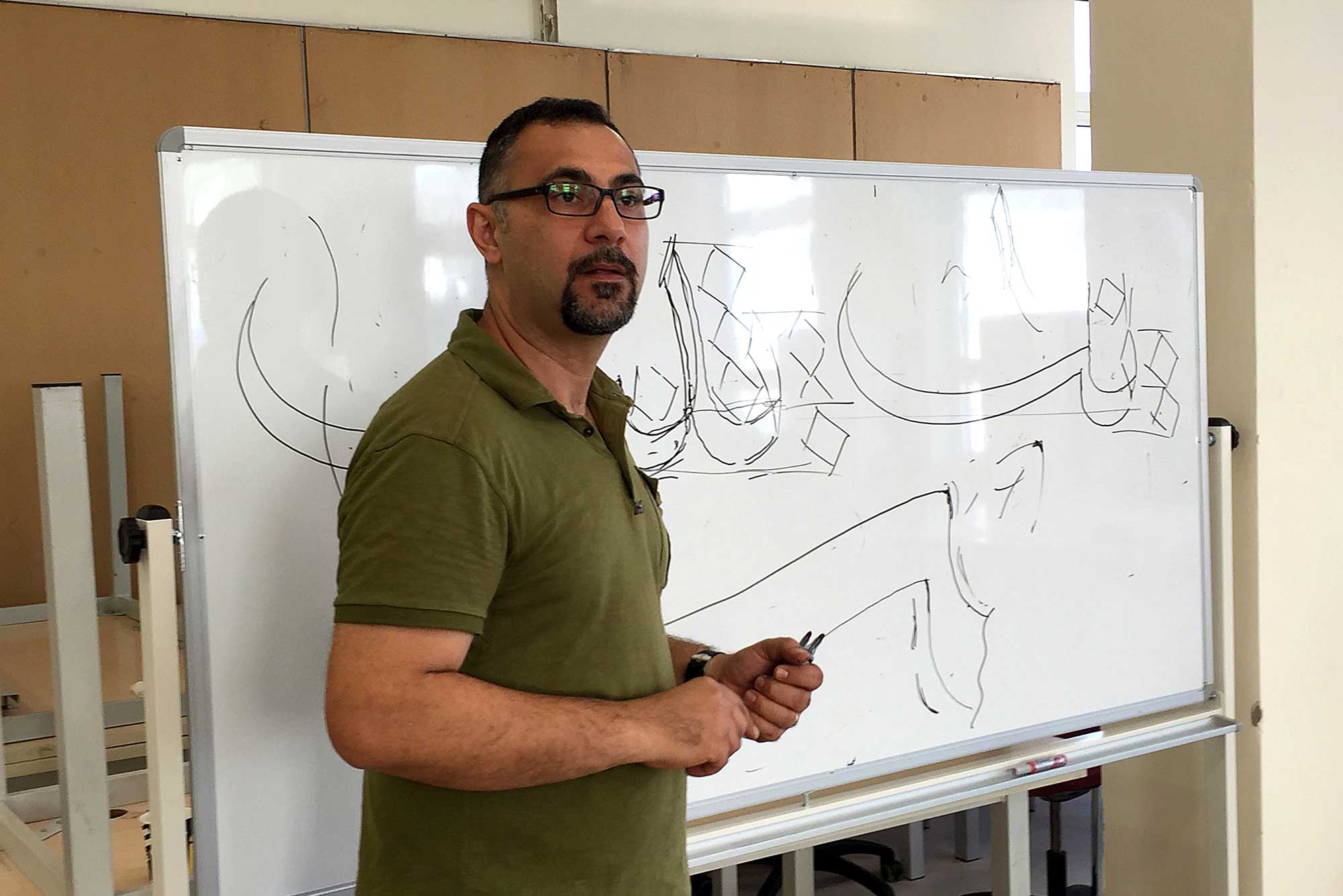
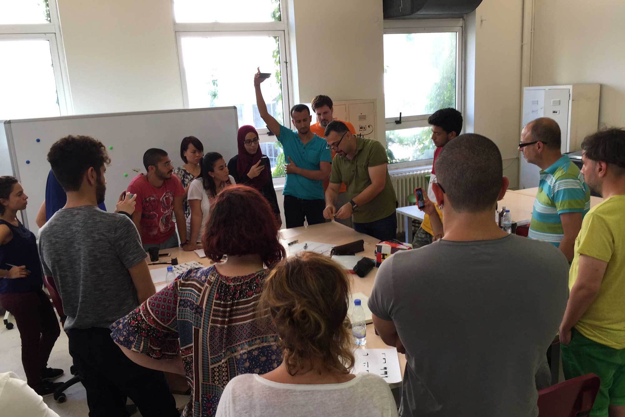
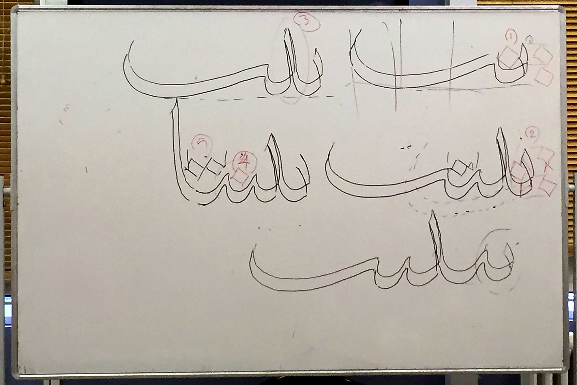
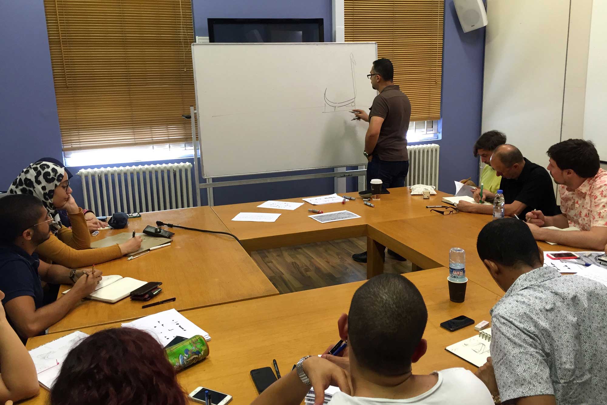
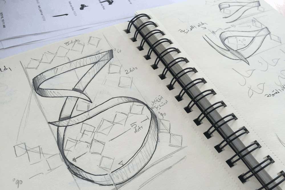
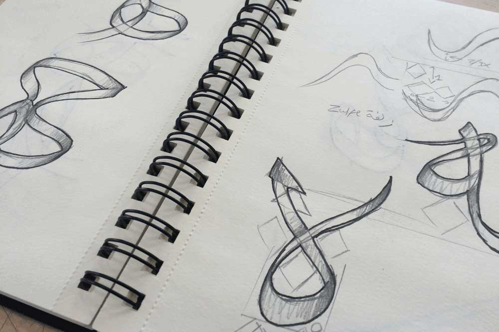
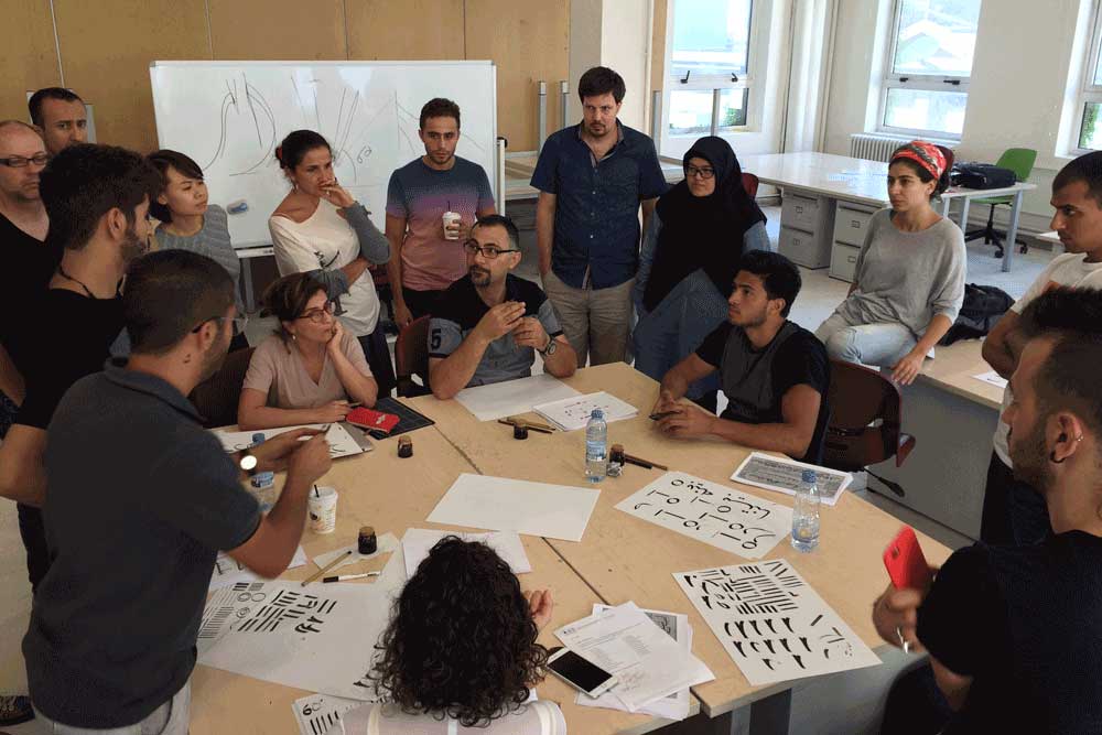
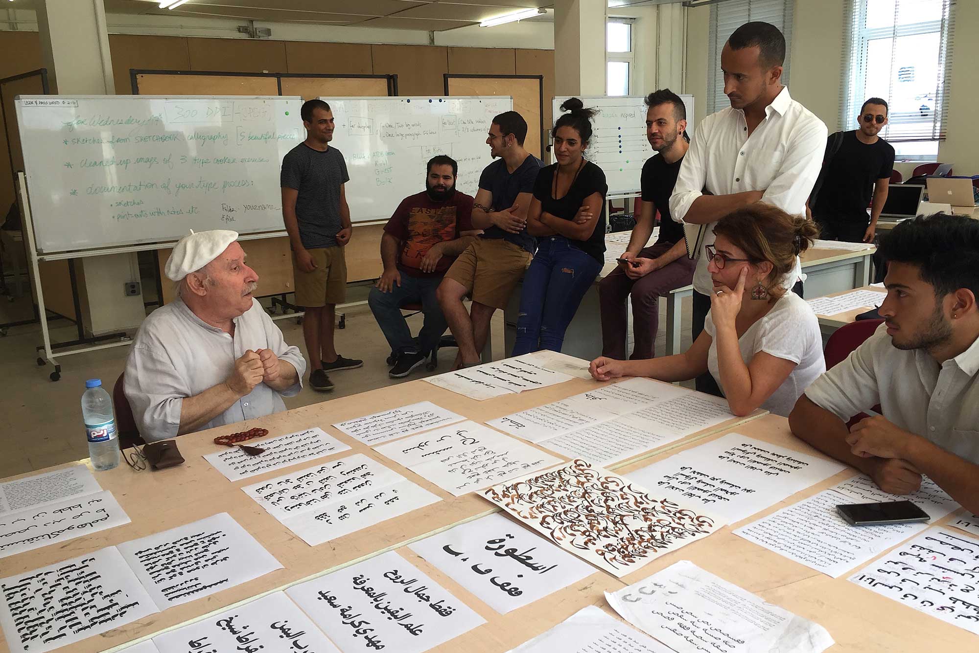
Understanding the script with master calligrapher Wissam Shawkat
It all starts by learning the script. It is important to note the difference between learning calligraphy and script. The immense amount of calligraphic styles are a product of functional, geographical, historical or political influences. They are but expressions of the different attributes of the script. The latter is the larger umbrella of a writing system, encompassing handwriting, stone carving, calligraphy and all forms of text. Behind all this diversity galore, there are two main structures or cateogries: Al-Khatt Al-Yabes (roughly translated to The Solid Construction) and Al-Khatt Al-Layyen (roughly translated to The Fluid Construction). They differ essentially in letter structure, grammar and mechanics. All the calligraphic styles that have surfaced since the birth of the script fall under one of these two categories in the form of parametric variations. It is specifically here where we wanted to kick off ATDB. With Wissam Shawkat, the students spent the first week analysing those categories, learning about their skeletal and structural components and specificities, similarities and differences. As early as this first week, the curiosity about the richest details in the script - that are sadly largely lost to the Arabic type design field - followed by the excitement of experimenting with those details, manifested itself enthusiastically.
The ensuing conversations and debates were as insightful as they were hopeful. The topics included general questions about the state of modern Arabic type and its users, the political and social reasons behind the striking schism between script and type, the possible ways the script can inform our type design practise, as well as questions of typographic details such as how to describe the letterforms in their different positions through strokes, what is the grid of construction, how can a single structure be expressed in different proportions, how do the letterforms connect to each other.
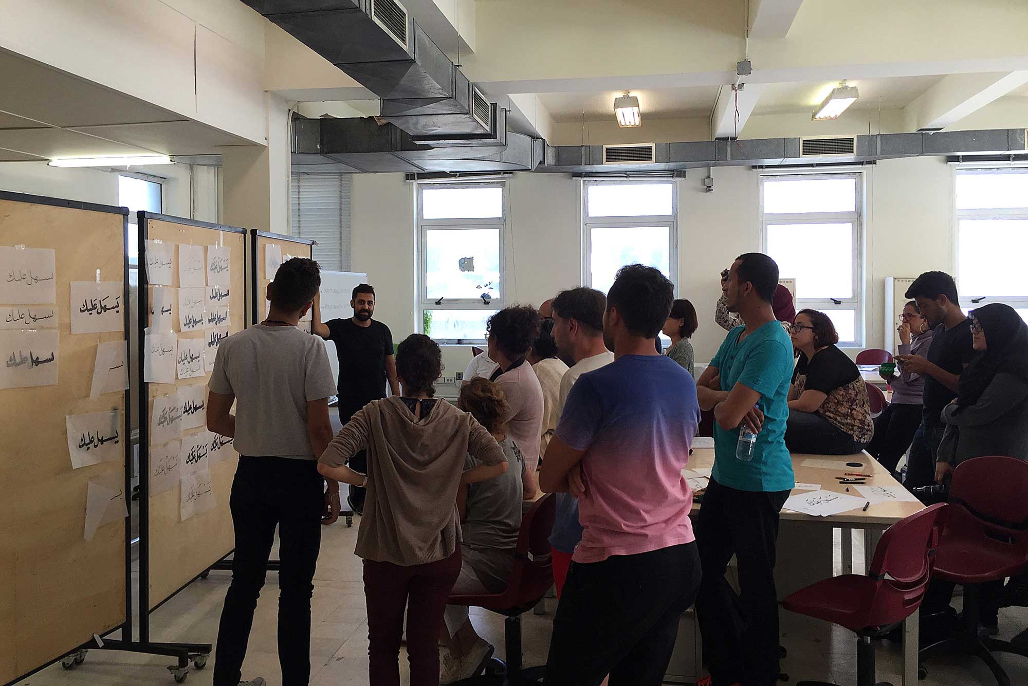
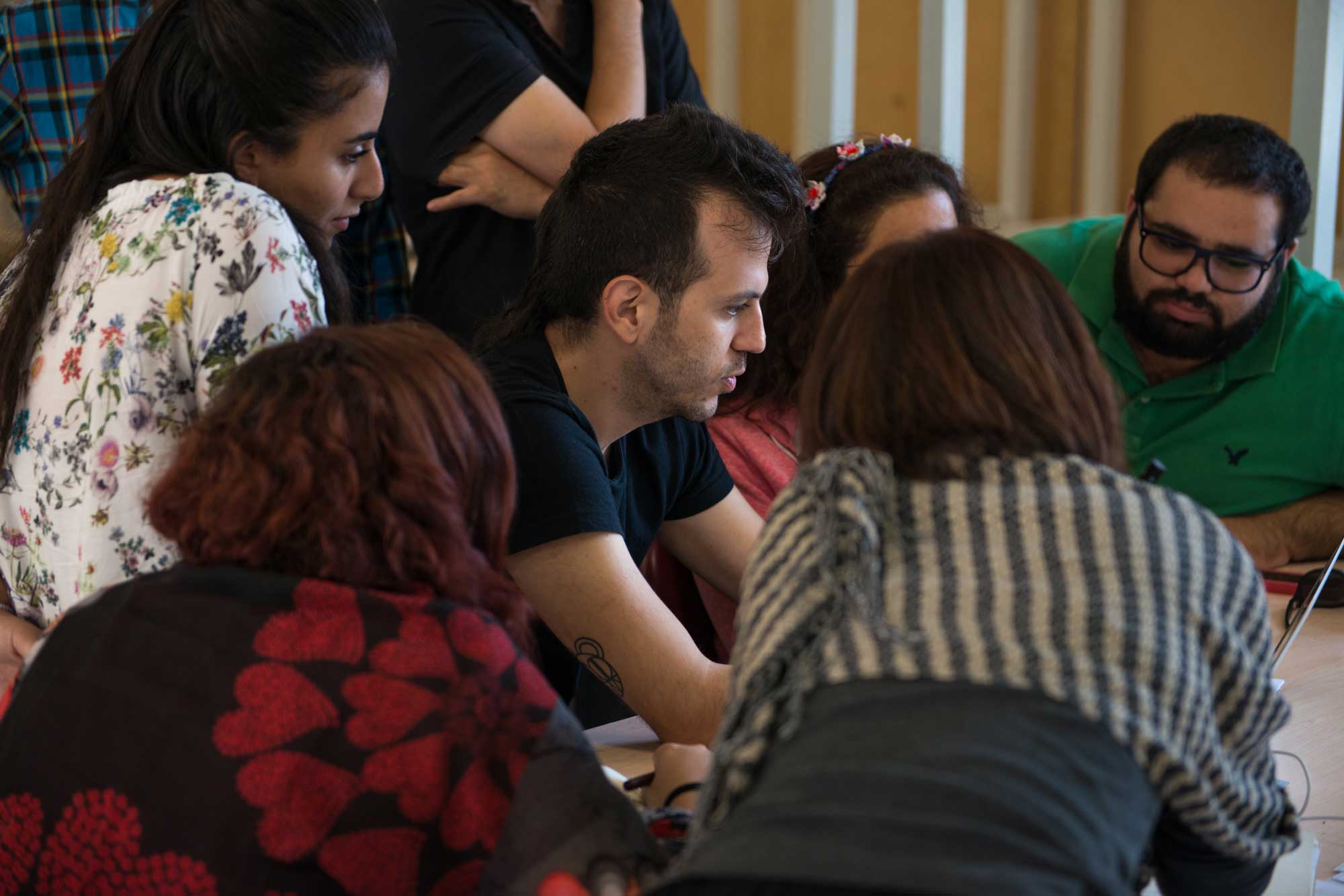
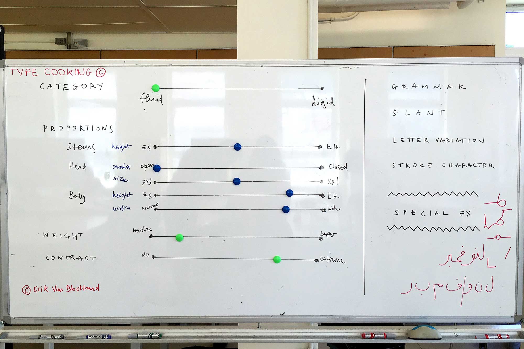
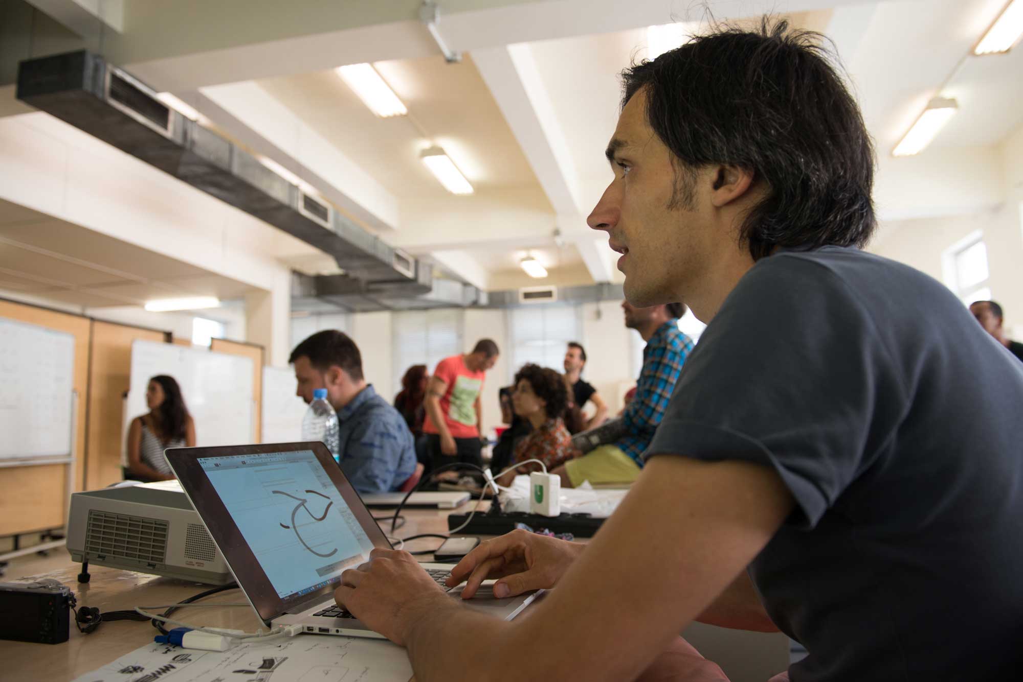
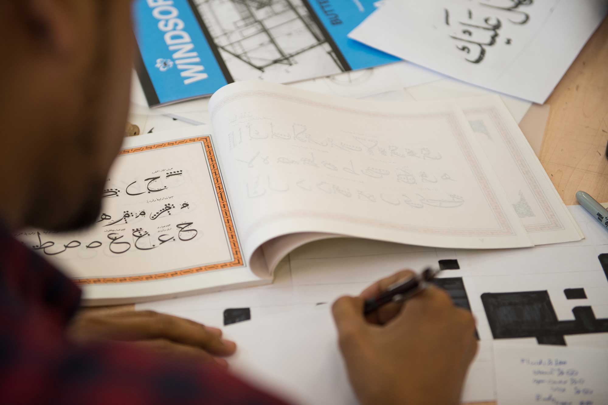
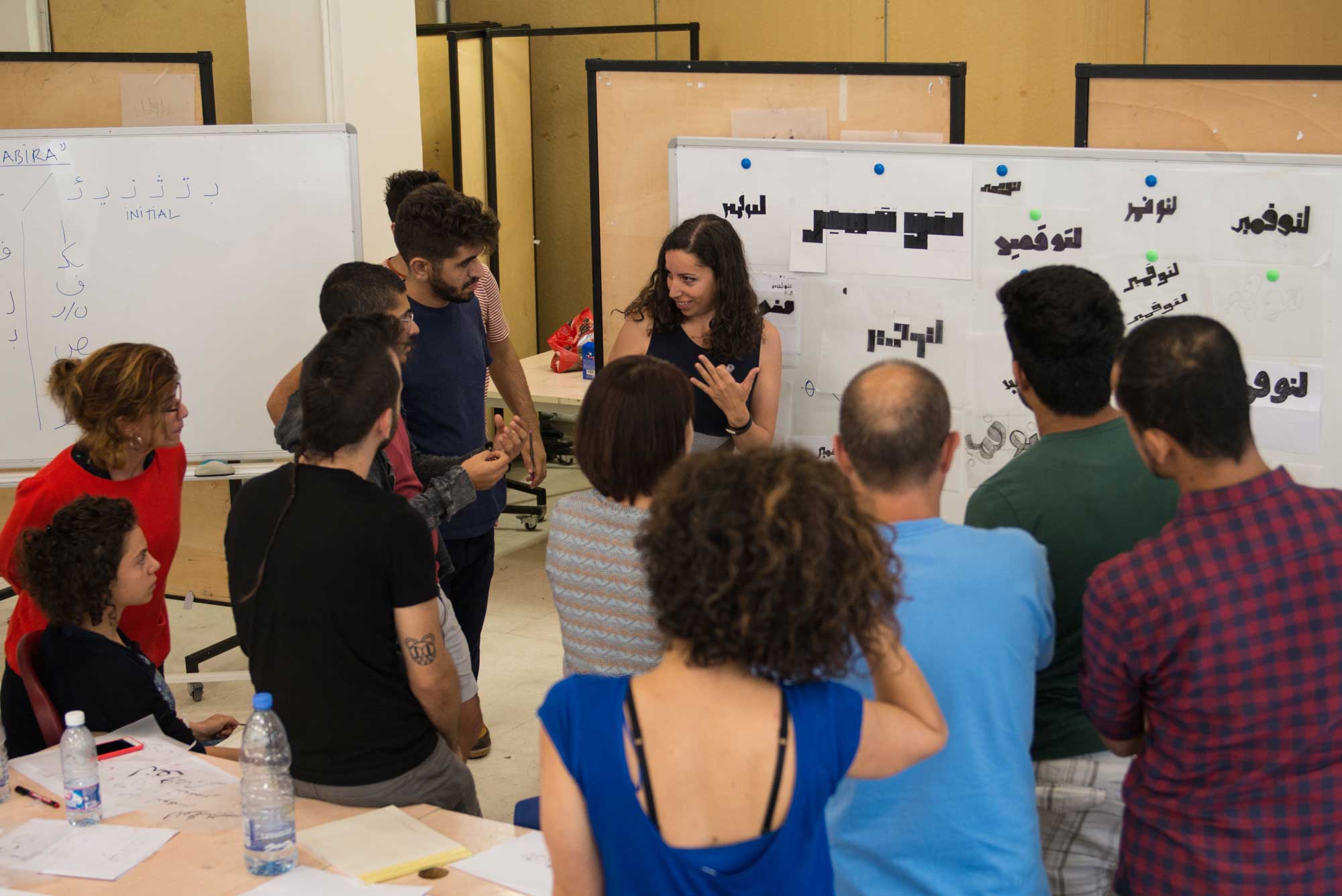
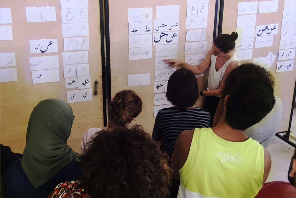
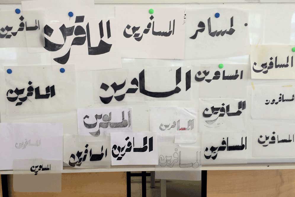
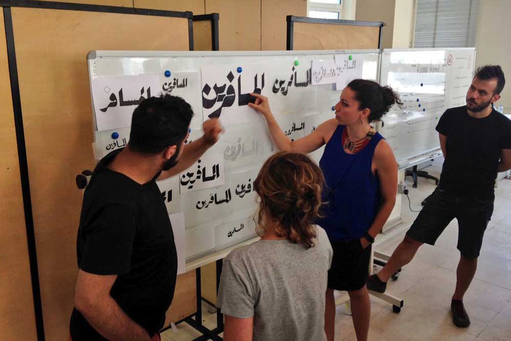
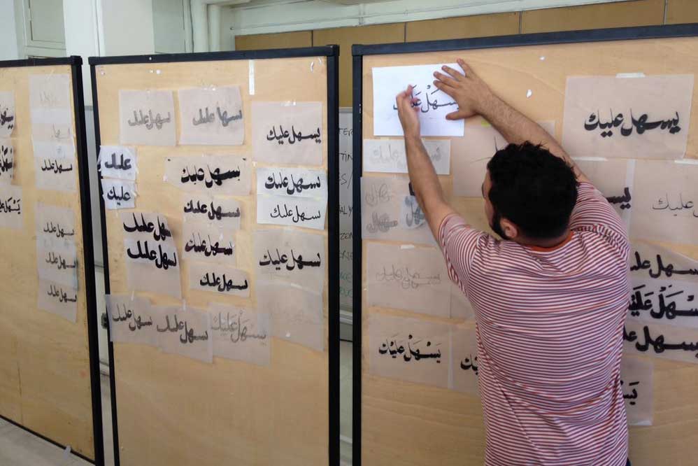
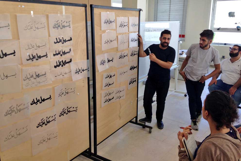
Typecooking exercises
After the intensive general introduction, the journey continued and zoomed in closer on the script as the hands-on experimentation started. The students were introduced to a set of parameters we conceived to help dissect the characteristics of the script and gain a better understanding of its flexibility and potentials of its structure. Those parameters were presented in the form of a table we devised with Khajag Apelian inspired by Typecooker and adapted to Arabic. Typecooker, created by Erik van Blokland, is a method of generating different recipes for drawing type according to a set of ingredients. The advantage of this approach is not only the potential diverse and unorthodox results it yields but the scientific aspect in breaking down letterforms to a set of parameters that can be manipulated. This approach to understanding the script frees us from the labels of the calligraphic styles while focusing on the attribute(s) of the script each style brings forward.
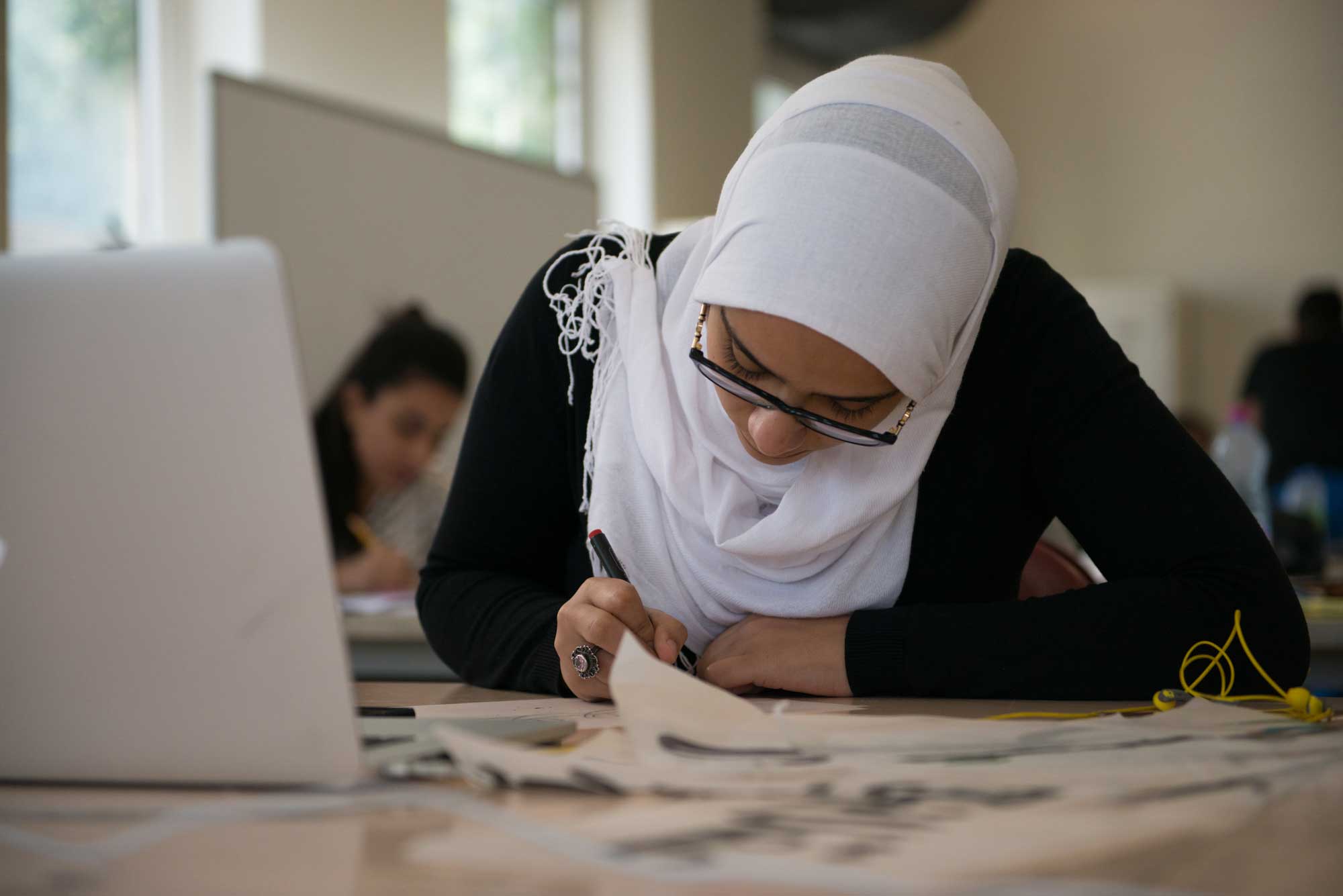
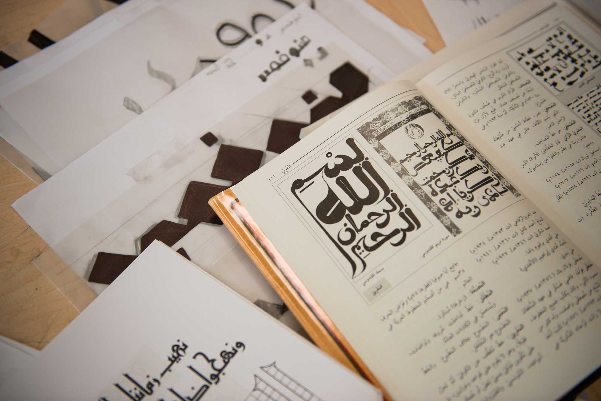
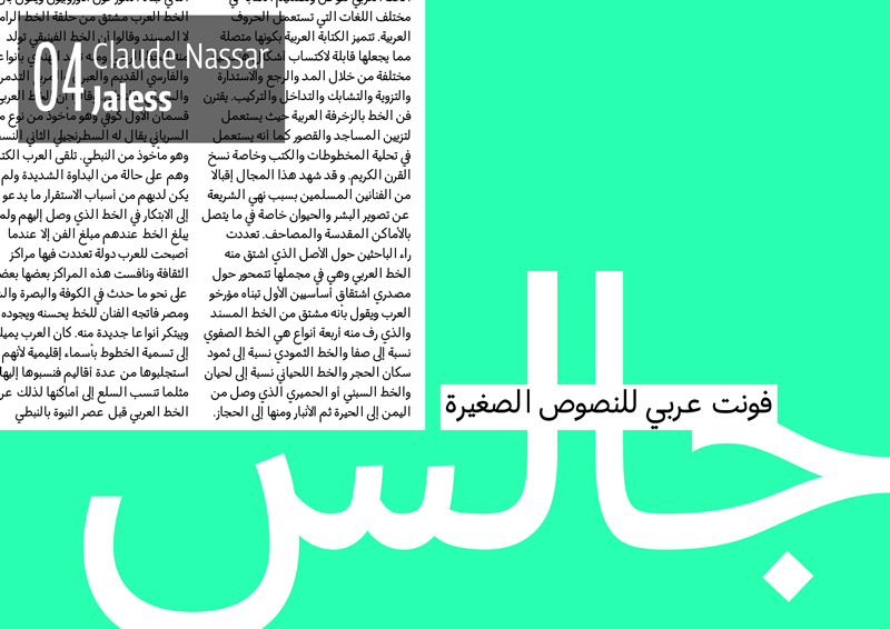
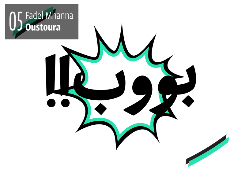
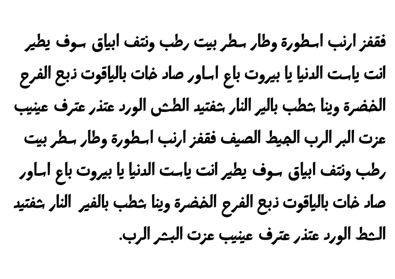
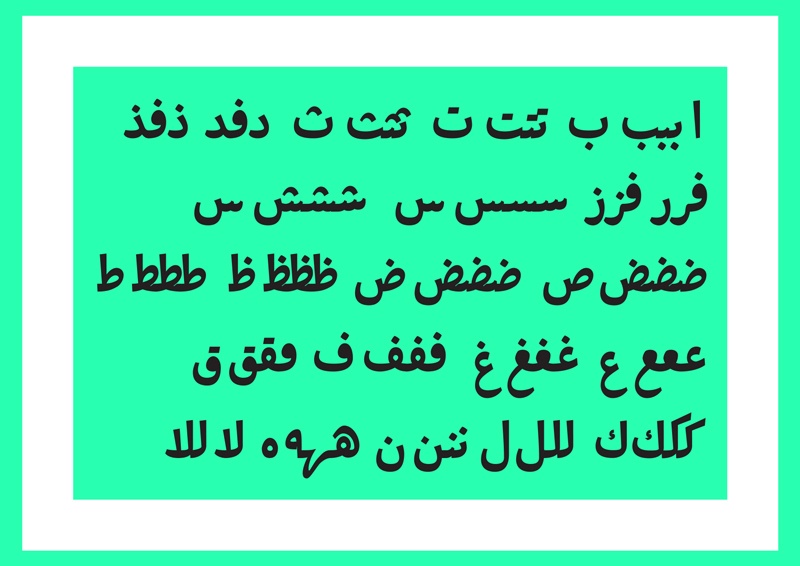
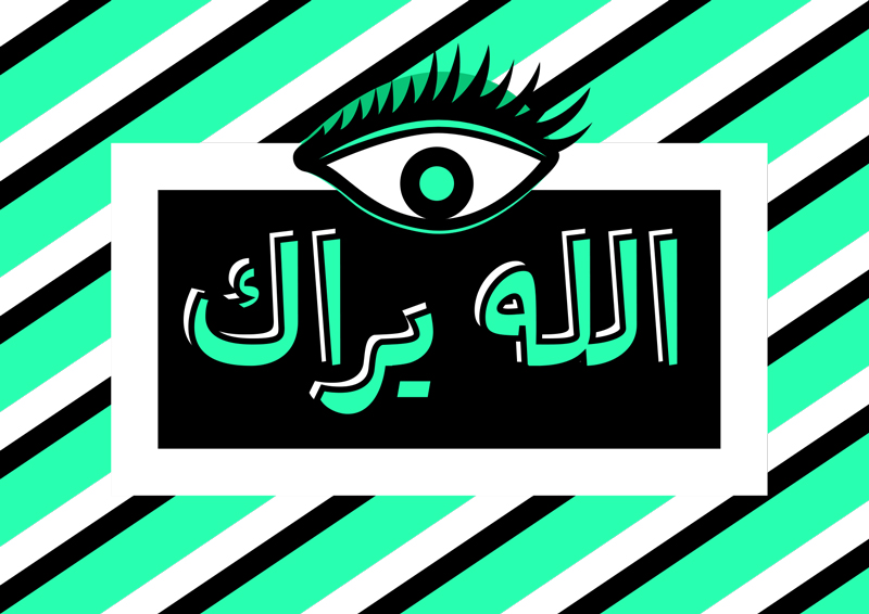
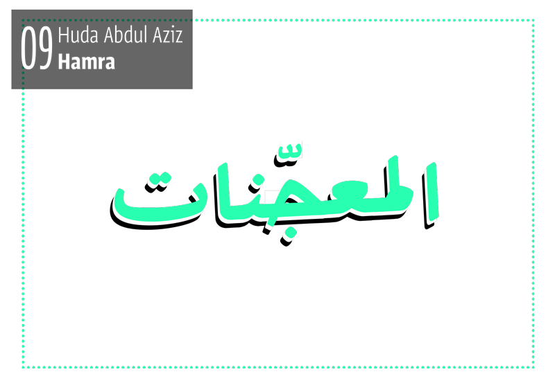
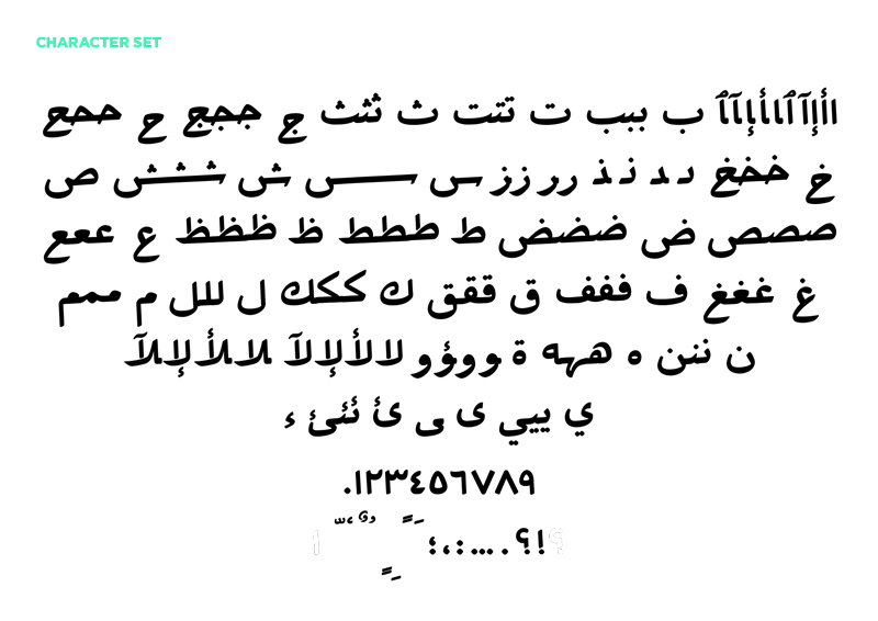
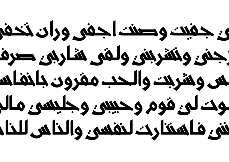
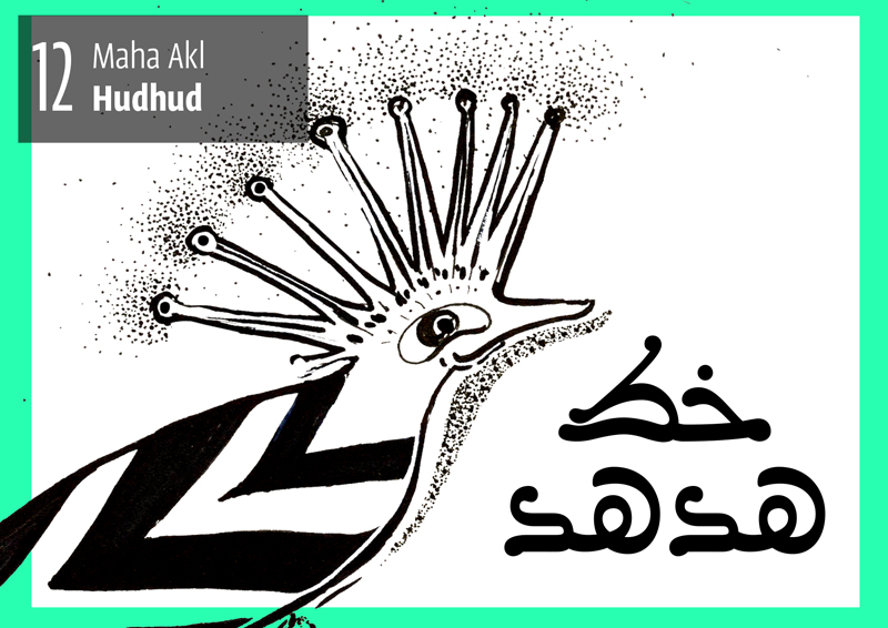
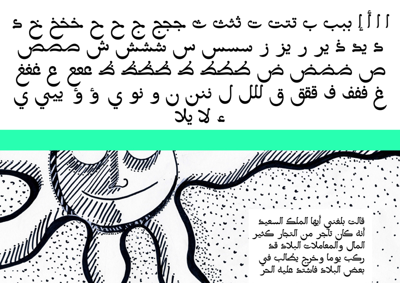
The week was spent drawing different recipes built with specifically designed aims at exploring the different parameters and their individual effect on letterforms. Through the different experiments, the concepts started to emerge. Whether to answer a certain need or to a solve a certain script-related problem, testing the behaviour of the letterforms in different environments and extremes broadened the scope of solutions and gave the students crucial insight into the attributes of the script and their possibilities. This resulted in unsurprisingly diverse ideas: from a type family for modern truck art to a type system studying the hierarchical system of manuscripts to family for comic books with a specific tone of voice. Once the concepts were consolidated, and following the Typecooker approach, the students narrowed down their brief into a set of ingredients and started drawing accordingly.
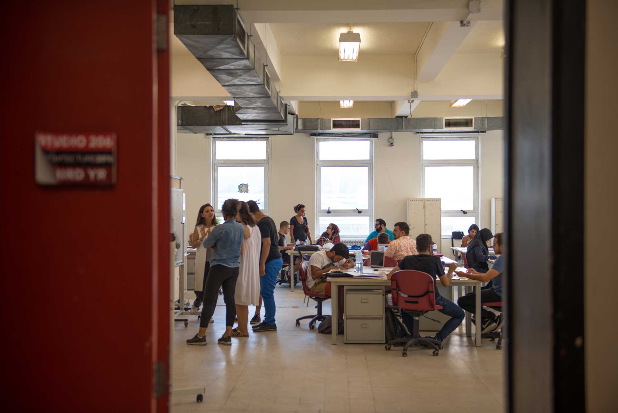
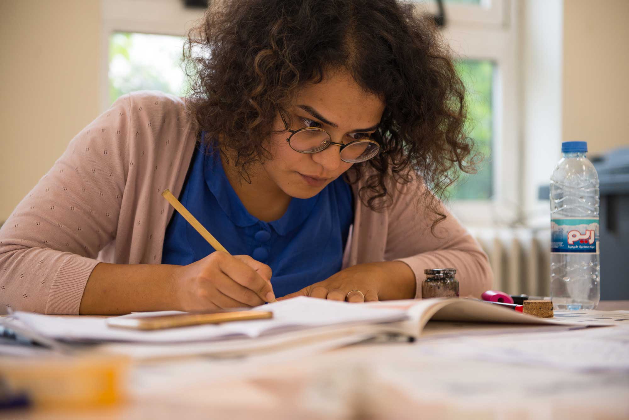
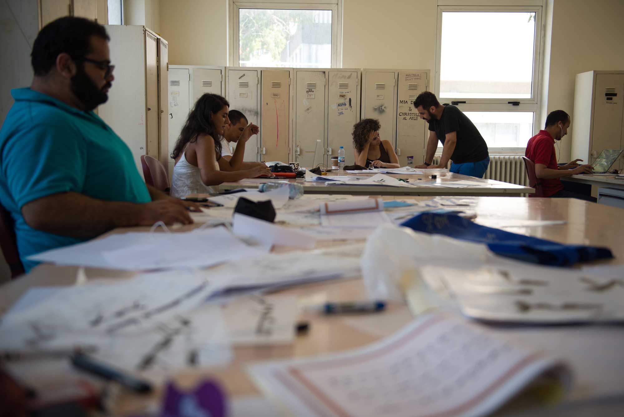
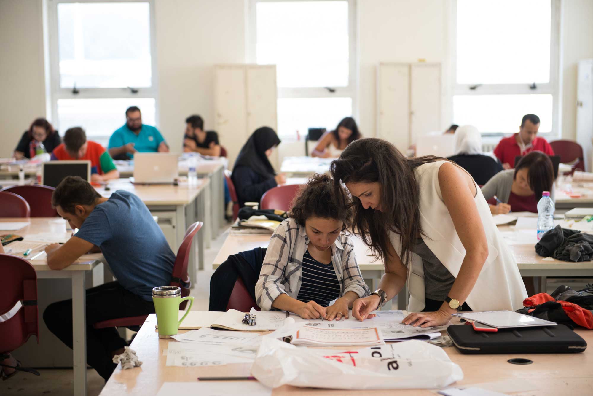
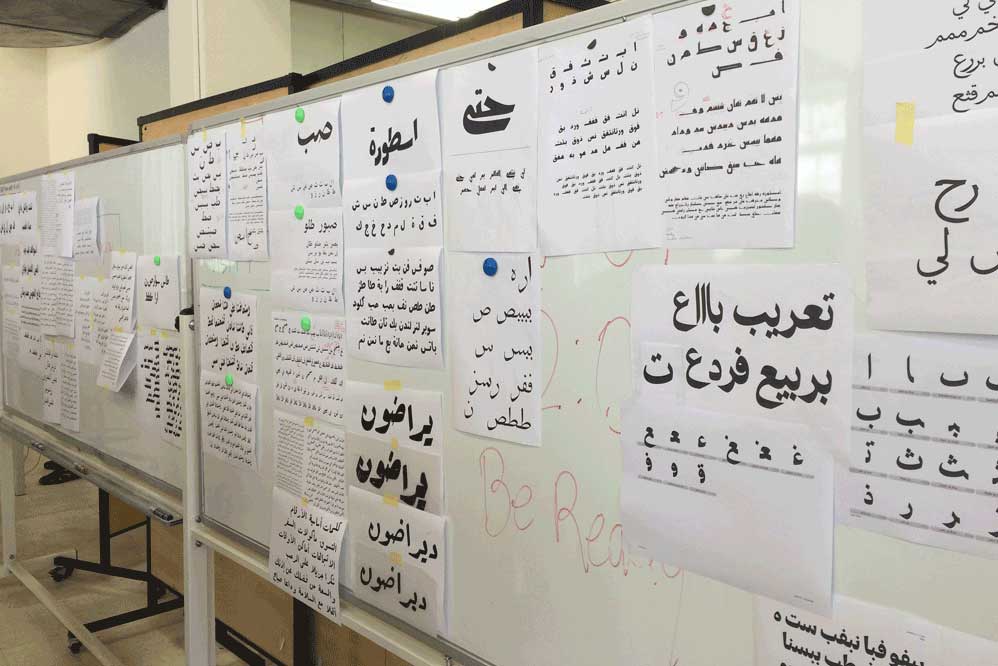
Conversations and development of the projects
Moving to the digital world
It is true that over the past the Arabic script has suffered from the lack of technologies that would create a smoother evolution into a more mechanical setting and approach to design. It is also true that to this day, very few softwares cater to the Arabic script on a satisfying level to type designers and typographers alike. But luckily a lot more is possible than ever before and while we still hope for more freedom in this process, there is plenty we can do already. One of the apps that caters best to the Arabic script is Glyphs app by Georg Seifert who spent 3 days with us in ATDB to explain and demonstrate the capabilities of this app for Arabic type design. What was pleasantly surprising was that the earliest and most frequent questions about the technical know-how were concerned with interpreting characteristics of the script that are rarely explored or not at all: Slanted baseline, contextual alternation, cascading… While not all characteristics are possible to be interpreted in type, a surprising amount is. The main challenge is in the interpretation itself and in making a typographic characteristic from an attribute of the script.
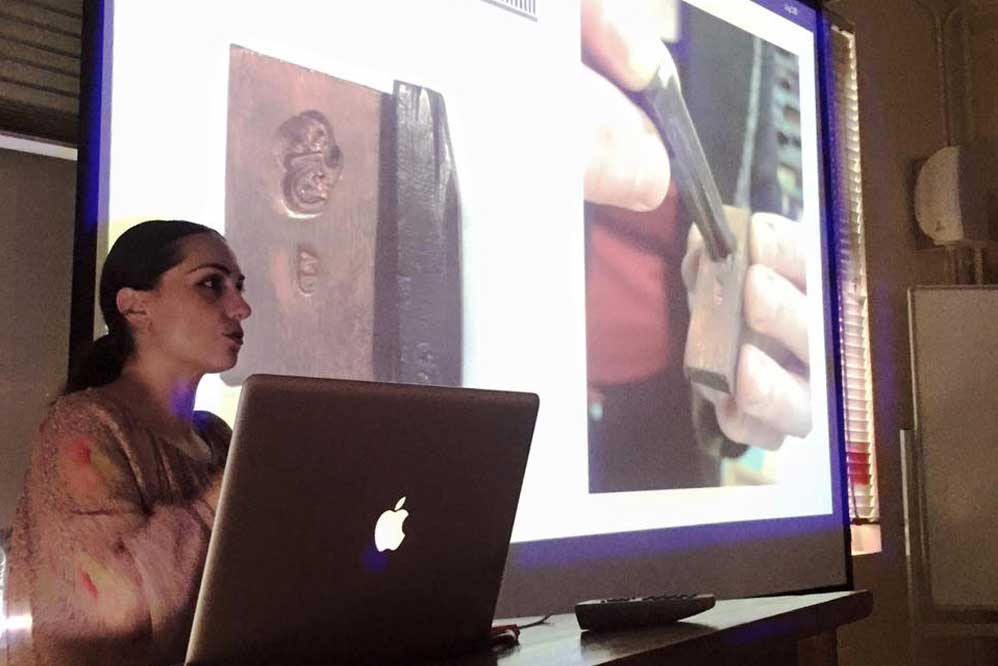
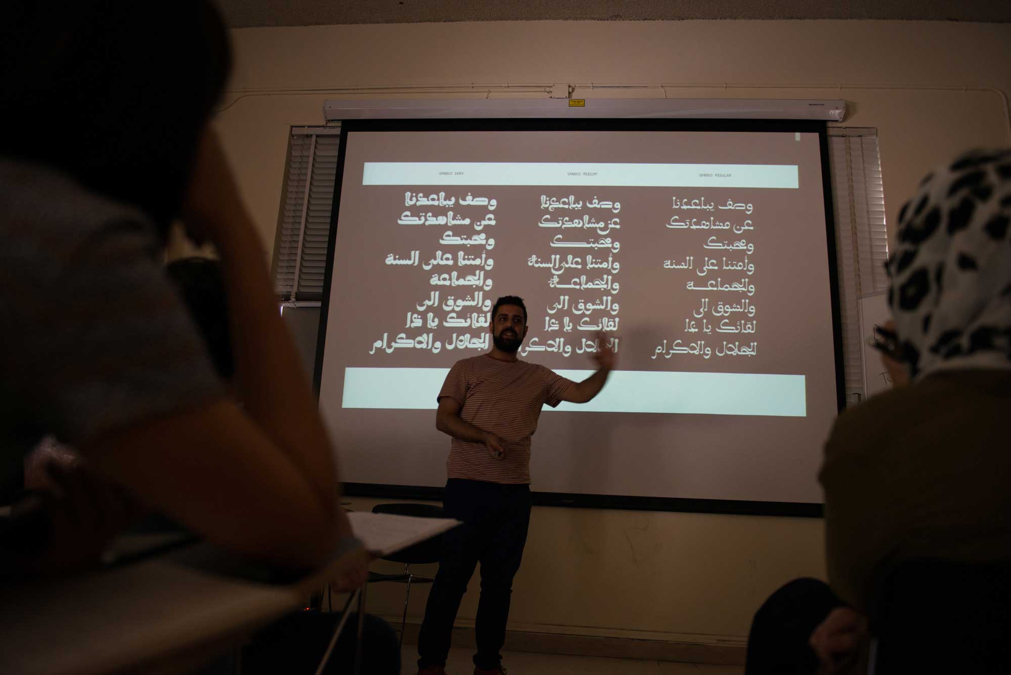
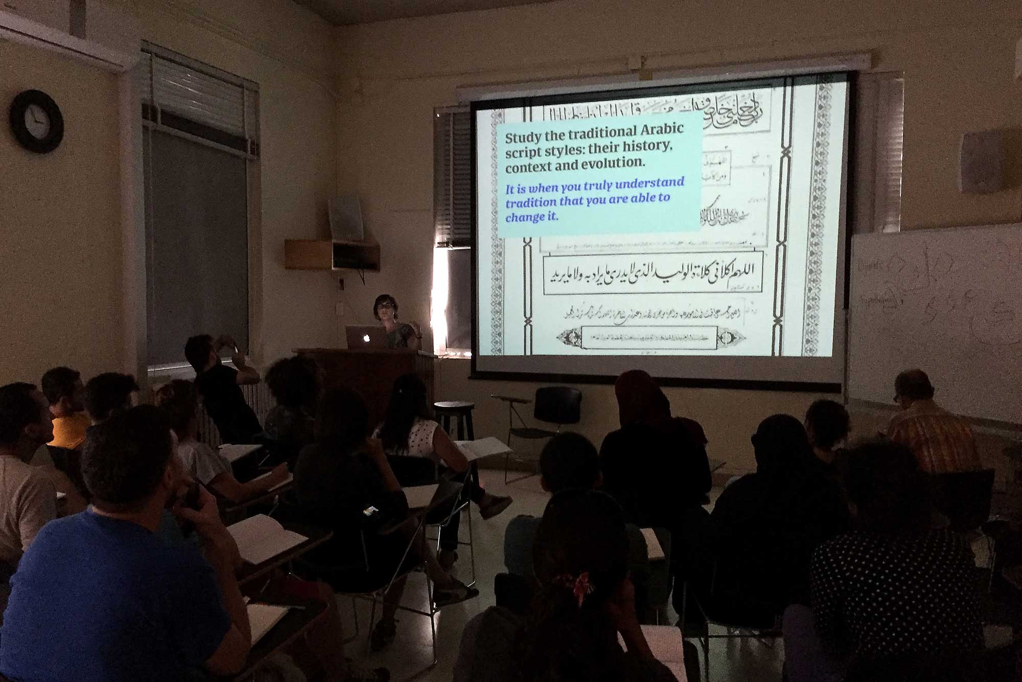
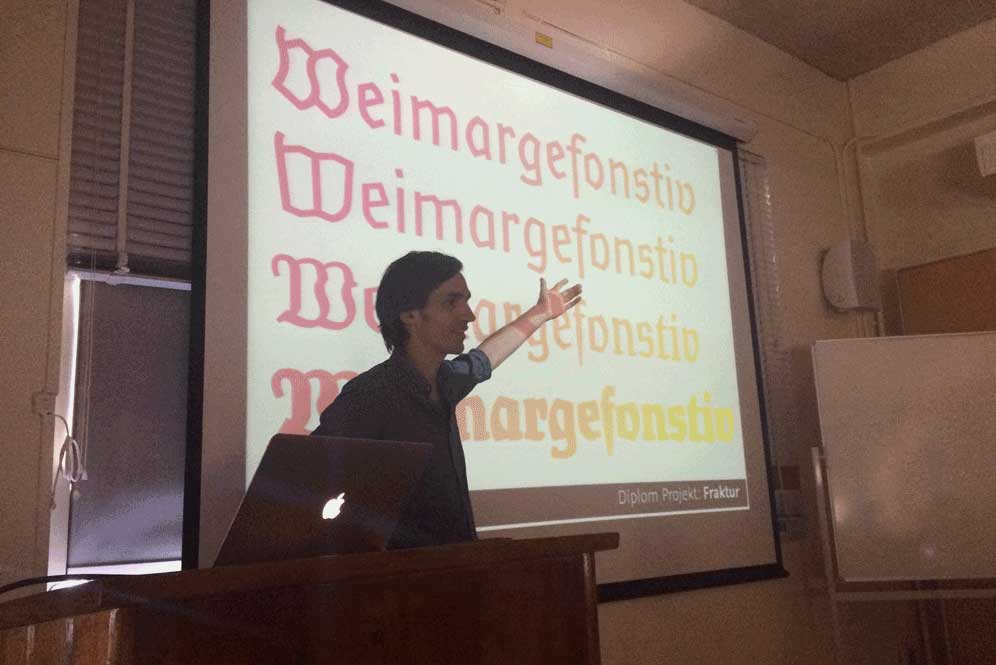
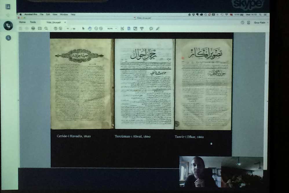
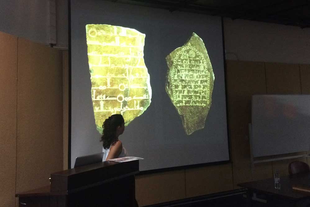
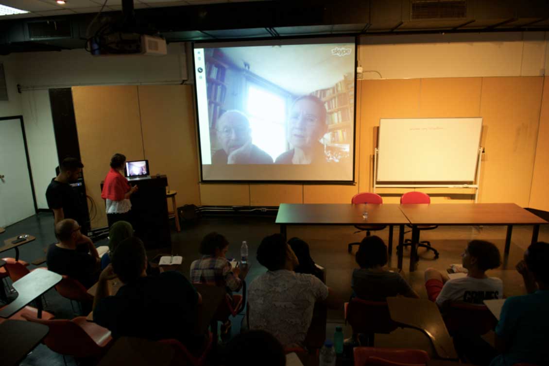
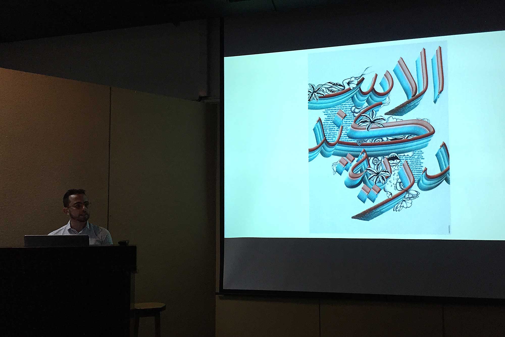
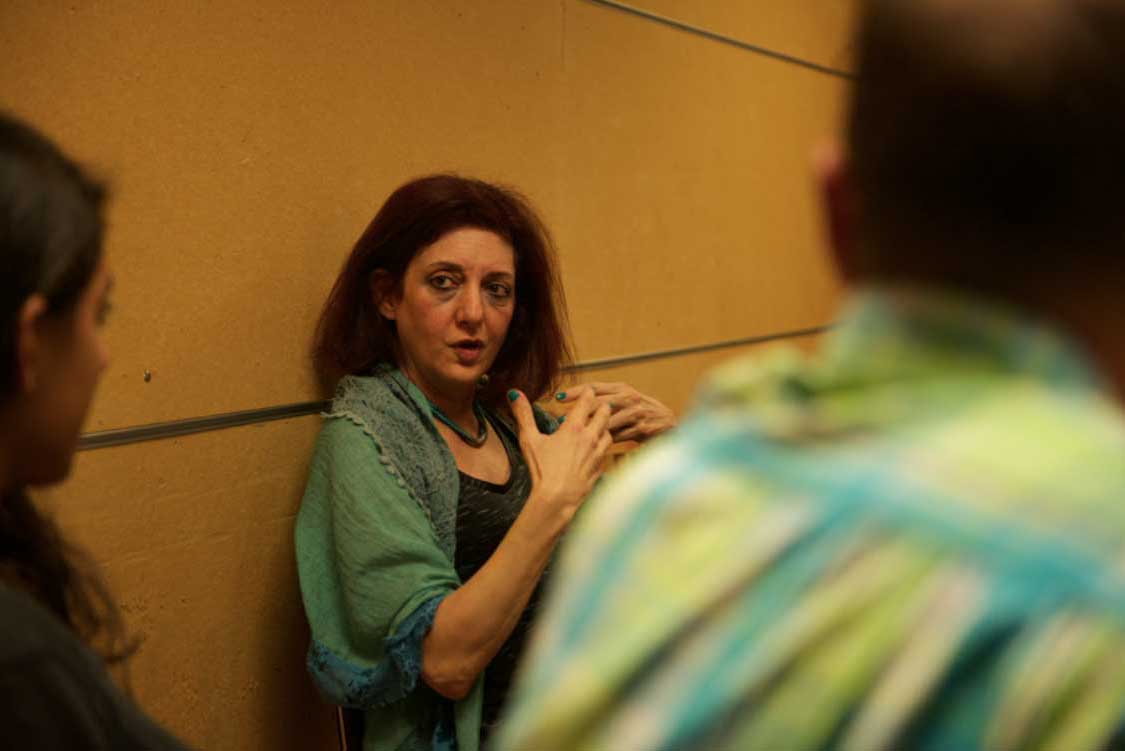
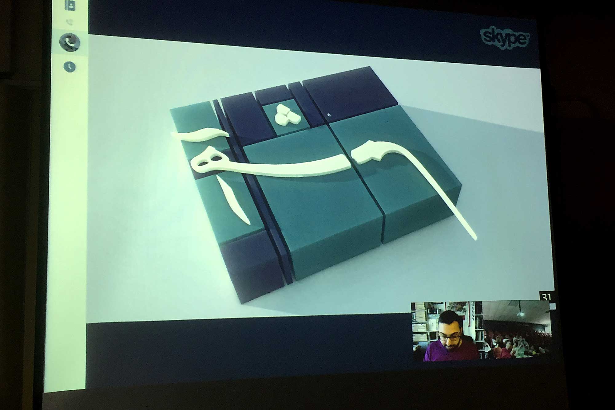
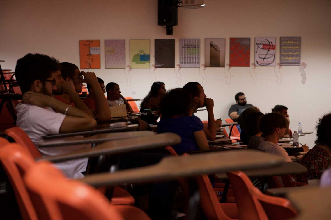
Speakers at ATDB
In the next three weeks, the different typefaces slowly started taking form alongside more questions that arose than answers. To provide more insight on the history of the mechanisation of the script and the different attempts, Onur Yazicigil gave a talk about the Ottoman printers of the 19th century, Emanuela Conidi about the Italian moveable type experiments and Borna Izadpanah about the Early Nastaliq types. There is a lot to learn about the successes and even more so from their shortcomings. What didn’t work in a mechanical context but could work in a digital one? And how? Why is the model of designing digital Arabic type so closely related to metal type when that didn’t prove to be very accommodating to Arabic?
Planting a seed
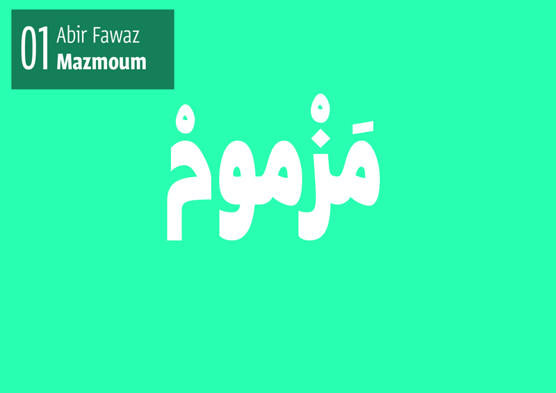
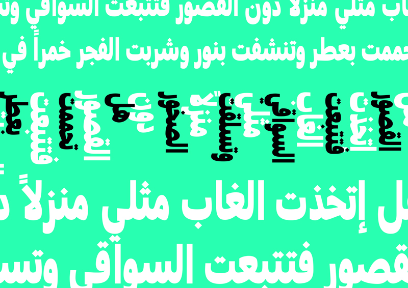
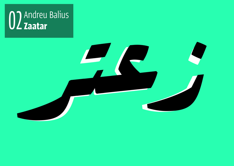
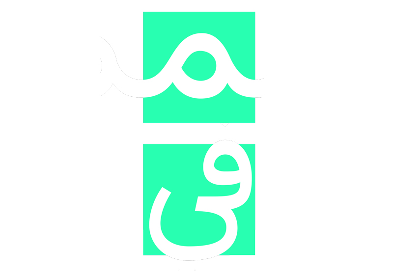
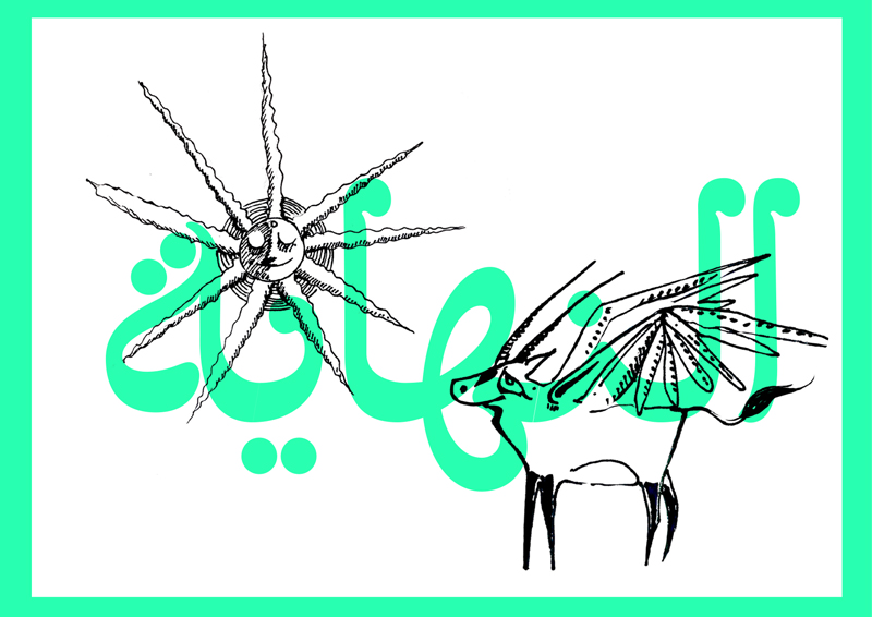
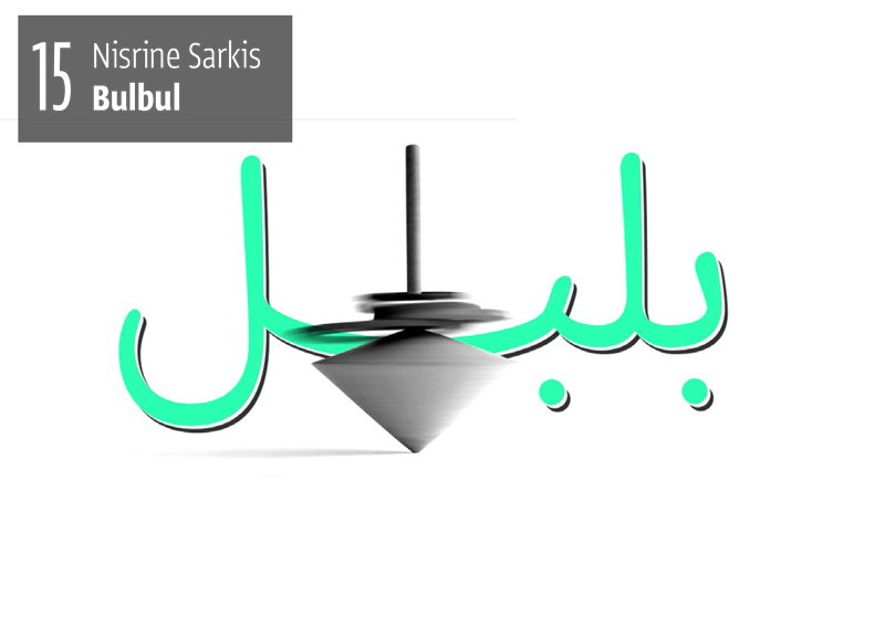
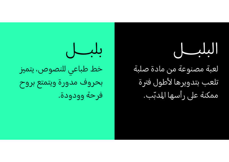
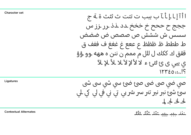
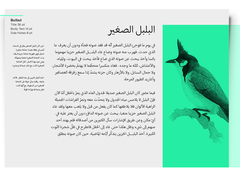
ATDB set out to test a certain philosophy we believe in. That by learning the Arabic script to inform type design, the scope of solutions becomes much broader, more authentic and representative of contemporary local cultures or identities. This couldn’t have been more obvious in the projects the students presented in the end. No one shied away from going against any current trends and from implementing new experiments by playing with: slant, width, contextual alternation, cascading, contrast… and showing a hopeful amount of critical analysis. It is not an overstatement to say that probably the most interesting part of the ATDB experience is all the conversations and debates and eye-opening questions that came about. On the very first day we introduced ATDB as a platform where we can collectively think and question our knowledge and traditions of the type design practise. It is extremely gratifying that it was just that.
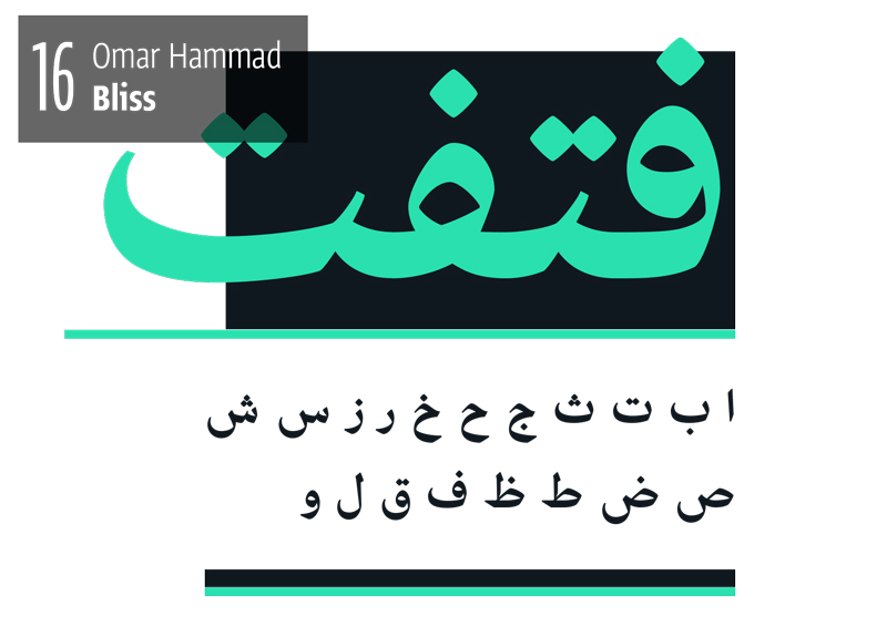
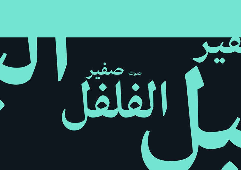
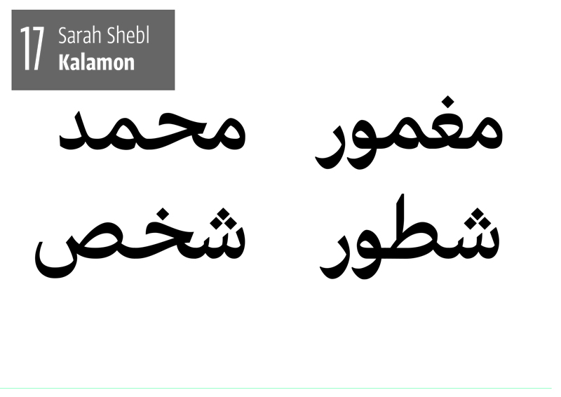
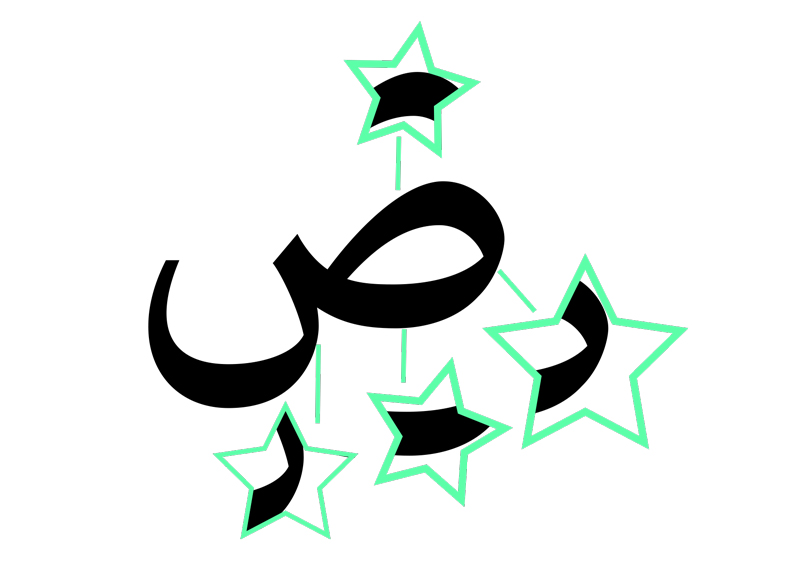
The Results
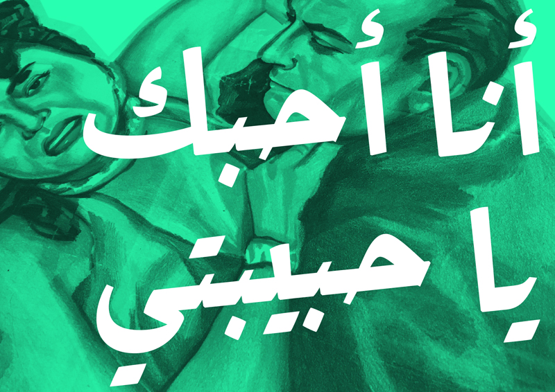
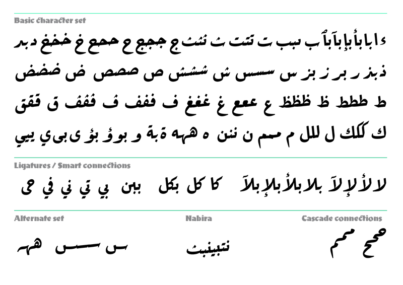
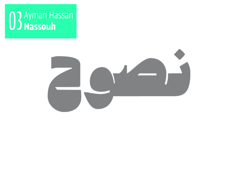
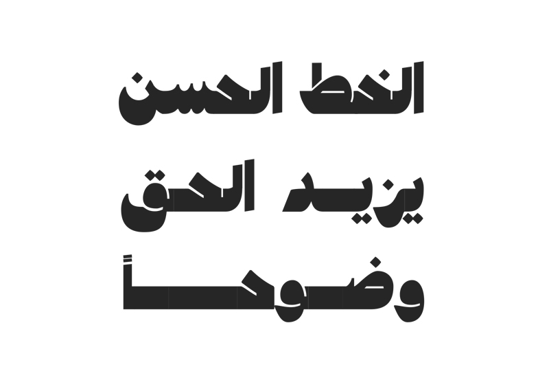
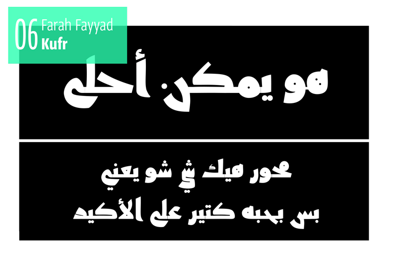
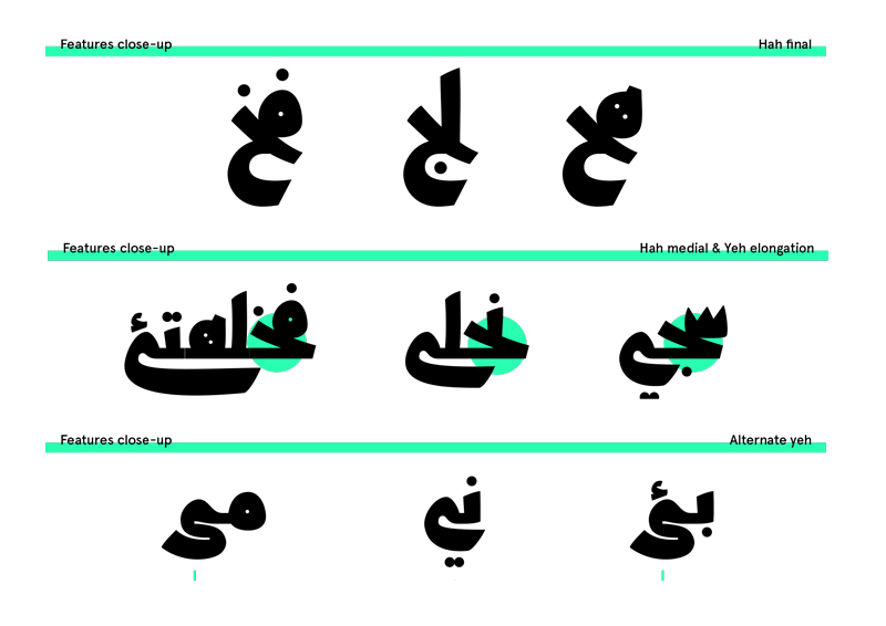
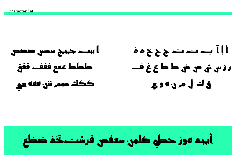
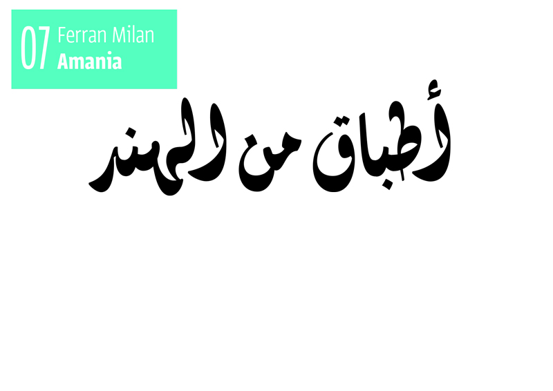
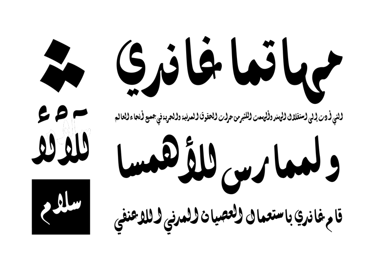
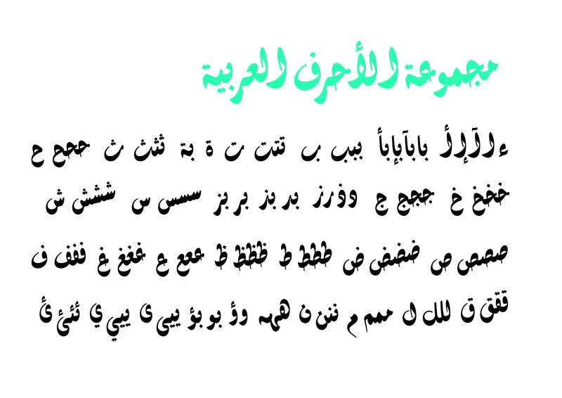
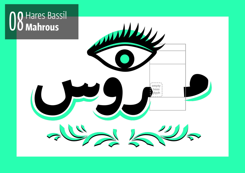
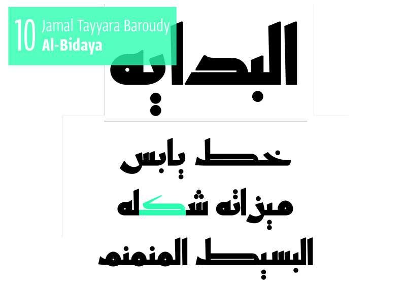
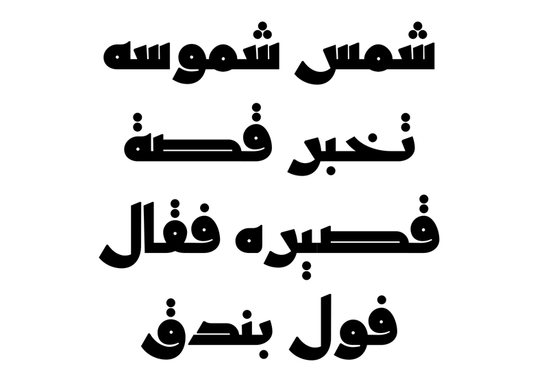
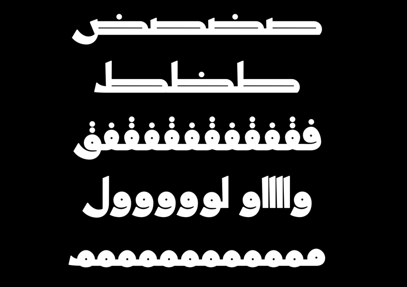
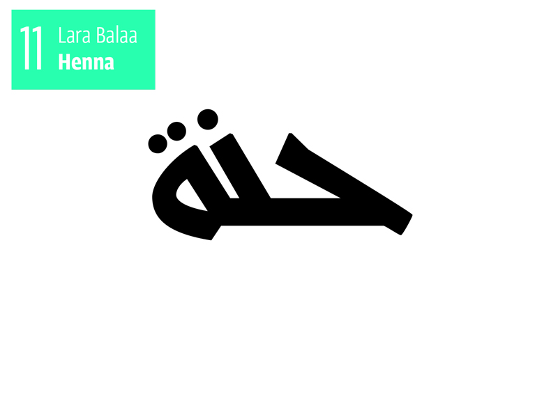
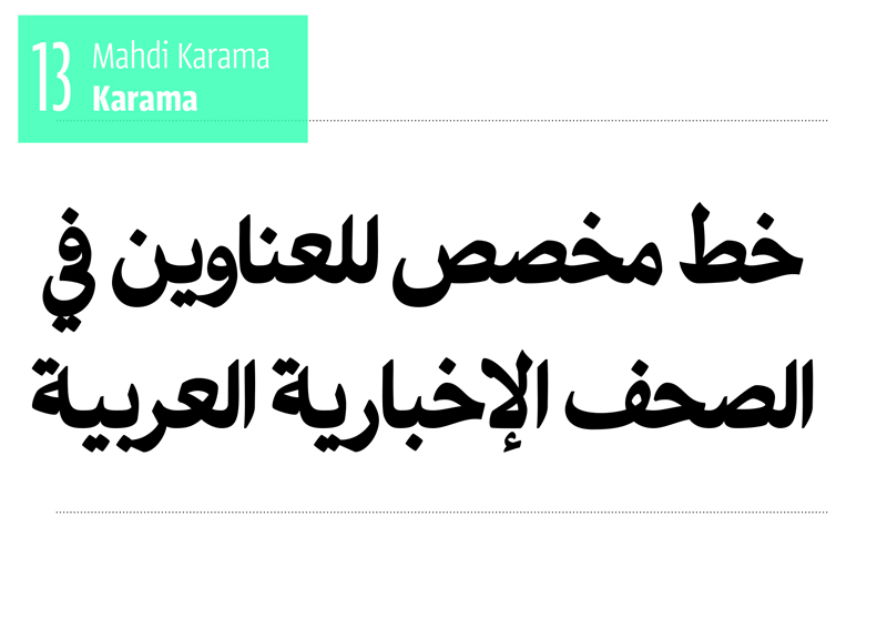
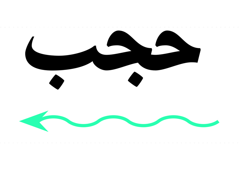
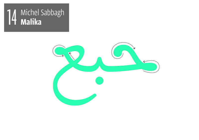
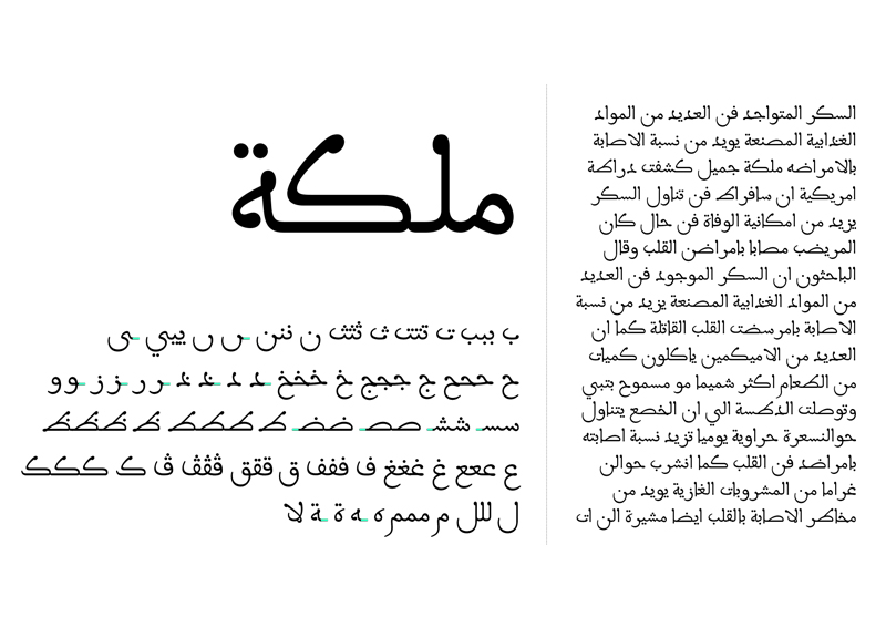
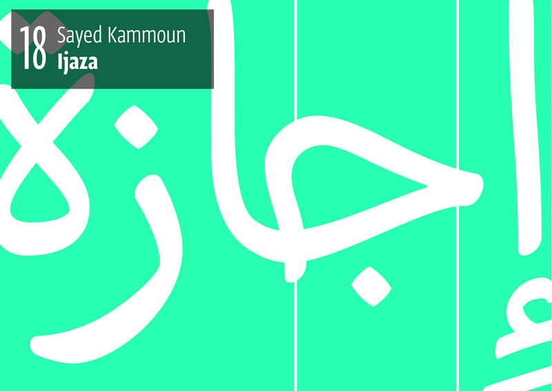
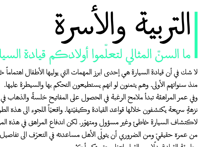
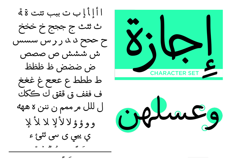
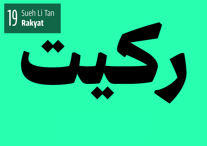
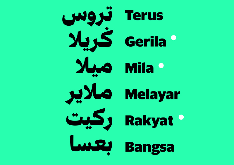
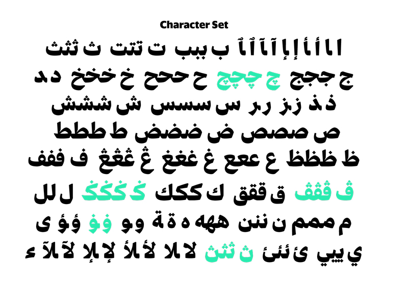
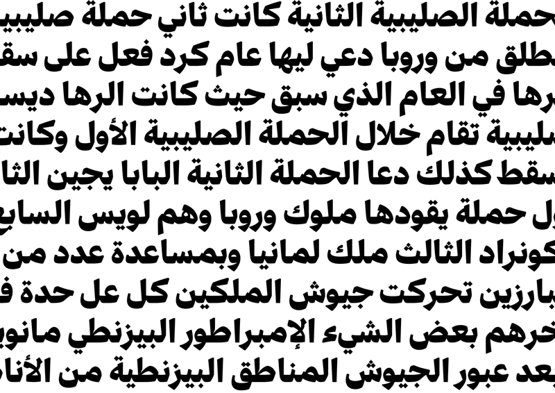
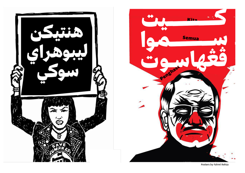
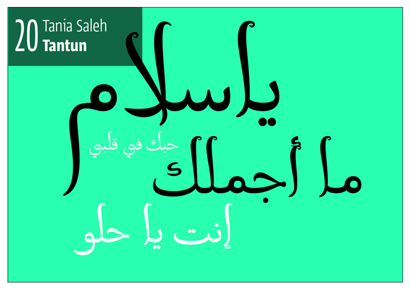
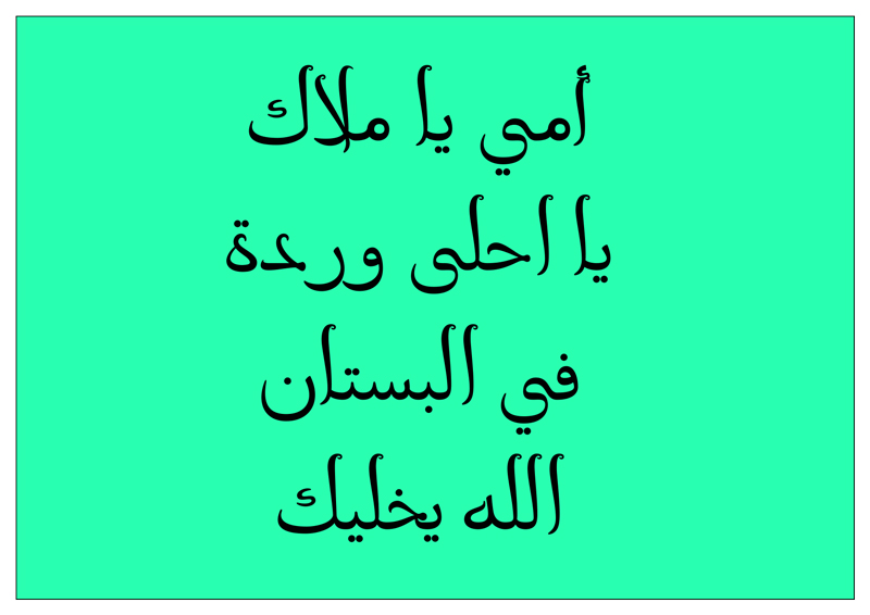
Coming next
As we realise, this article raises a lot of unanswered questions in relation to the Arabic script and how it can inform type design, we are planning a series of articles that will follow tackling the different topics mentioned in this article: The main structures of Arabic, the anatomy, the parameters, the calligraphic styles deciphered.
We would like to thank the following people for making this program possible: Leila Musfy, the staff of the Department of Architecture and Design, the Faculty of Engineering and Architecture and the American University of Beirut, Cara di Edwardo, Sumner Stone, the Cooper Union, Peter Biľak and theType]Media teachers for inspiring us, the teachers: Khajag Apelian, Yara Khoury, Wissam Shawkat and Georg Seifert, the speakers:Azza Alameddine, Emanuela Conidi, Samir El-Sayegh, Borna Izadpanah, Thomas Milo & Mirjam Somers, Wael Morcos and Onur Yazigicil, Abboudi Abou Jaoudeh for showing us his collection of Egyptian posters, old magazines and books, the archivists at the AUB library special collections , The monks of the Qozhaya monastery (home of the Abdallah Zakher printing press), the film and photography team: Myriam El Hage and Elias Moubarak, and of course, the students: Abir, Andreu, Ayman, Claude, Farah, Fadel, Ferran, Ghaleb, Hares, Huda, Jamal, Lara, Maha, Mahdi, Mariane, Michel, Nisrine, Omar, Sarah, Sayed, Suehli and Tania, Finally we thank Basma Hamdi, Krassen Krestv, Bahia Shehab, Mouneera Spence and Salem El-Qassimi for helping us spread the word.
