The Influences of Greta Text Arabic
Documentation and research that lead to design of Arabic newspaper typeface
With a few scattered exceptions, the current state of newspaper typography in the Arab world exhibits a striking visual homogeneity. The reasons for this phenomenon are beyond the scope of this article, but its consequences are at the core of Greta Text Arabic’s definition. Newspaper typography, the Naskh calligraphic style and Greta Text Latin, constitute the three key ideas behind Greta Text Arabic’s conception. Individually and collectively, they dictated or inspired my design decisions throughout the whole process.
Newspaper Typography
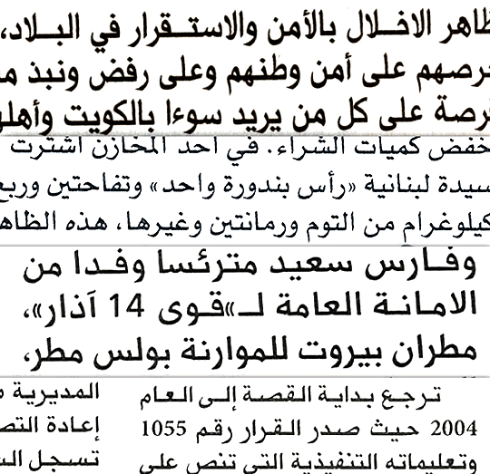
When Peter Biľak asked me to think about the design of Greta Text Arabic, we started by considering criteria for Arabic newspaper typefaces. I started with research into existing newspaper typefaces collected from different regions of the Arab world: Egypt (3 samples), Kuwait (5 samples), Lebanon (10 samples) and Saudi Arabia (2 samples). My research focused on text type selections and typographic treatment, with particular attention paid to proportions, space economy, legibility at small sizes, tone, spacing, kerning and use of ligatures.
Analysis of the results showed that the vast majority of the newspapers in question use simplified¹ text typefaces, mainly due to the extremely limited selection of available Arabic newspaper typefaces. A few exceptions, such as AlNahar (Lebanon) or AlYawm (Saudi Arabia), use custom-made typefaces. This underlines the scarcity of Arabic type families suitable for newspapers.
The research also showed that when Arabic typefaces are combined with Latin typefaces, little consideration is given to their compatibility. In most cases a system typeface (Times, Helvetica, Palatino) is used, whether or not it matches the proportions, weight, style or size of the Arabic. The contrast is becoming more obvious thanks to the switch from Hindi numerals (١٢٣٤٥٦٧٨٩٠) to Arabic numerals (1234567890).
Finding a well-kerned Arabic typeface in the newspaper world is very rare. While this is not as big a concern as it is for Latin typefaces, given the cursive nature of the Arabic script, kerning is still essential to optimal typesetting of Arabic texts, especially for the letters that connect only on the right side (ا ر ز د ذ و لا)
It is worth noting that while the choice of body typefaces in newspaper is quite limited, there is a greater variety of headline typefaces, reflecting an increased interest in the role of typography in newspaper design. This, however, makes the visual gap between text and headline stronger still, emphasising the absence of type families that offer a wider range of possibilities.
A well-known feature of Arabic newspaper design is the uniformly applied ‘justified text’ using kashida, a system which elongates the characters at certain chosen points. This feature requires smooth connections at the baseline between the kashida (a straight stroke) and the rest of the letterforms (generally curved at the connection).
On the basis of this research, I established three main goals for this project:
• Design a complete Arabic newspaper type family that benefits from the possibilities of modern digital technology.
• Maintain the tradition and familiarity (in terms of letterforms and general texture) expected by the readers.
• Pay careful attention to the importance of kashida justification.
The Naskh calligraphic style
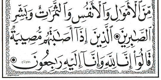
The Naskh calligraphic style is one of the oldest Arabic calligraphic styles. However, it was only with the ‘revolution’ of Ibn Muqlah² that Naskh rivalled and finally replaced the Kufic style for transcribing the Qur’an. To this day, most Arabic text typefaces are based on, inspired by or attempted reproductions of this style. Naskh (“copying” in Arabic) was developed to be a pragmatic and rounded cursive style, easy to read and write, and highly legible. Our contemporary perception of the elemental Arabic is heavily influenced by Naskh due to its almost exclusive use in print since the early days of printing. Thus the style highly familiar and easily accessible for readers .
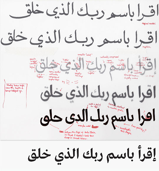
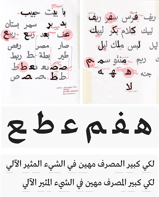
When it came to drawing, my starting point was the Naskh style. I studied the construction, structure and proportions of the letterforms, the angle of the pen, the hand movements and the stroke breaks and pen rotations. The main characteristics were straight vertical stems, relatively narrow horizontals, proportioned ascenders and descenders, and clear, uncomplicated strokes. From calligraphy to drawings I went through several rounds of sketches with different parameters in mind: a modern yet authentic/familiar style, a space-efficient design, an appropriate tone, and most importantly at this stage, compatibility with Greta Text.
Greta Text
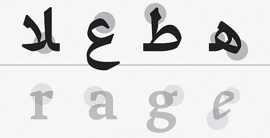
Greta Arabic was designed as an Arabic companion to Greta Text. Latin-Arabic matchmaking is a hotly debated issue and there are several different opinions as to what constitutes a good match. In discussion with Peter, we agreed that Greta Text Arabic’s design process should focus on the intended application rather than on the details of Latin type. The matching takes place at a functional level, resulting in natural Arabic shapes optimised for the same application as the Greta Text, a contemporary, serif type family with a sharp, serious tone developed specifically for newspaper printing.
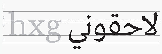
Getting the right colour of the text was one of the most important aspects of this project. The characters of the Arabic and Latin scripts are difficult to compare because they differ in almost every aspect: pen angles, stroke directions, line thicknesses, speed contrasts and variations. Achieving the right texture and colour of the whole text was more important than mimicking the exact thickness or contrast of the Latin, especially in the case of the bolder weights. Arabic letterforms react differently to weight than Latin, where there is a clear vertical stress in the letters. In the Arabic letterforms, the angles of the strokes are more varied, which causes the letters to expand in every direction as they become bolder, leaving little room for the thick strokes. Therefore, some compensation has to be made in other aspects to create the same visual weight.
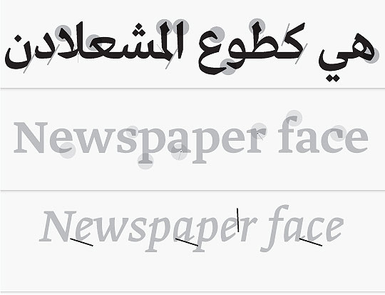
Greta Text Italic was a great deal closer to the Arabic thanks to its more cursive nature. Deciding to relate the Arabic to the Italic changed the whole character of the typeface throughout the design process and even brought it closer to the upright style. The sharp cuts on the corners, the stroke breaks, the virtually straight lines, the general squarish feel, all characteristics of Greta Italic, are prominent features of the Arabic.
Greta Text Arabic is the synthesis of all the above mentioned influences. To my knowledge, it is the first Arabic typeface to come in three different grades. (Grades are similar to weights, except that the differences in width between grades are very subtle.) Greta Text Arabic comes in three grades, Regular (-), Regular and Regular (+) which are basically lighter and darker versions of the weight using the same metrics information. This is a further difference between weight and grade; when setting text with different font grades, the widths remain the same, so the text doesn’t reflow.
Grades are also useful when combining positive and negative text (dark text on light background/light text on dark background), and trying to achieve even typographic ‘colour’ of the text. Because the white reflects more light than dark colours, it is difficult to get the same appearance of the text on light backgrounds as on dark ones, or in print when compensating for different printing conditions. Using different grades of the font is also useful when combining text of different sizes while trying to optically balance the appearance of the text. While grading systems are known in fine newspaper printing in the West, they are unprecedented in Arabic typography, but here is no reason why fine typography should be reserved exclusively for Latin typography.
Production
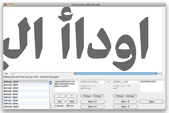
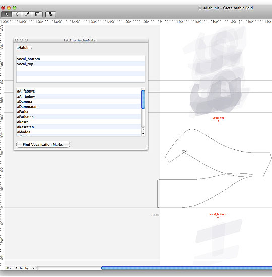
For the production of Greta Text Arabic, Erik van Blokland developed a unique set of tools for the process usually done with Microsoft VOLT. Erik created three RoboFont plugins that allow creation of right-to-left kerning, generation of vocalisation marks for the letters and ligatures, and generation of the right OpenType features for the Arabic font production.Traditionally, when designing Arabic fonts, designers work on Macs and then do the final steps of production on a Windows machine using VOLT. Erik’s tools streamlined the process and blurred the borders between the design and production phase of the project.
Conclusion
This ambitious project resulted in Greta Text Arabic, a modern type family intended for newspaper design.
1 The term Simplified refers to Linotype’s Simplified Arabic developed in 1956. Due to the limited number of keys on the Linotype machine at the time, the number of characters was reduced from 104 to 56. The process involved major compromises in the core of the script.
2 In the beginning of the 10th Century, Vizier and Master calligrapher Ibn Muqlah subjected 6 cursive scripts (otherwise known as the six pens of calligraphic styles) to strict rules of proportions and letterforms. They are the Tuluth, Naskh, Muhaqqaq, Rayhani, Tawqi, and Ruqaa. This phenomenon re-shaped the history of Arabic calligraphy.
