New Lands in Arabic Type
Greta Arabic is the counterpart of Greta Sans type system. This text is a reflection on the journey of creating and developing the first Arabic type system of this scale .
It starts with Greta Sans. A type system conceived by Peter Bilak and designed together with Nikola Djurek. Greta Sans was created to be a design space as concerned with the individual styles as it is with their interrelationship across a continuum of widths and weights. It sways from Compressed to Extended, from Hairline to Black, continuously adjusted to maintain the characteristics of the system.
In 2012, Peter asked me if I would design Greta Arabic, the counterpart of Greta Sans. I remember instantly realising how challenging this project was going to be. So I said yes! In that same conversation, we talked about creating a type system that would explore the extremes in width and weight in Arabic, as opposed to simply designing the matching counterpart of Greta Sans. This approach had a major impact on the development of Greta Arabic; rather than matching forms and proportions, it became a quest to study how Naskh-inspired letterforms react, when subjected to extreme conditions of width and weight.
Beyond the breath of its scope (40 styles), the project presented one major challenge from the outset. Outside the context of Square Kufi (1) - a flexible structure that easily allows compression and extension - the notions of compressed and extended text are virtually unknown in Arabic.
1. Square Kufi, a style that was strictly created for pattern-making in which letters are reduced to straight lines to fit a 1/1 grid. www.kufic.info
Compression / Extension in Arabic
Often when new concepts are introduced in type, they generate new forms that require adjusting to. And more often than not, they are met with mixed reviews. For example, the first sans serif Latin typefaces or wood type, pejoratively dubbed Grostesque and Fat Faces, were met with considerable disdain by conservatives. (2)
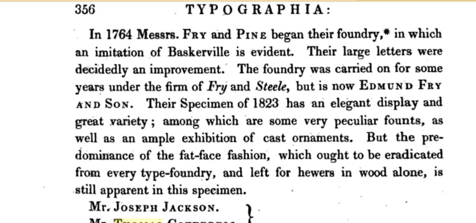
2. ’But the predominance of the fat-face fashion, which ought to be eradicated from every type-foundry, and left for hewers in wood alone, is still apparent in the specimen’ Thomas Hansard: Typographia: an historical sketch of the origin and progress of the art of printing, 1825. London.
A couple of centuries later, Helvetica is one of the most widely used typefaces; and many other former experiments, such as different types of serifs or extremes of proportion, have become standards. In that respect, looking back at the history of Latin type development was eye-opening during the process of Greta Arabic. Indeed some of these concepts are characteristic to the Latin script, but others are universal. It would be helpful to look at the evolution of the Latin script in contrast with that of the Arabic.
Compression and extension are basically testing the effect of one parameter - the width - on the aesthetics and function of the whole alphabet. This parameter had unfortunately not yet been dabbled with in Arabic type. Today, we are faced with more and more complex typographic situations, be it aesthetic or functional. To provide informed and diverse solutions, it is essential to approach the Arabic script, like any other script, as typographic letterforms with parameters that can be manipulated to generate different authentic typefaces. With that in mind, I delved into the first sketches of Greta Arabic.
Greta Text Arabic VS Greta Arabic

3. The two main axies to finding the skeleton of Greta Arabic. Greta Text Arabic, the high contrast counterpart and the concept behind Greta Sans about exploring the extremes. 
I had previously designed Greta Text Arabic (3), Greta Arabic’s more modest high-contrast counterpart. It was safe to start there to find the forms of what would be the center of the new typeface's range - normal width regular weight - while roughly sketching on the side how the extremes would look like (4). I was eager to see what a compressed black or extended hairline would look like. Those sketches provided early insights into the effect of width and weight on the distribution of black and white, both inside and around the letterform, and its overall size, though admittedly, they did not say much about the character and how to maintain it across all the styles.
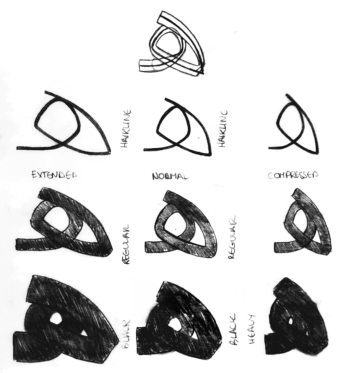
4. Quick sketch for the main masters derived from the drawing of Greta Text Arabic. 
The concept of high / low contrast under the same family is also relatively new to Arabic type. Since Arabic does not have serifs, what makes a low contrast different enough from a high contrast? What I learned during this project is that low contrast typefaces are about sailing away from the effect of the traditional calligraphic pen, whether by using a different type of contrasts or constructing letterforms. This has great effect on every part of a letterform: the beginning and ending strokes, the axis and the calligraphic details. Since Greta Arabic has Greta Text Arabic as its ancestor, this phase of the process was concerned with examining the effect of the pen on the Naskh-based forms of the latter, while staying authentic to the main structure. (5)
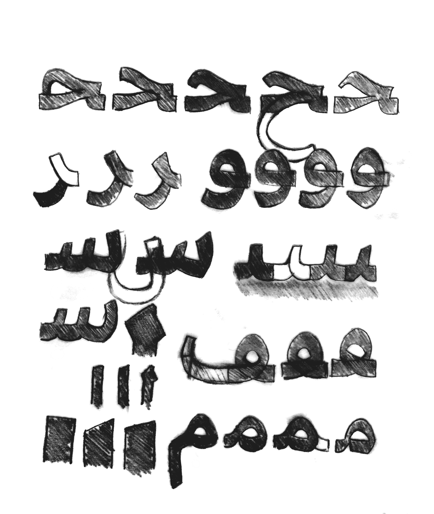
5. Sketching in layers based on Greta Text Arabic. 
A lot of questions come up. How do they relate to each other in size? in character? in proportions? To maintain the cohesiveness of the family, several optical adjustments and compensations had to be made. Observing the relationship of the Latin Sans to Greta Text within those same parameters provided a solid guide as well.
Beginning and ending strokes
 

The angle of the pen
 

Softening the curves and details
 

Removing calligraphic details
 

Removing the pen influence on the breaking point of a curve
 

Readjusting the proportions

After reaching a version of the normal width regular that I was pleased with, I impatiently started work on the Black of the same width (Normal) and the Compressed of the same weight (Regular), always alternating depending on the progress and the effect of one style on the other.
The widths
The key point was ‘compress/extend until it stops making sense, then take it down a notch’. The mixture of excitement from seeing these forms come to life and the uncertainty - because of the lack of references on the subject - was exhilarating. Though the first few attempts fell short of reaching a convincing result, they were crucially informative about the construction of the letterforms through their behaviour.
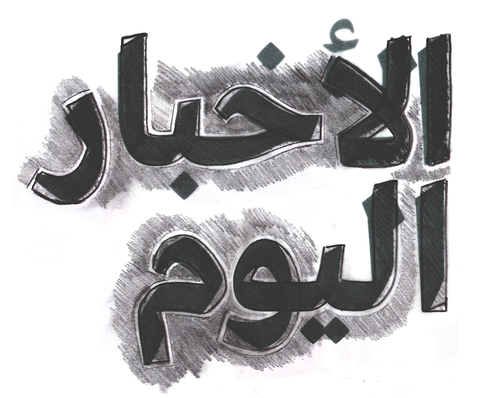
One of the most important notions that I tried to carry out all through the system is the triangularity of the Arabic forms. (6) Unlike the elliptical forms of Latin, most loops in Arabic have triangular counters, a characteristic that is important to maintain, however wide or narrow the characters are. When the compressed started losing its triangularity is when it started looking alien. It was only after several trials of different levels of triangularity that the Compressed regular reached its correct form. In that respect, it was easier to draw the Extended because of the generosity of space in and around the letterforms.
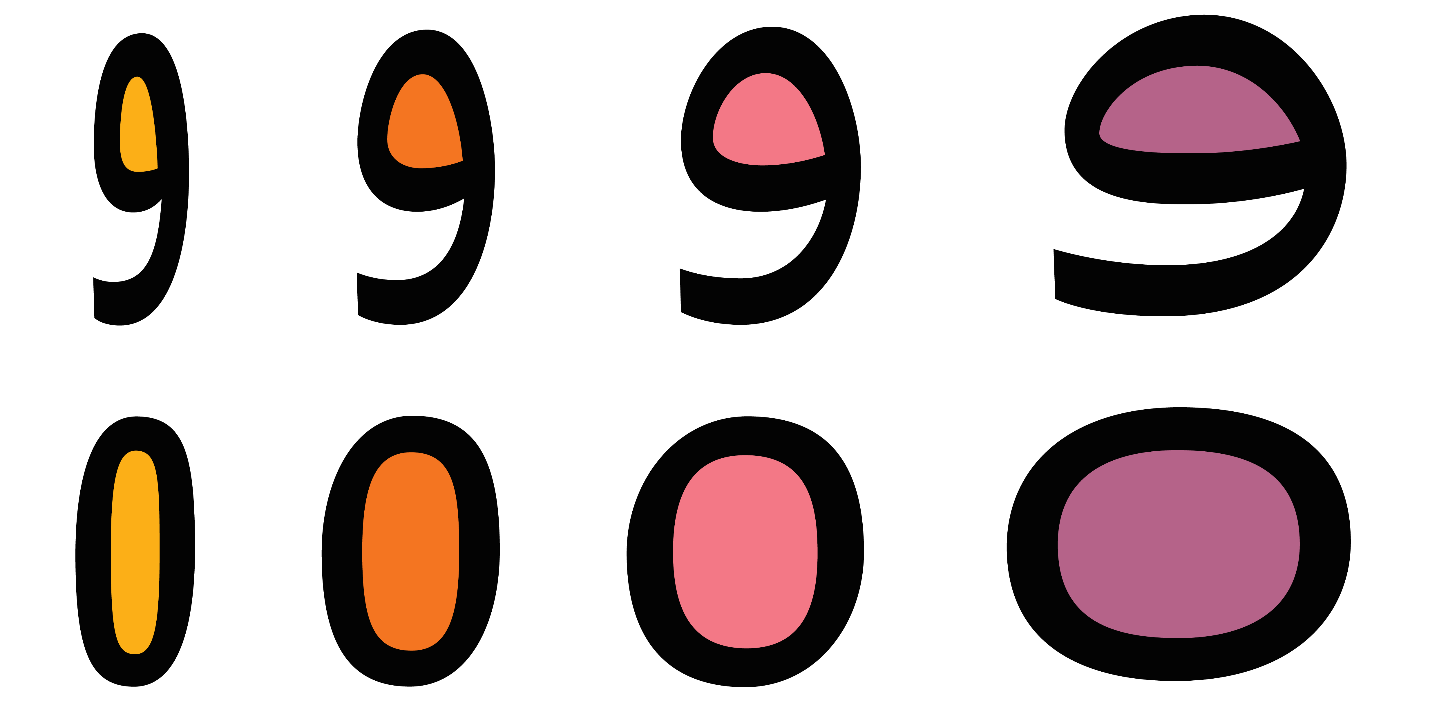
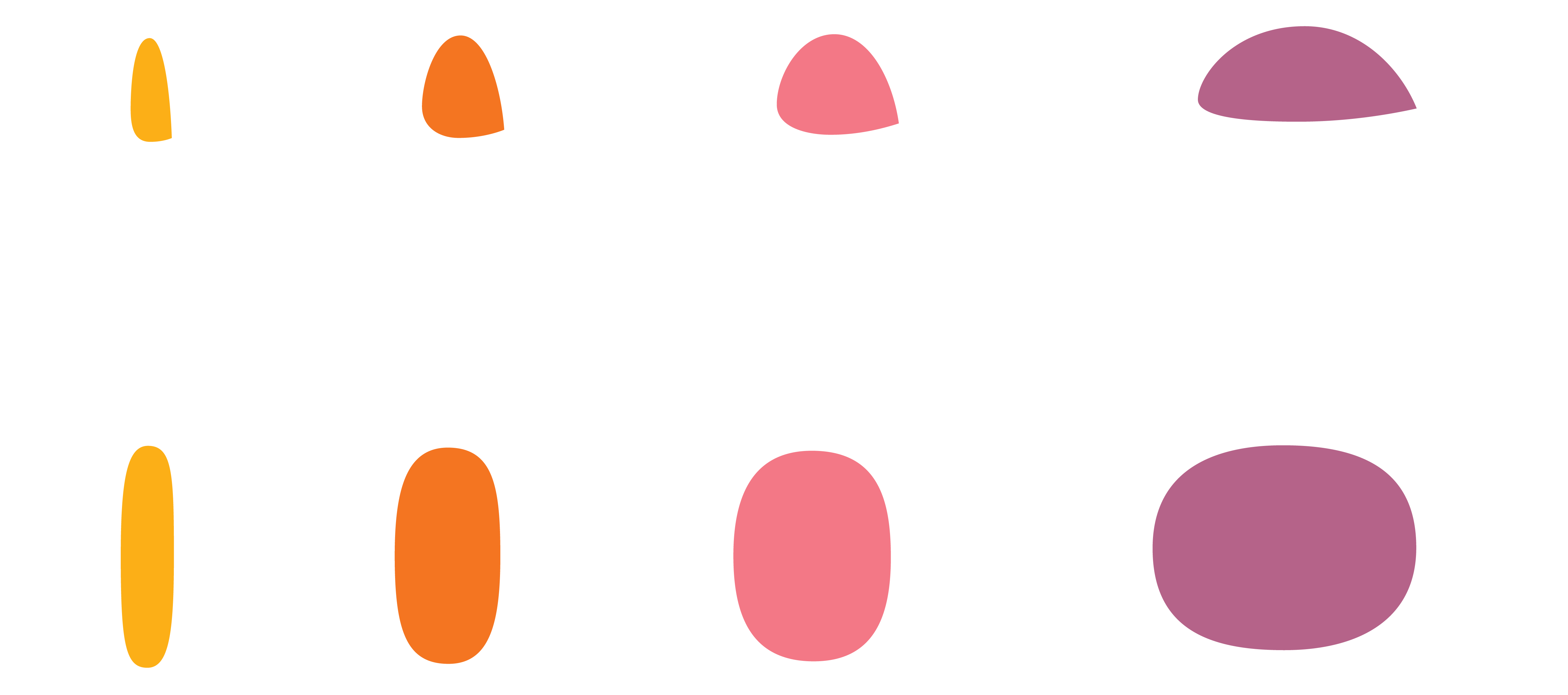
6. Triangular counters of Arabic in comparison the elliptical forms of Latin and how they react to compression and extension.
The spacing is another important aspect of the script that is brought to spotlight when manipulating the width. In the Latin script, adding space around a letter means adding white around a shape made of black and white. IIn Arabic, however, it means increasing/decreasing the white around the letterform as well as the black connections between the letters. For example, spacing out the extended in Latin to balance out the white inside the letters makes it lighter, but spacing out the Arabic makes it slightly darker. (7) The opposite is also true for the compressed. While some decisions concern individual styles, the most essential ones involve all widths and all weights. How one detail changes from one extreme to the other, how much space a hairline letterform needs to be able to grow into a healthy black one, how the angles of the strokes and their curvature change with extension and compression. Developing simultaneously the extremes allows for minimum compromises (and maximum fun!), as a harmonious system is only crafted when solid relationships are created between all of its components.
7. Spacing in Arabic in contrast with the spacing in Latin and the distribution of black and white.
The weights
The same is true in the case of weights. From Hairline to Black, all styles share similar and sometimes very different characteristics in specific styles. The Naskh style (as most of the Arabic styles) has a horizontal stress*. That, in a script whose individual strokes move in all directions, means that Arabic letterforms grow in all dimensions when weight is added. It essentially means that there is a limit to how dark Arabic can get, otherwise letters grow way above the Alif height. The trick is to find the right intervals in optical size between the styles before the letters start to look bigger in point size when placed next to each other. (8)
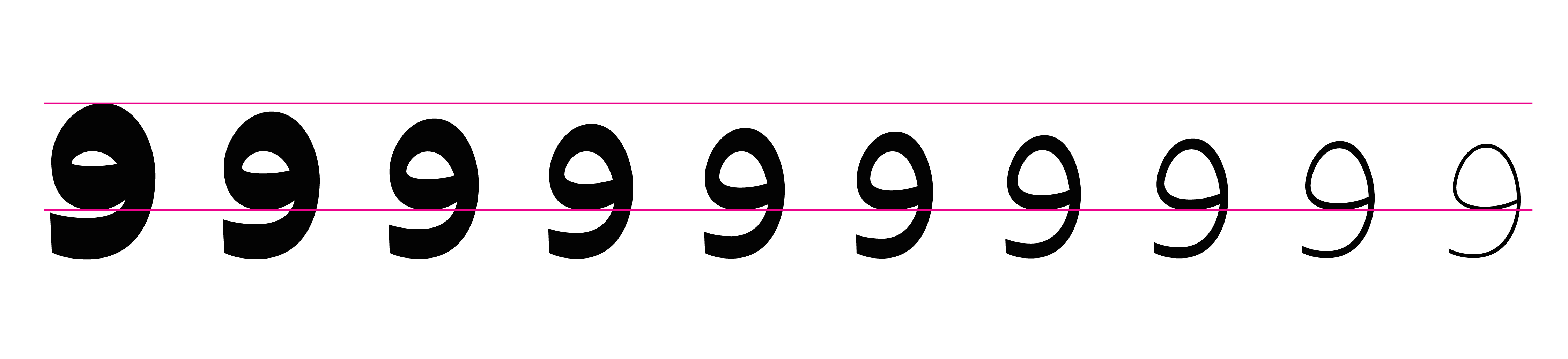
8. The difference in size between the lightest and darkest style from the normal width family.
Because there is a limit to the height of the letter in dark weights, the juxtaposition of two or three thick strokes on top of each other in some letterforms necessitated adjusting the ratio between black and white to achieve the darkest colour possible and yet maintain a recognisable shape. In some cases it required a bit of typographic sleight of hand. In the Extended Black for example, there was not enough horizontal room to get a solid dark effect. One of the solutions, that surprisingly I got away with, is adding weight below the baseline (9). Optically, the characters sit on the same line as the Latin because of the rounded nature of the baseline, and the extra depth gave this specific style the last drop of ink it needed.
9. Greta Arabic Extended Black color compensation.
The contrast fluctuates greatly from Hairline to Black. Whereas in the Hairline it is a timid difference of 1 unit between thin and thick strokes, in the Black it becomes much higher. Due to the humanist nature of Greta Arabic’s forms, the dark weights show a considerable reference to the pen, similarly to Greta Sans (10). Correct placement of the contrast, even when it is as low as 1 unit, is one of this type system’s most authentic features.
10. Overlaying the 10 styles of Greta Arabic normal underlines the movement of the pen.
When developing the weights, it was important to first find the darkest possible color within the Arabic system, separately from the Latin, and at the final phase, match the individual styles accordingly through different interpolation ratios.
*Naskh also involves rotations and using the tip of the pen. 
With 4 widths in 10 weights each, Greta Arabic is a powerful toolbox that explores new territories in Arabic type. Ranging from Text to Display, it provides new solutions for typographers and graphic designers striving to create an authentic and contemporary visual expression with the Arabic script.