
The encounter between Grotesque and Maghrebi letterforms with a few detours along the way

Grotesque: Grottesca in Italian - غَرِيْبة in Arabic. Qui fait sourire par son apparence ubuesque en français - Amusingly quirky.
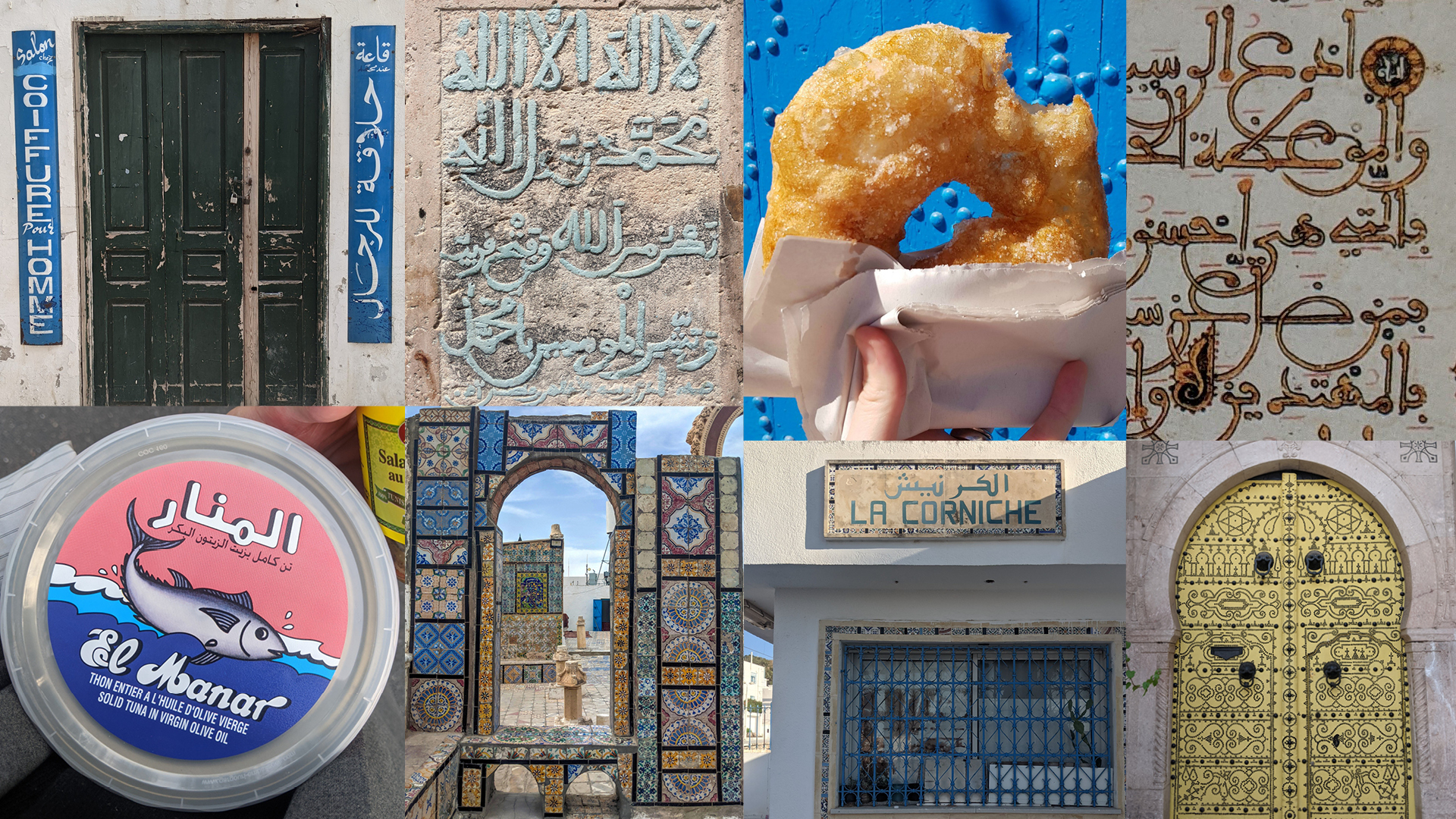
From Marseille to La Marsa via Marsala
La Grotesque is an effort to create Arabic & Latin in collaboration, like a conversation among friends, like a meal you prepare together. La Grotesque is a fun summer trip from Marseille (France) to La Marsa (Tunisia) via Marsala (Italy), celebrating the interconnectedness of the Mediterranean triangle that forms our cultural heritages.
The encounter between Grotesque and Maghrebi styles
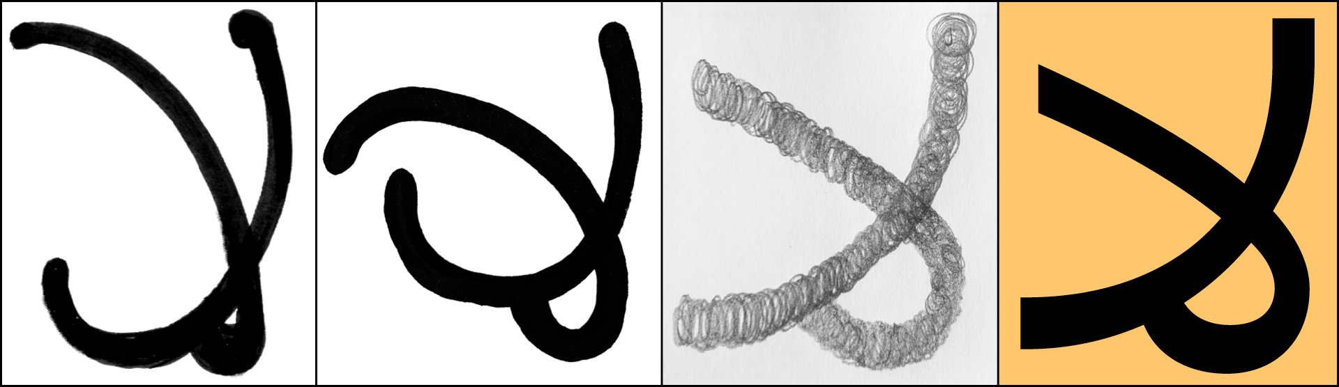
The traditional Maghrebi script, derived from the solid Kufic styles, is specific to North Africa and southern Spain (Andalusia). It is characterised by low contrast produced by a pointed pen, a flat baseline, and very rounded counters and exit strokes. However, what truly sets Maghrebi apart is its deviation from the strict calligraphic conventions perfected by generations of calligraphers in the eastern Islamic empire. The Maghrebi script seems to follow its own rules, with letterforms and proportions varying significantly from one manuscript to the other and even within the same page in an unconventional manner, almost grotesque in style.
This trait parallels with the early Latin sans serif from the 20th century, allowing us to see Maghrebi as the grotesque of Arabic calligraphic styles.
This design concept emerged from thinking Arabic and Latin script together, rather than designing them one after the other as is typical in most multi-script typefaces (where Latin is usually prioritised). We believe that this approach can broaden the design brief and move beyond the limitations of a Latin-centric focus.
Arabic features and the process of simplifying the letterforms
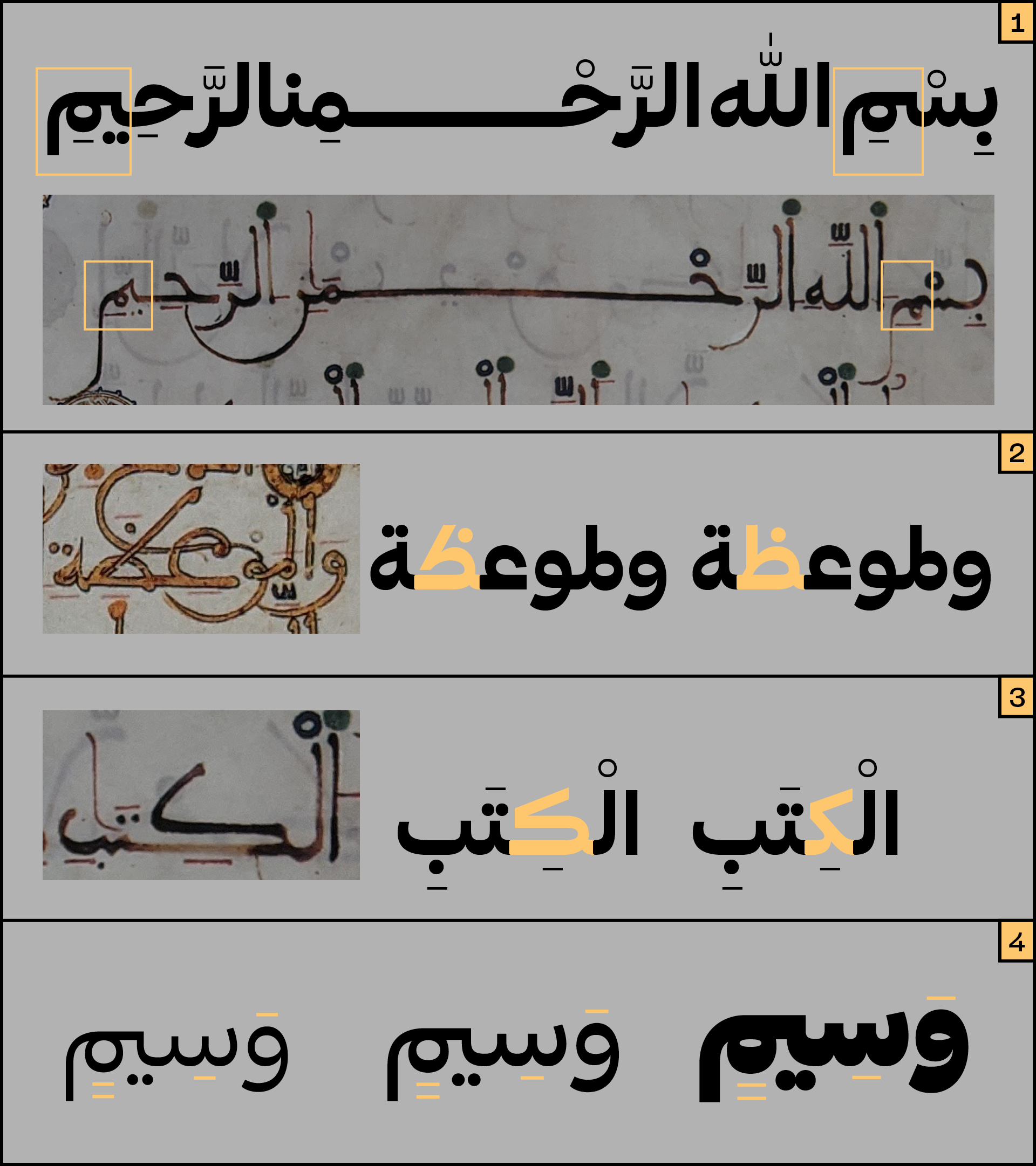
The primary inspiration for the Arabic script is the Maghrebi style, but the design isn't a strict interpretation of it. The design process was like observing the script wearing glasses with a Grotesque filter on: analysing and comparing various letter structures, then sketching a simpler, more blocky and upright version. Rounded curve extremities were removed, smaller counters were enlarged, larger ones reduced, and vertical proportions were shortened for a more compact text. The letterforms were simplified as much as possible, with taut curves that harmonise with the Latin.
Lam alef ligature: from researching different maghrebi structures to sketching La Grotesque interpretation
The Maghrebi style grammar (how letterforms change in specific combinations/connections) and stylistic variations were also implemented:
• The meem connections preserving the roundness of the counter (see below how the letter meem connects from the top of the previous tooth before looping down) (1)
• The Tah with a slanted stem is a stylistic set (2)
• The kaf exists also in its elongated body shape (3)
• The flat and thin vocalisation marks share the same thickness across weights (4)
The lighter weights are optimised for long text, while the heavier weights exhibit a bolder personality, with generous round curves, touching paths, and overlapping dots. These features are distinct to La Grotesque, yet they manifest differently in the Arabic and Latin, adapting to the unique requirements of each script.

Latin specificities
The Latin script is rooted in the warm, rounded forms of early 20th century wood type sans serifs. The capital letters are notably broad, including traditionally narrow characters like -B -F -E and T. In contrast, the lowercase letters are more restrained, with proportions suited for casual reading.

Characters such as C, R, and S showcase generous and distinctive curvature and in the bolder weights, characters including -a -e -s and -g exhibit rounded terminals that close off with a bold, rounded curve.

La Grotesque got humour
To emphasise La Grotesque playful character and Mediterranean personality we incorporated emojis into the design to integrate more cultural narratives into the typeface. We added some of the essentials of Tunisian cuisine such as Harissa for the tin can emoji and the popular Tunisian bambalouni as the doughnut glyph.


To give La Grotesque an authentic Italian touch we added the essential hand gestures and of course, a proper Margherita pizza instead of the American pepperoni!

Is Grotesque queer? La Grotesque is!
Queer and grotesque have 'the bizarre' in common. Etymologically, it made sense to us to give La Grotesque a queer voice.
Bye Bye Binary had recently published their Typothèque containing their thorough research on the topic of Queer Unicode, finding typographic solutions to make inclusive glyphs in French and Italian languages.
We decided to follow their approach and included a series of combined characters and symbols accessible simply by activating the ligature feature and typing masculine - centred dot - feminine word ending.


For Italian, the [ə] e schwa (singular) and [ɜ] e open reversed used for gender-neutral plural are also implemented. Some of the (unofficial) queer emojis are also implemented.
These new typographic forms and languages are facing severe backlash from the establishment in our respective countries.
We fully support the queering of languages and typography, in our mother tongues and beyond. We see and think languages and type as fluid practices, and we will continue to investigate this moving field of research in future projects.