Fedra Arabic, 10 years later
Nearly 10 years after its creation Fedra Arabic is being rereleased, completely redrawn and remastered, featuring new styles and weights.
I’ve often compared designing type to making pancakes. As much as you try to the first one right, you only see how it should have been done after you finish the third or fourth one. Fedra Arabic, which was part of the first Typographic Matchmaking project, was my first (and so far my only) foray into Arabic font design, so I spent considerable time on research, familiarising myself with the script, its structure and visual rhythm. I wanted to develop an overview of existing design approaches to the script, to find out what had already been tried, what had worked and what had not. Searching for extremes (from the most conservative to the most trendy solutions) also helped me to define the research territory.

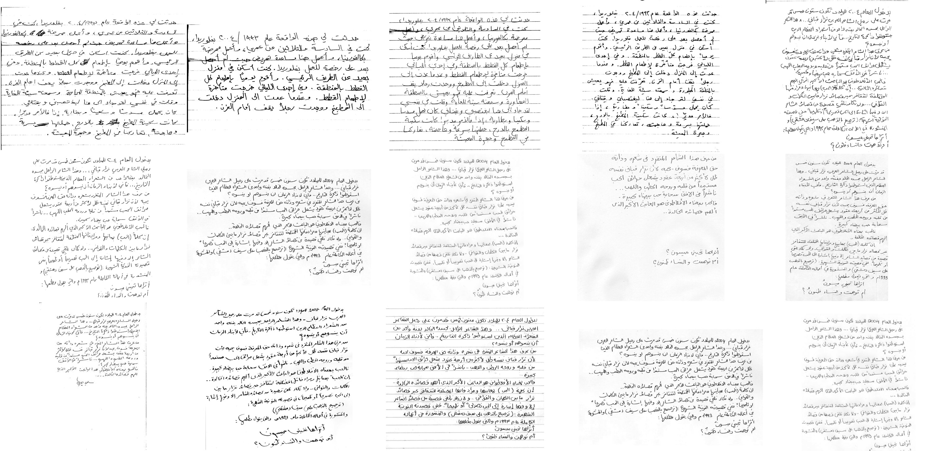
Collection of handwriting that has been analysed before the design process has started.
The TM project paired me with Tarek Atrissi, who frequently travels to the Middle East, so I asked him to collect samples of handwriting from different countries by people of different ages and backgrounds. It was fascinating to observe the same text rendered by different people and discover letter alternatives and culturally preferred forms. I found that in some ways Arabic handwriting was much closer to Latin handwriting than I had thought. In small handwriting, for example, people naturally raised very low letters to make them legible. And in everyday writing, the characters were more standardised, without the extreme differences in letter widths that can be found in calligraphy. After analysing dozens of samples, I felt more comfortable with my understanding of the letters’ genuine structure and could start to group characters according to their formal relationships.
Early proof of Fedra Arabic from 2005.
My plan was to create a highly readable font by isolating the key features needed to make individual characters recognisable, so based on my studies I created simplified skeletal shapes and proportions for the Arabic characters. The result was Fedra Arabic, a dual-script typeface system for contemporary publishing of Latin and Arabic texts. When it was first released there were very few digital fonts that supported both scripts and could be used at small sizes. It gained widespread popularity, and I have spotted it frequently in my travels to the region.
I haven’t drawn an Arabic type since, but since 2010 I have been working with Kristyan Sarkis who has opened my eyes to the full potential of Arabic typography. And as my understanding of Arabic evolved I started seeing faults in the original Fedra Arabic.
Having decided to establish our new foundry, we decided we should revisit Fedra Arabic. Originally, Fedra Arabic was designed to work with both the Serif and Sans version of Fedra Latin, and a lot of compromises had to be made to make it useable with both fonts. We asked Bahman Eslami to create two separate versions of Fedra Arabic, one with higher contrast (to work with Fedra Serif), and another with lower contrast (to work with Fedra Sans). Both have been carefully redrawn without losing the original characteristics of the design — sturdiness, contemporaneity and directness.
Fedra Arabic is now two separate font families — low contrast version to make it work with Fedra Sans, and higher contrast version for combination with Fedra Serif.
Serifs of course do not exist in Arabic typography, and we struggled with names for these two different styles and considered many different options (modern/traditional, low contrast/high contrast, old/new, etc.) since it seemed arrogant to apply foreign terms to Arabic script. In the end however, since we were creating Arabic counterparts to established Latin fonts already known as Fedra Sans and Fedra Serif, we decided, somewhat reluctantly, to keep the names as they are.
A completely new Latin weight was also created for Fedra Sans Arabic Latin, and the in-between versions were interpolated.
The baseline curvature has been unified, creating more pleasant rhytm of the text.
The original version of Fedra Arabic is inconsistent in the way how horizontals and verticals connect. Illustration above presentes the original above, and Fedra Serif Arabic Bold below.
Terminal (end strokes) have been changed to make the text look more harmonious.
When comparing the outlines that Bahman has created, it is surprising to see that nearly everything is different. It is an entirely new font. Yet, when I look at the text, it feels like Fedra. Looking at the differences, I am embarrassed to see the number of improvements; Bahman had the sensitivity to draw what Fedra Arabic could have been, if I had known more about Arabic. But that takes time, and so Fedra Arabic is fulfilling its potential only now, nearly 10 years after I started working on it.
Superimposed Sans and Serif version of Fedra Arabic to show the differences in contrast and stroke endings.
