A Custom Typeface for the Louvre Abu Dhabi
Back in 2013, I was asked by Philippe Apeloig and Hala Wardé from Ateliers HW/Jean Nouvel to design the custom typeface for the identity, signage and museography of the Louvre Abu Dhabi (LAD) museum. A few days ago the museum finally opened its doors to the public after ten years in the making. Needless to say it was an honor to work alongside Philippe Apeloig and the whole Studio Apeloig and Ateliers Jean Nouvel / Hala Wardé team.
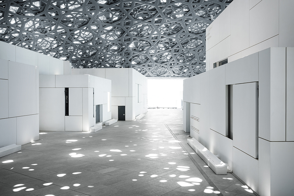
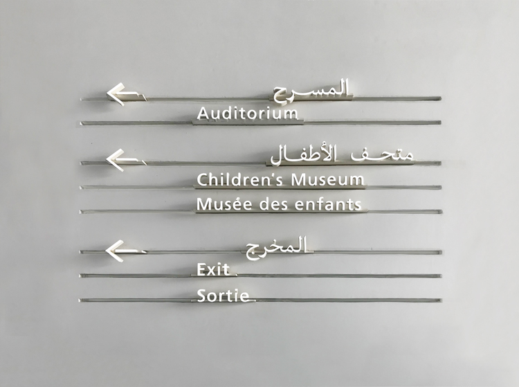
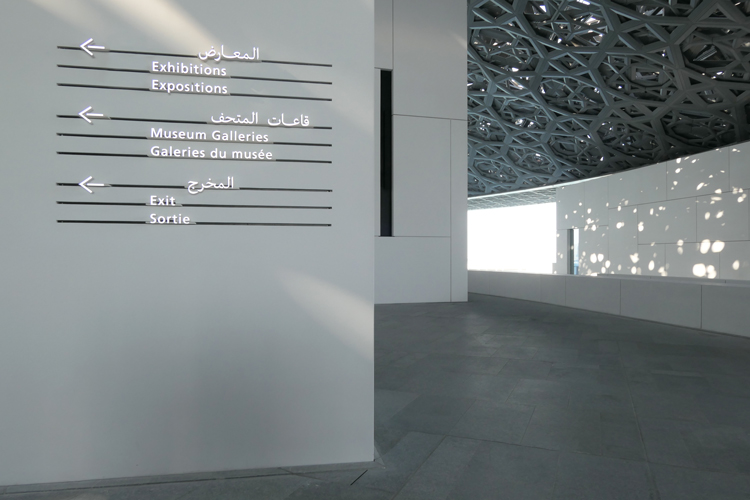
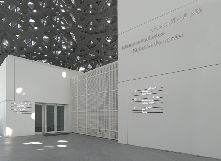
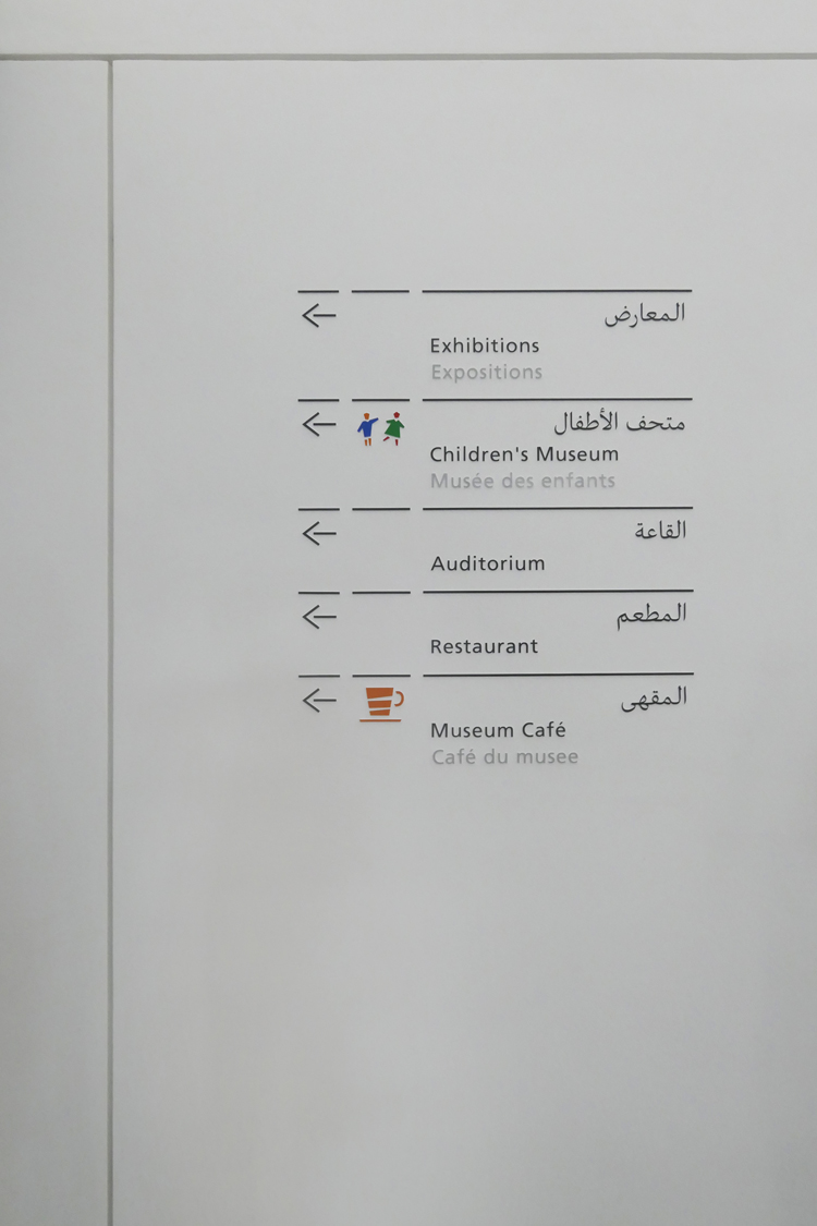
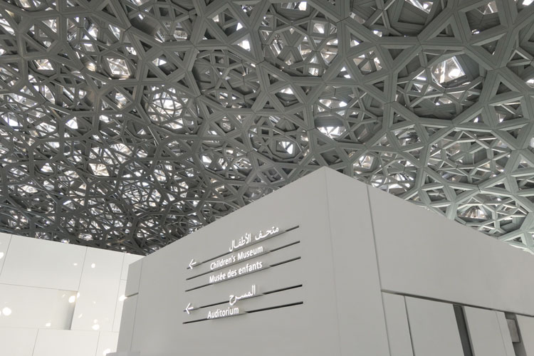
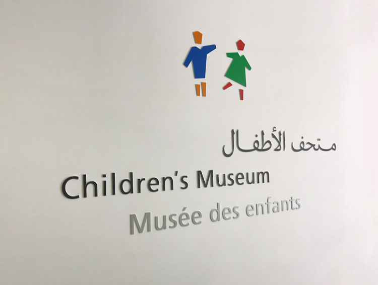
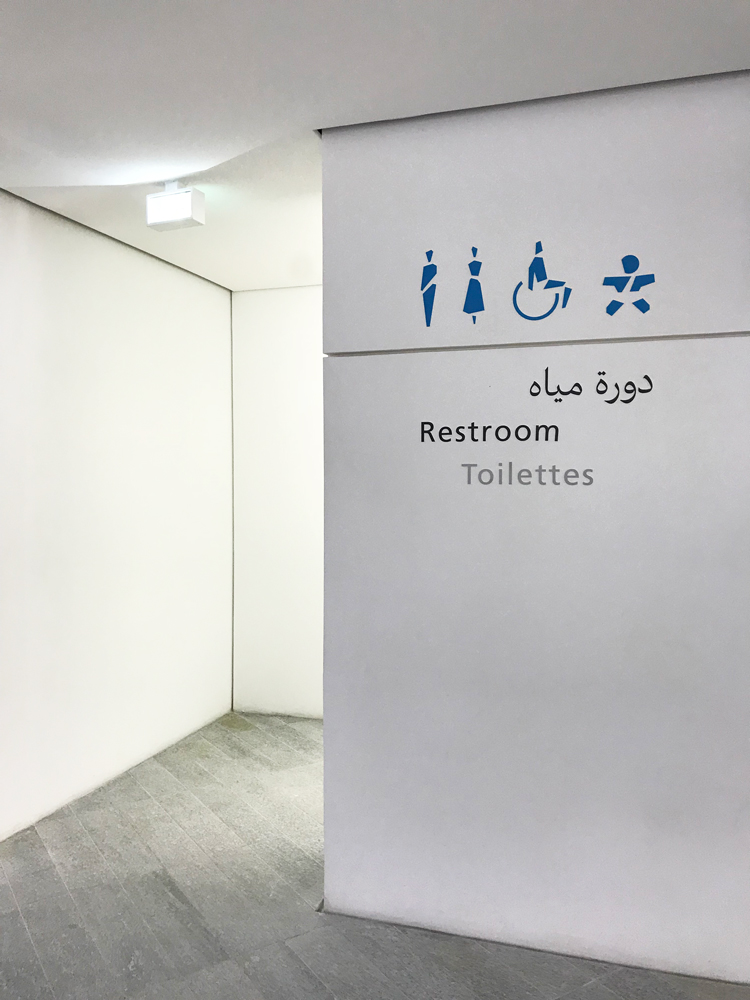
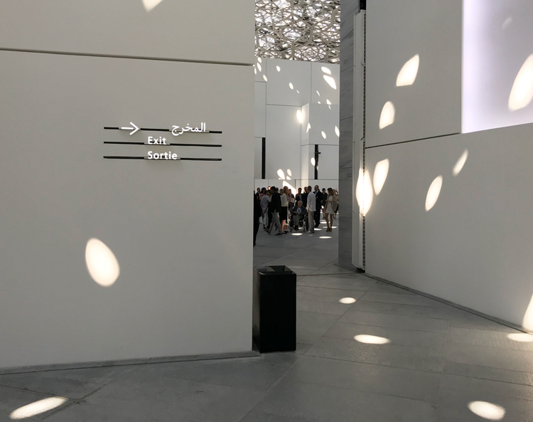
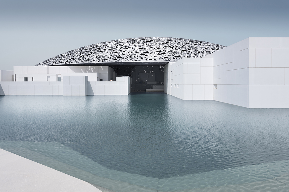
The stunning building, created by Jean Nouvel, combines modernity and tradition by mixing small simple cubic structures with a seemingly floating 180m diameter dome. The web-patterned dome is meant to let the light in creating light sculptures simulating the light shining through a palm tree. When Philippe Apeloig shared with me his vision for the signage and identity as a whole I was delighted to say the least. Philippe’s mind was set on the Frutiger typeface for the English and French languages, a modern low contrast and a classic signage typeface. For the Arabic he asked me to bring a more traditional flair into a modern typeface with a higher contrast. The choice to go for a different personality and tone of voice for the Arabic was surprising and exciting.
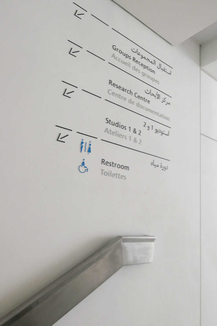
The typeface had to work for all printed and digital applications in relation to the visual identity, wayfinding system and museography. Given that this is a wide range of applications we decided to create a typeface in three styles: Signage Regular, Text Regular and Text Bold. Though miles away in terms of character the LAD typeface keeps a similar color to Frutiger for them to work well on the same page.
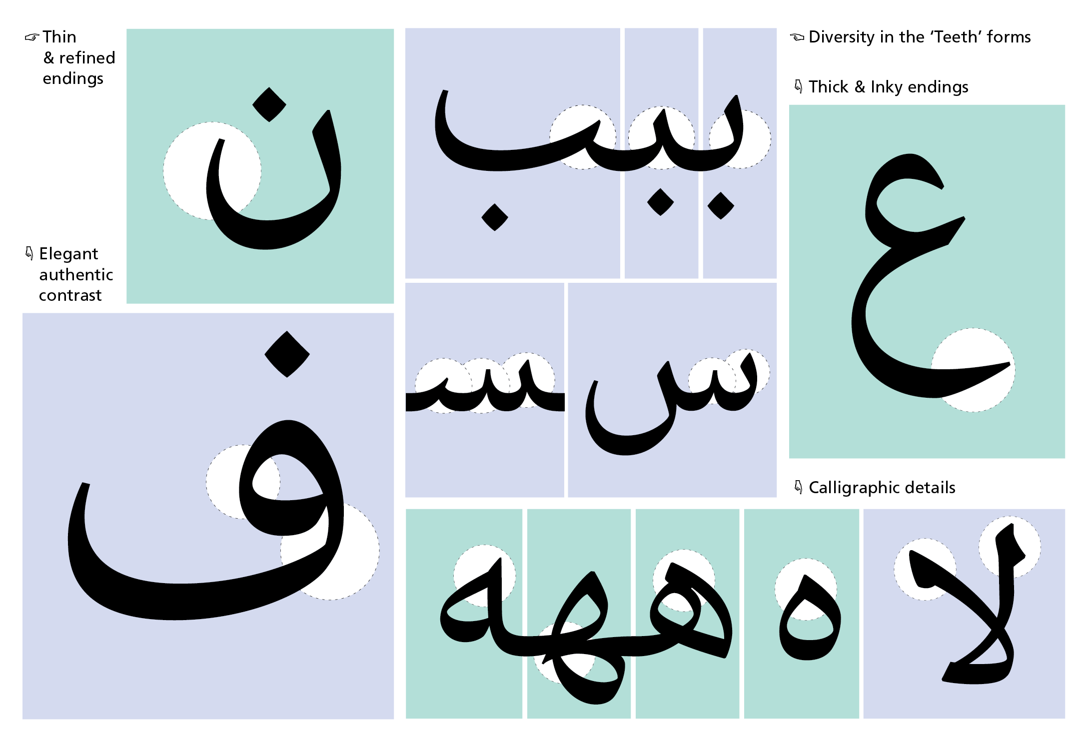
LAD Arabic plays between the classical proportions and more modern ones. The heads of the letters were opened up for more clarity both for signage purposes and small text settings. Some design decisions such as the thickness of the thinnest point were dictated by the applications like LED lights and how far the light can reach into those thin corners.
The family includes a large character set with several stylistic alternates.

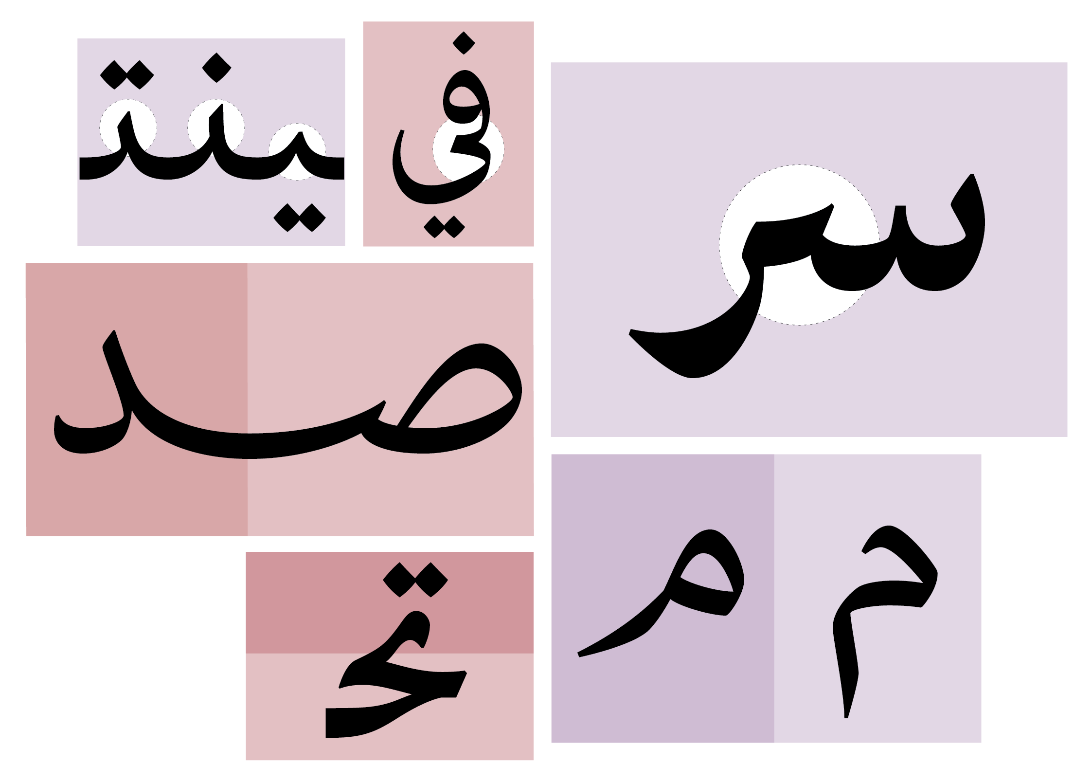
The most interesting feature in the LAD Arabic typeface is the extension feature or Madd. While working on the project we were noticing that the Arabic constantly occupies less space than the French or English in the trilingual signage. Given that Arabic is the 1st language of the museum and sits on top in the signage, we needed the Arabic to be more prominent. One of the most interesting characteristics of the Arabic script is the ability of its letterforms to be organically extended given its largely connected nature. We decided to make use of that and create organic extensions as opposed to the stiff simplified version. I proceeded to create extended versions of all my character set. It was not the fastest way of applying this feature, yet this was my 2013 knowledge and it got the job done. The Arabic occupied more space and looked more present.
The Arabic wordmark was created based on LAD Arabic. Ideally we would not have broken the beh-yeh connection in the word Dhabi, however with few letters and possibilities to extend it was necessary.
The project took an intense six months and a few years later it is now at home and in use. A trip to Abu Dhabi is in order soon!
Written by Kristyan Sarkis