
Somewhere Between Solid and Fluid Arabic
A personal account on the development of the Hudhud typeface.
In the summer of 2016, I was lucky enough to join the unprecedented and timely Arabic Type Design — Beirut intensive course (ATDB), lead by Lara Captan and Kristyan Sarkis. Having just completed a course concerning the same subject during my senior year in VCUarts Qatar with Basma Hamdy, and discovering my strong, persistent passion for Arabic letters, I was at the right time and place to learn about Arabic typeface design. Considering the lack of reference and resources in this field, I was very fortunate to be guided by some of the most inspiring designers and researchers in Arabic type design. It is safe to say that this program catalyzed an important development in my design approach. It transitioned it from being just experimental and intuitive to being also systematic, analytical and informed.
During ATDB, we learned to classify the Arabic calligraphy styles on a scale that goes from fluid to rigid and learned to dissect and analyze the unique characteristics of these styles. We then used these characteristics as parameters to explore different ideas and eventually build our typefaces. This method, named Typecooking*, unlocked endless possibilities that can make any type designer feel like a kid in a candy store. But ultimately, this kid had to settle for just one option and commit to one recipe to work on throughout the program.
As an illustrator, I have always struggled to find an Arabic typeface that could work in harmony with my organic hand drawn illustrations. Traditional Arabic calligraphy would look too serious next to my drawings, so I would often resort to handwriting and hand-lettering, which was not always the most time-efficient solution. This made me want to dedicate my first typeface to this very specific and personal need: a playful typeface that looks peculiar and quirky enough to accompany my illustrations and would be useful for children's books, comic books among other warm and friendly contexts.
I chose the most peculiar-looking calligraphic style to me as my main inspiration and starting point, which is Mohamed Abuqasim Al-Qandusi’s style. Kristyan brought to my attention that the work of Al-Qandusi is based on the Maghribi style, written with a wider calligraphic reed, which leads to an increase of stroke thickness and contrast, and considerable amount of drawing. He advised me to go through the same process of changing the weight and contrast of the Maghrebi style and producing my own forms out of it, in order for me to follow the spirit of Al-Qandusi's calligraphy, but not its forms. And since Maghribi is not a particularly refined style, it paved the way to originality and maximized the freedom in adapting it into a fresh expressive Arabic typeface.
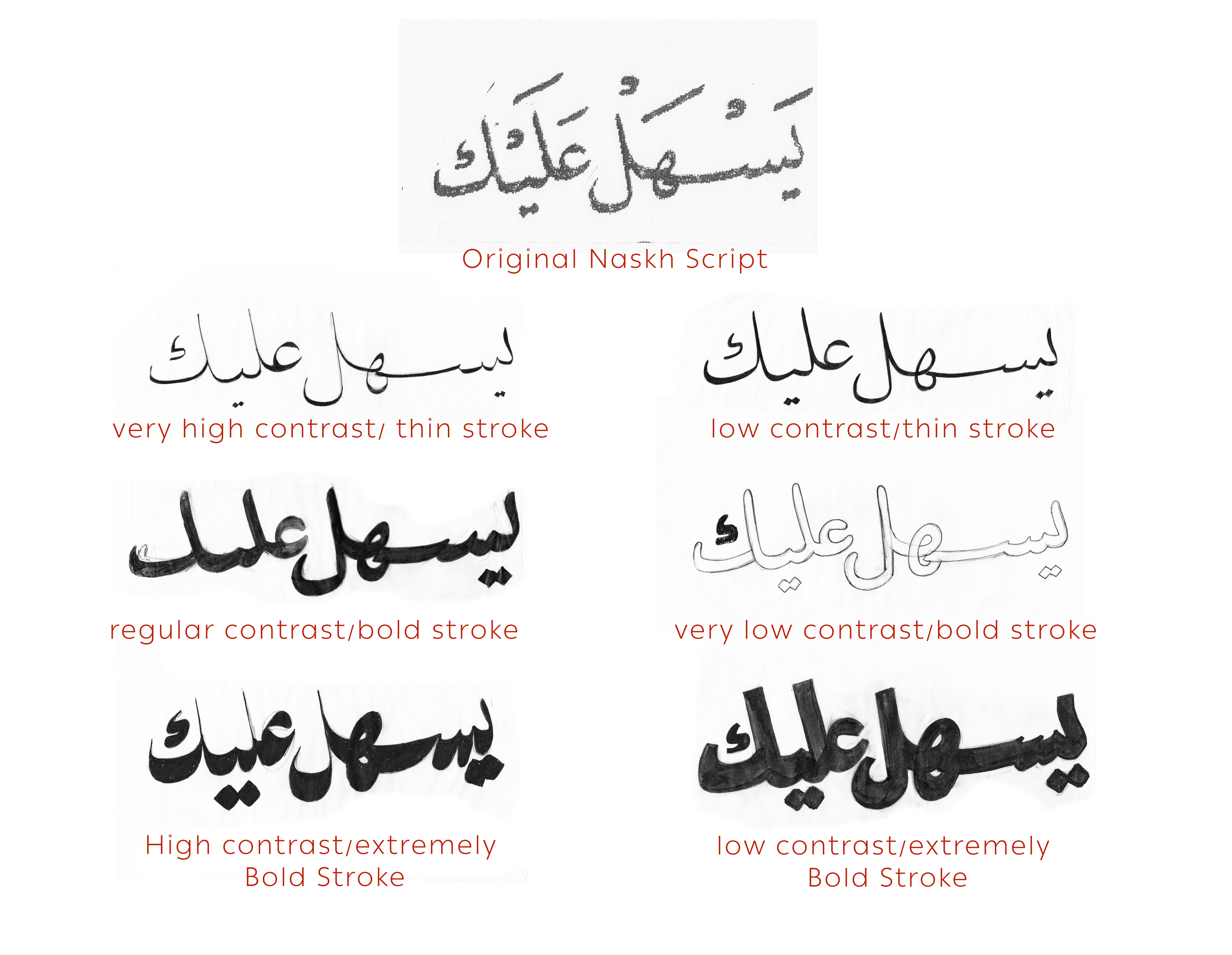
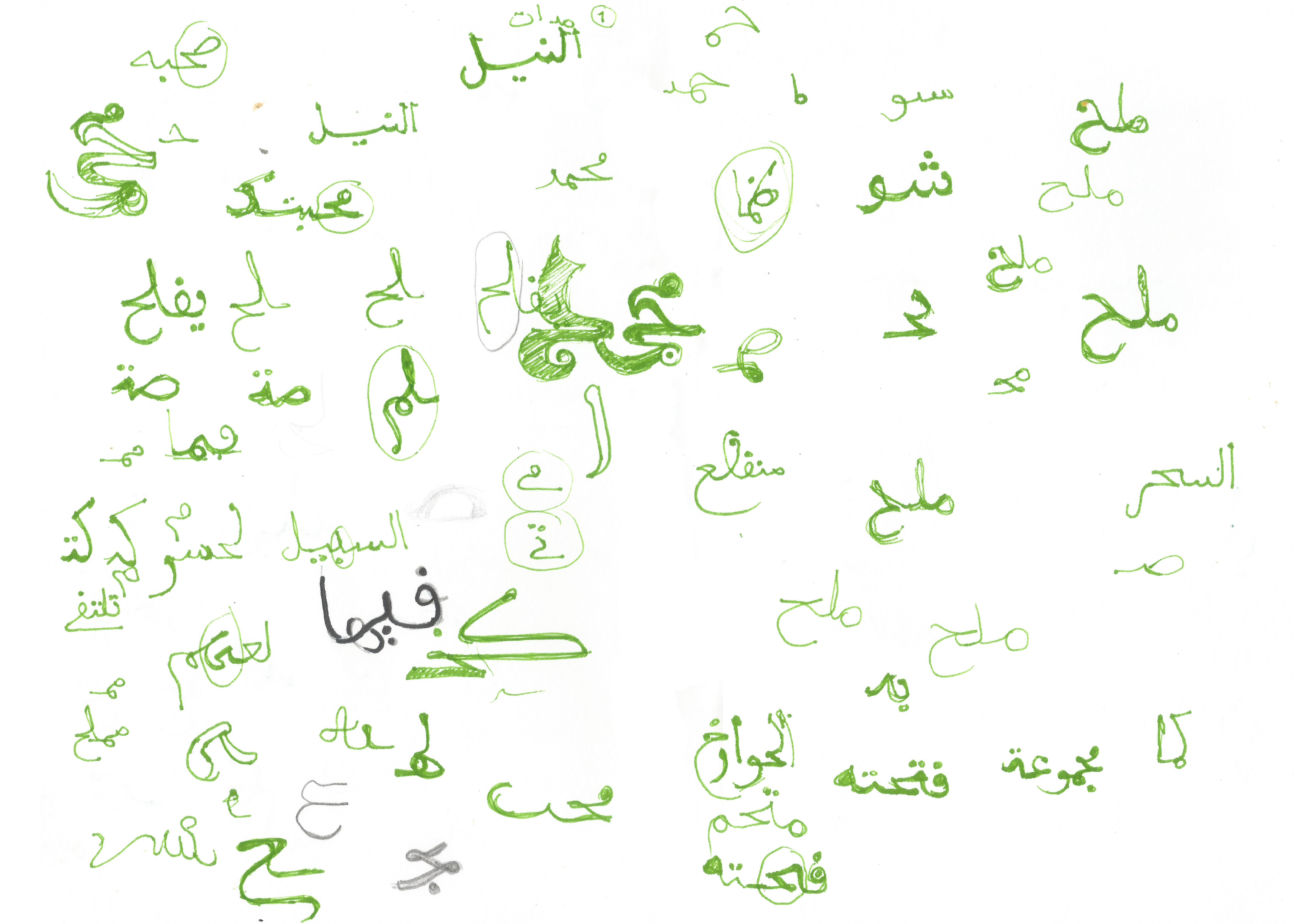
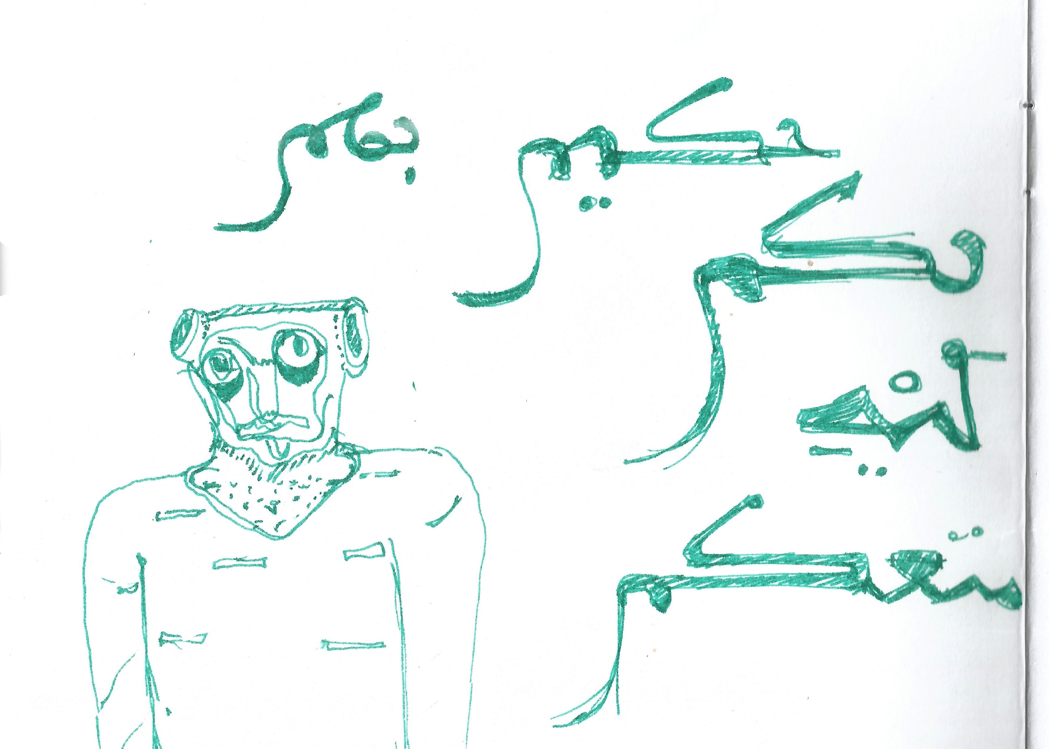
In the early stages of Hudhud's development, my experimental inclination lead me to explore extreme and drastic solutions first, then retreat some in favour of the typeface system, usability and legibility. The Maghribi style offers a large playground for experimentation due to its quirky unrefined forms, diverse letter variations and unusual connections. I would squint at the unsteady, ever changing lines of Maghribi calligraphy and sketch what I am seeing. Through this process I was able to generate a number of unique shapes and interesting ligatures.
The one issue I had with the Maghribi style, is that despite its friendliness, it had a rigid baseline which conflicted with the intended fluidity of Hudhud. So I started giving up the stiffness to a more organic approach, to be able to create curvy and smooth connections. This naturally lead to a major change in the letterforms' structures.
The fluid pen movements and my attempt to familiarize the Maghribi shapes to contemporary eyes beyond the Western part of the Arab world started to give Hudhud a hint of a Naskh like texture. Little by little, the Naskh features started to be more apparent in Hudhud and the idea of integrating Naskh influences in it solidified. Hence, the concept of Hudhud which I continued developing for the following three years luckily supported by the mentorship and valuable insights of Kristyan, who has been very generous with his time and efforts throughout the last two years.
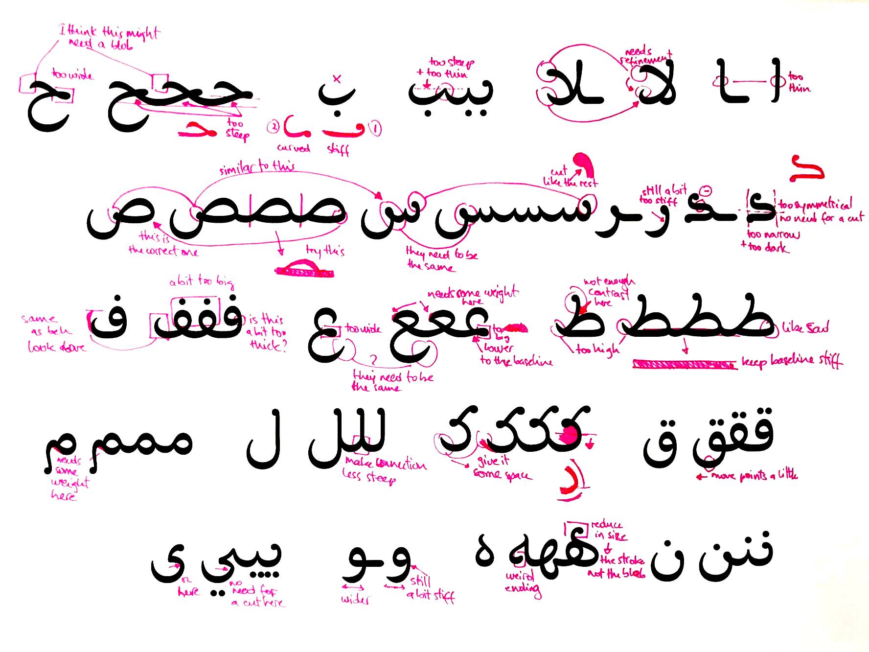
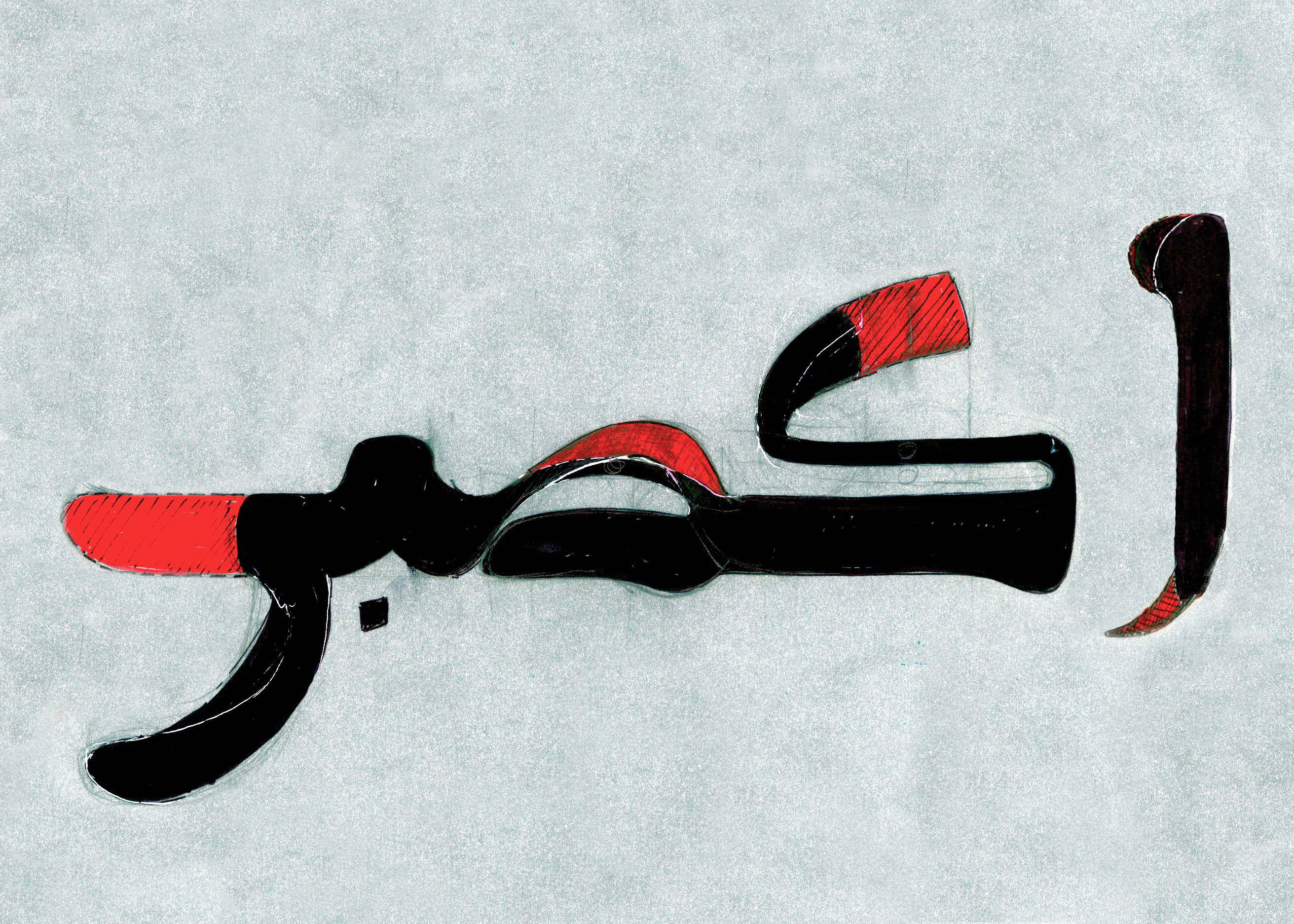
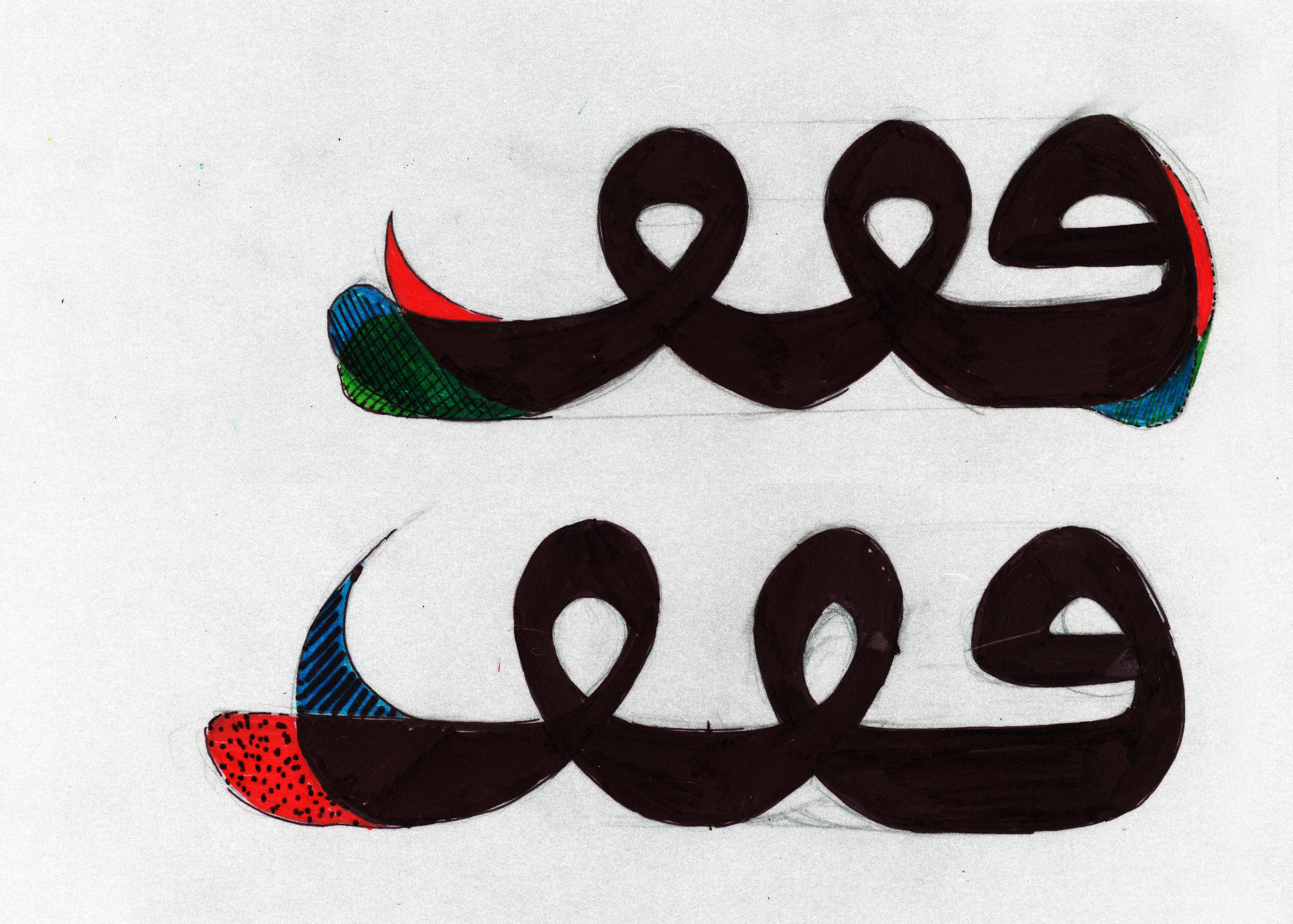
A sample of the feedback I received from Kristyan.
The Naskh style gave Hudhud the definition it was lacking, especially with its consistent refined contrast and proportions . The “blobby” nature of the Maghribi helped make Hudhud approachable and warm, so I held to the idea of blobs but made sure that their form is shaped following the pen movement in a continuous smooth manner to reinforce the fluidity. As a result, its level of sophistication and legibility increased while keeping the Maghrebi flair dominant. After honing the regular weight, it was time to expand the Hudhud family with two extreme masters; thin and heavy. I started out by naively adding/removing weight equally on all strokes, and then learned that contrast is always related to the change of weight. The bolder the weight the higher the contrast and the other way around. This resulted in a low contrast Thin Hudhud that is easier on the eye and could work in longer text, and an elegantly heavy Hudhud. The family is completed with three more weights in between the master weights, making suitable for short texts and display sizes.

In finding both the right amount of quirkiness and fluidity, it started by going to an extreme and later finding the right balance. This is how I came to learn that the slightest details can be bold enough in type.
To further celebrate the playfulness of the Maghribi script, and for my own pleasure, I drew a range of flamboyant ligatures under the standard and discretionary ligatures sets, in addition to two stylistic sets reviving the extended swashy bowls and bodies of some letters; a strong characteristic of the Maghribi style.


I would like to leave a note for my fellow Arabic type designers or anyone who is beginning to explore this field: Do not let the linearity of this written process fool you into believing that it was a smooth perfect plan. On the contrary, it was a snaky, bumpy but a truly exciting road to a beautiful destination. I could not find better words to describe this journey than a quote of Georgia O’keeffe, who is famous for her enlarged flower paintings: 'Nobody sees a flower - really - it is so small it takes time - we haven't time - and to see takes time, like to have a friend takes time.'