Shekanj, a contemporary dialogue with Nastaʿlīq
Shekanj is a typeface shaped at the intersection of three calligraphic styles: Nastaʿlīq, Ruqʿah, and Naskh. Each of these scripts plays a distinct role in its construction. Stylistically, Shekanj remains closely tied to the letterforms of Nastaʿlīq, with subtle echoes of Ruqʿah. Structurally, however, its underlying composition follows the logic of Naskh.
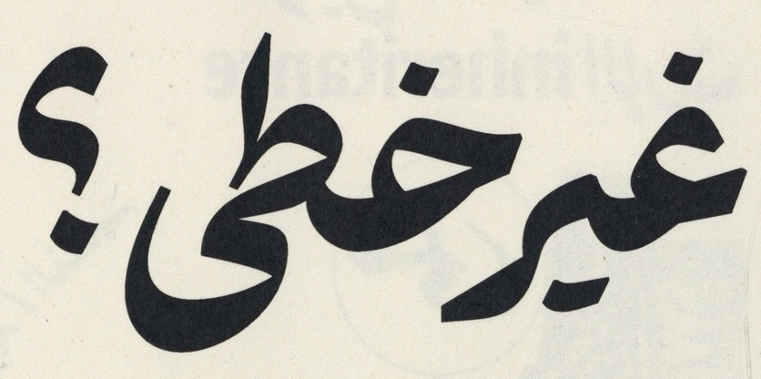
At the heart of Shekanj lies a fundamental question: can Nastaʿlīq letterforms be positioned along a horizontal baseline—khatt-e korsī—and still function as a viable typographic system, both in form and in overall texture? Exploring this question became the driving force behind the design, guiding decisions at every stage of development.
The scarcity of Nastaʿlīq typefaces in the history of Arabic-script type design is not accidental. It stems from two closely related challenges. First, Nastaʿlīq’s highly variable letter combinations resist simplification and systematization, demanding a deep understanding of letter behavior and contextual relationships. Second, existing font technologies have historically struggled to render these complex interactions efficiently and faithfully, reinforcing the script’s resistance to typographic standardization.
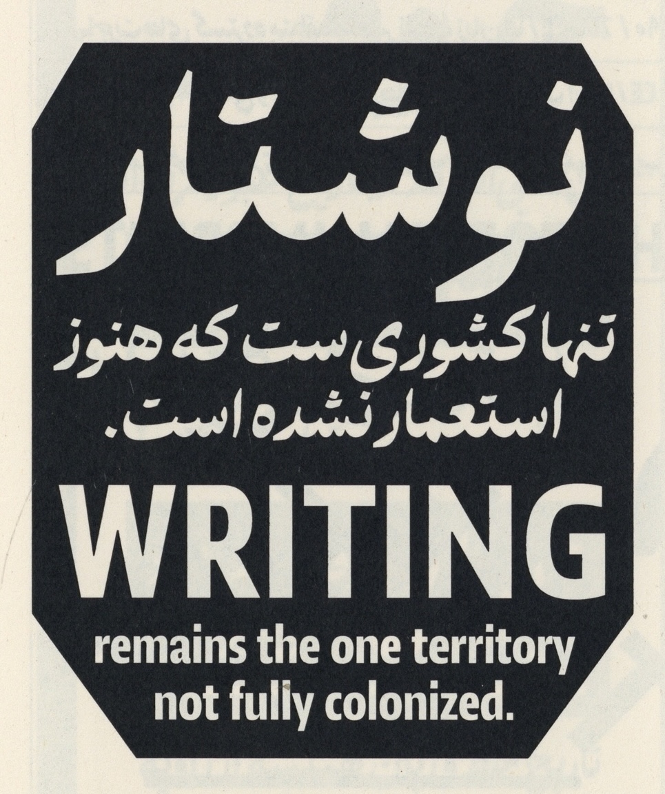
Nastaʿlīq holds a central position in the eastern regions of the Arabic-script world, particularly among Persian- and Urdu-speaking communities, where it functions as the dominant writing model. At the same time, it has long been embraced in the western Arabic-script context—especially in the Arab world—for headings and vernacular use. Despite this wide cultural presence, contemporary typographic interpretations of Nastaʿlīq remain limited.
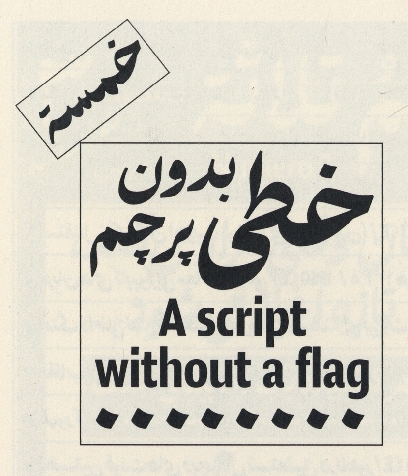
Shekanj seeks to respond to this gap. Its aim is to offer a contemporary, typographic interpretation of Nastaʿlīq, one that respects its calligraphic heritage while allowing it to take on new roles within today’s Arabic-script typography. Rather than attempting to replicate manuscript traditions, Shekanj translates their underlying principles into a system suited to modern typesetting.
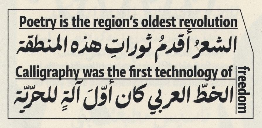
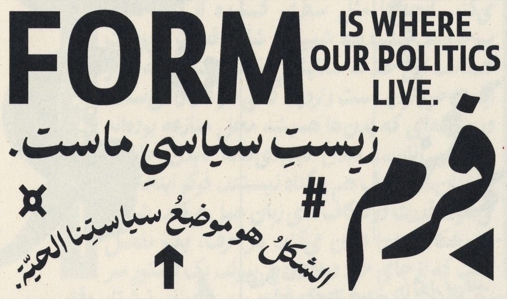
Expressive by nature, Shekanj preserves clear calligraphic references in its forms, while carefully moderating them to maintain coherence across text blocks. This balance allows the typeface to remain visually rich without sacrificing readability. It is particularly well suited for titles and short texts, where its handwritten character creates a strong emotional and sensory connection with the reader, making Shekanj an ideal choice for expressive writing, literary content, and contemporary poetry; contexts in which nuance, rhythm, and atmosphere are as important as legibility.
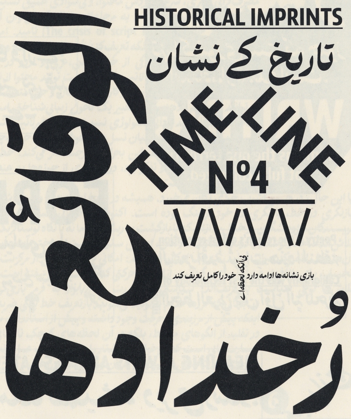


Shekanj was designed by Amir Mahdi Moslehi under the supervision of Kristyan Sarkis between 2021 and 2025. Font engineering was carried out by Amin Abedi.
Specimen design: Studio Melli