
Shekanj: A Typographic Essay on Writing, Script, and Contemporary Design
From the first encounters with Shekanj and the extended conversations surrounding its design process, its references, theoretical frameworks, and points of tension, it became clear that this project could not remain within the neutral conventions of a standard type specimen. Designed by Amir Mahdi Moslehi and supervised by Kristyan Sarkis, the typeface’s formal choices, the coherence of its systems, and the extension of its patterning logic across the entire font result in a structure that feels both contemporary and deeply considered. It is precisely this consistency that suggested the typeface could operate not merely as a functional tool, but as a narrative system in itself. The depth of historical research behind it, and its sensitivity to the human and political dimensions of writing, raised a fundamental question: can the conventional format of a type specimen truly carry the intellectual and historical weight embedded in such a process?
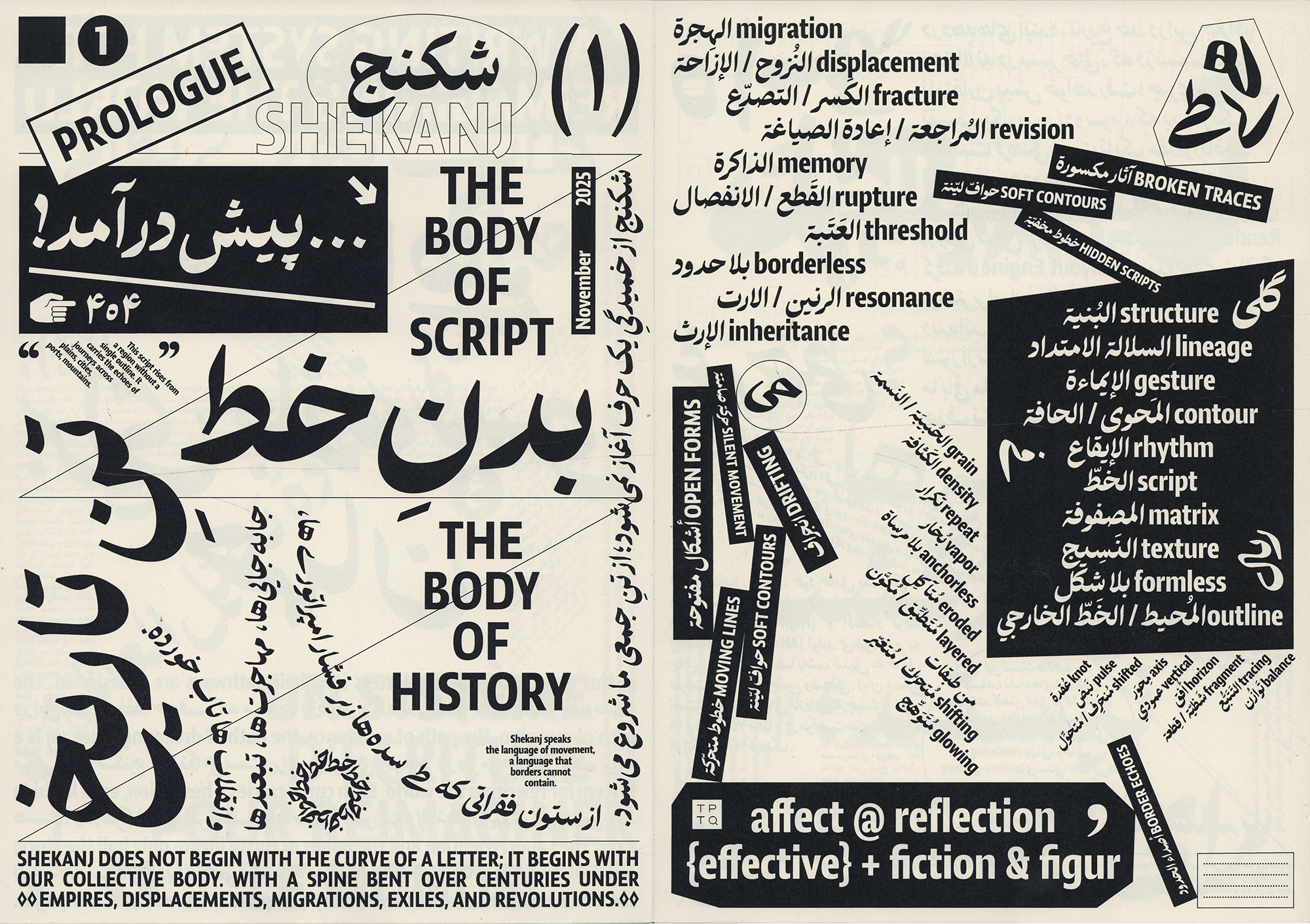
Gradually, the answer revealed itself as no. The classical model of type presentation, which isolates glyphs, weights, and applications from their context, inevitably reduces type to a consumable object detached from history, embodiment, and lived experience. In response to this limitation, the idea of transforming the presentation into a visual typographic essay emerged, not as a stylistic gesture but as a critical position. This essay does not aim merely to display a typeface; it seeks to think through type itself, and through the ways writing and typographic form operate within networks of power, history, and ideology.
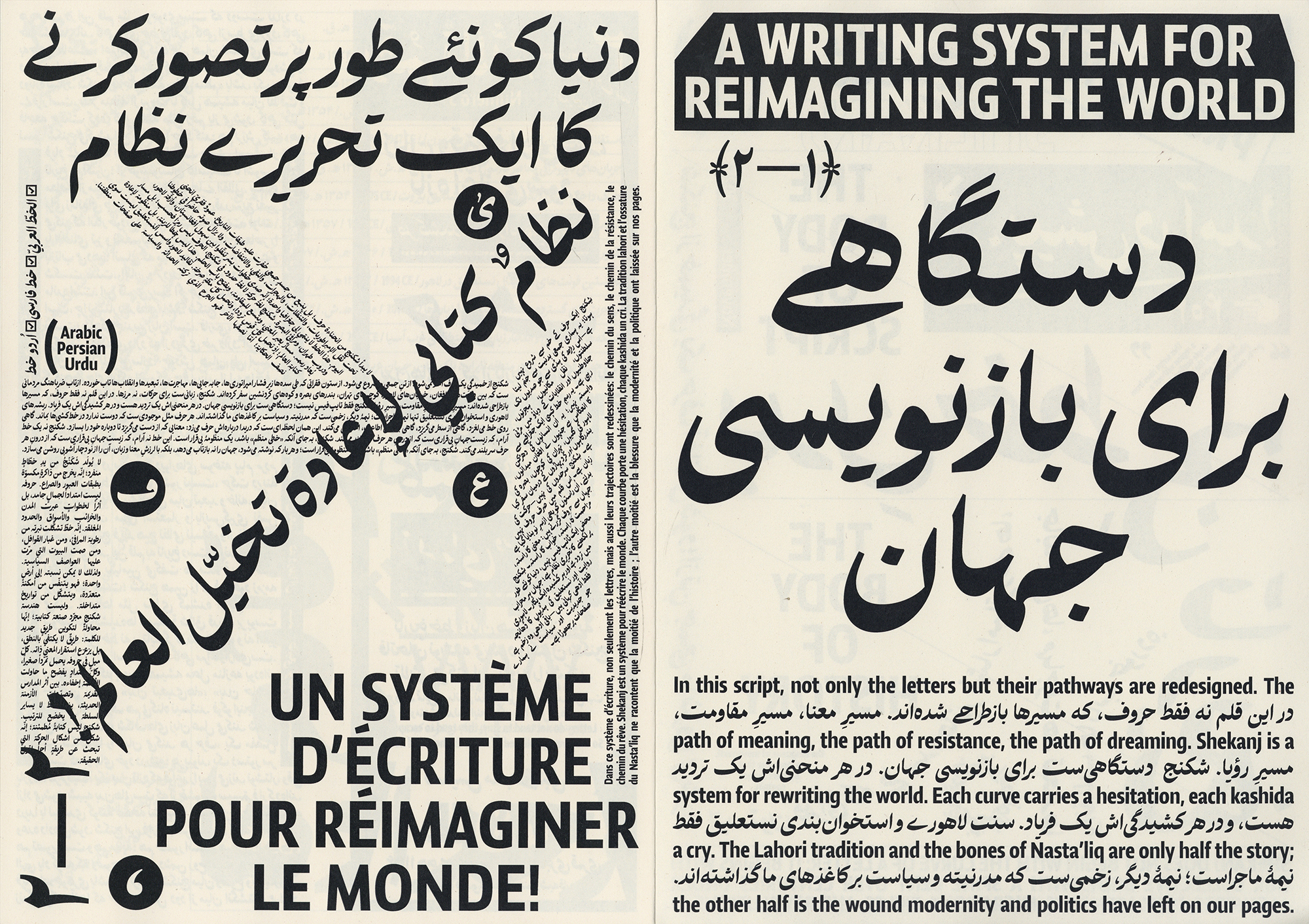
Within modern critical and philosophical traditions, writing has never been neutral. From Walter Benjamin’s understanding of history as rupture to Michel Foucault’s analysis of power as something that operates through discipline and form, writing is understood as an active force rather than a passive medium. Jacques Derrida’s notion of différance reveals meaning as perpetually deferred and unstable, emerging precisely in moments of slippage and delay. It is within this interval that writing becomes political. This project engages such ideas not through citation alone, but through form, where typography, as a visual system, determines what is stabilized, what is marginalized, and what is allowed to escape the center.
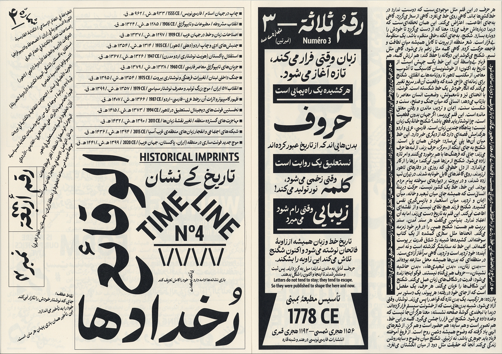
The histories of Arabic, Persian, and Urdu scripts are neither linear nor serene. They have taken shape within geographies marked by empires, displacement, colonization, linguistic reform, and revolution. Industrialization, the advent of print, and later digitization transformed not only the tools of writing but also its underlying logic. Standardization, ostensibly introduced in the name of order and efficiency, systematically erased rhythms, elongations, curves, and internal logics intrinsic to these scripts. What we encounter today, particularly within software environments and global design systems, is a continuation of this process. Technology no longer functions merely as a tool of production; it actively produces norms.
It is within this condition that what might be called a crisis of script literacy becomes visible. Many formal changes now perceived as “modern” are not the result of conscious aesthetic evolution, but rather of technological systems unable, or unwilling, to comprehend non-Latin structures. The educational rupture between calligraphy, traditional typesetting, and contemporary type design has only intensified this condition. Rather than concealing this crisis, the project renders it visible through text, image, and typographic tension, not to resolve it, but to make it readable.
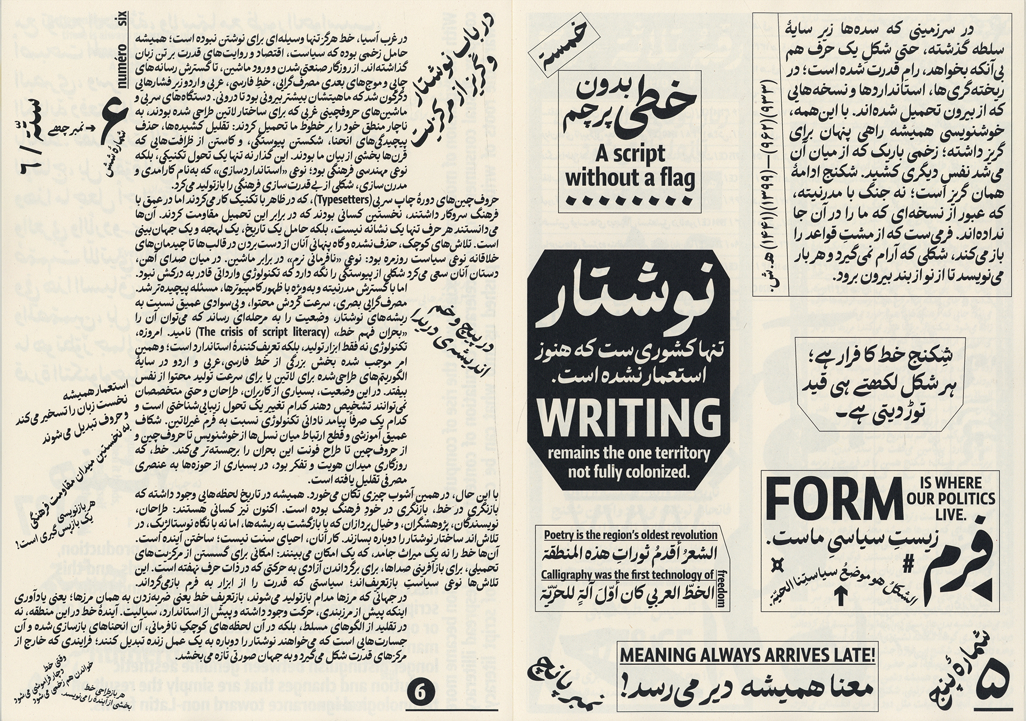
Here, writing is not supplementary to design; it is design. Texts, poetic fragments, slogans, and broken structures form part of the typographic experience itself. This approach aligns with practices in which knowledge is produced not solely through linear text, but through visual and spatial forms, as seen in the work of thinkers such as Irit Rogoff and Hito Steyerl , where theory, image, and narrative are inseparable. Writing about type thus becomes an authorial act, a form of speculative practice in which design does not solve problems but opens fields of inquiry.
Engaging with calligraphic traditions and historical scripts in this project does not imply a nostalgic return. Across postcolonial theory and Eastern philosophical traditions alike, the past is understood not as a destination but as a source of energy. The forms of this typeface, while structurally grounded, remain deliberately unsettled. Curves and elongations resist complete discipline; their instability is not a flaw but a position. Here, form becomes, quite literally, a site of politics.
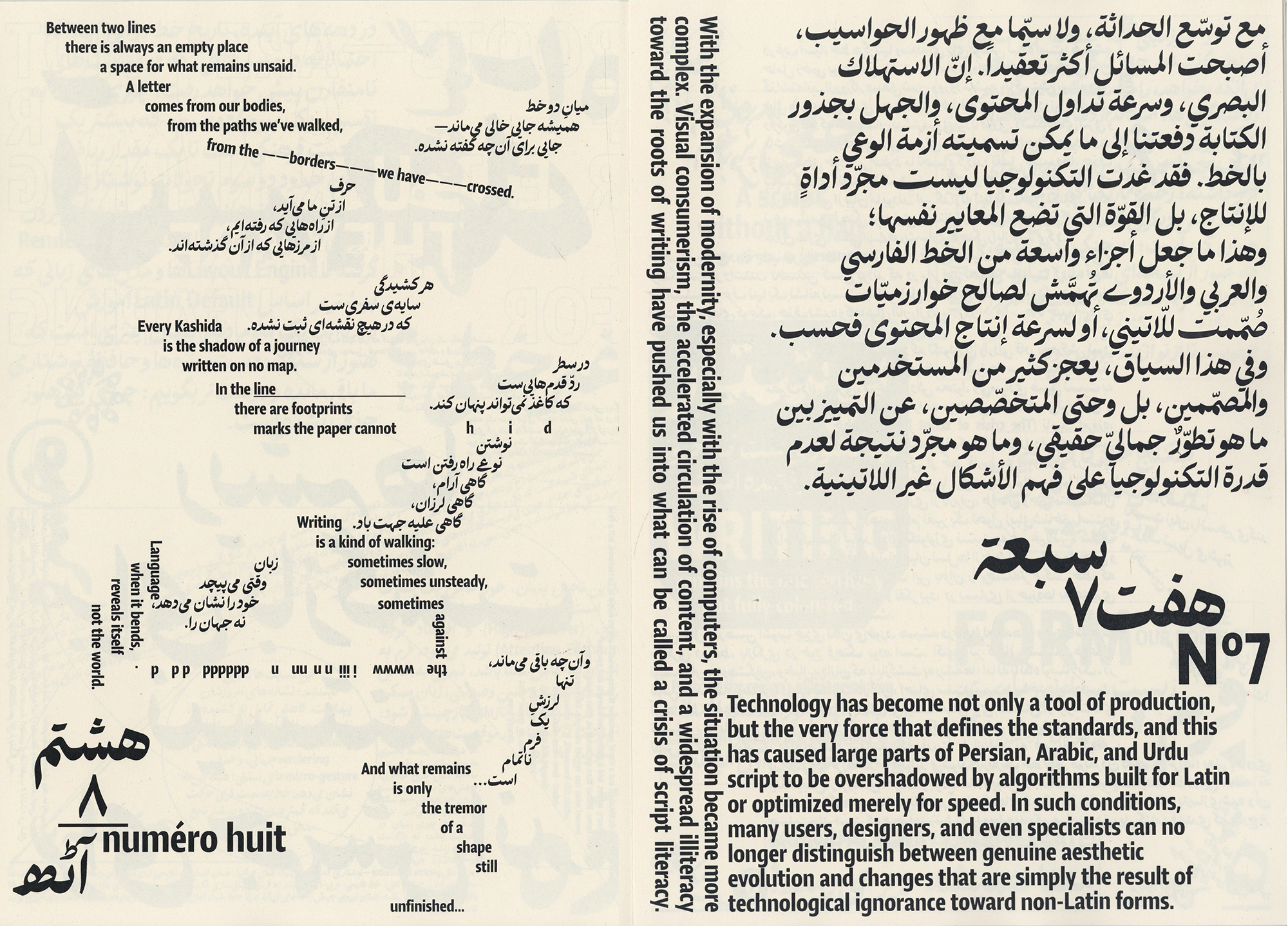
The conscious coexistence of Arabic, Persian, Urdu, and Latin scripts, along with the careful negotiation between them, is central to this inquiry. The aim is not simply to expand functionality or complete a linguistic system, but to explore a shared visual culture that has circulated for centuries through poetry, literature, and writing across a vast and interconnected geography. Rather than simplifying this complexity, the project treats it as a living resource.
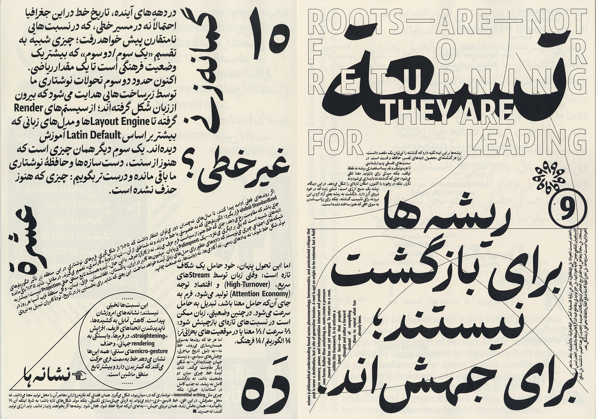
Ultimately, this typographic essay proposes a way of understanding type as a living narrative. In a region whose history is shaped by rupture, instability, and resistance, script and language have functioned not only as tools of communication but also as enduring forms of cultural continuity and critical thought. To engage with type, in this sense, is to engage with a mode of thinking—one that moves between past and present and still holds the capacity to question, to speak, and to imagine futures yet unwritten.