In Pursuit of Light Through Blackness

The curves of Sufism
Since its emergence in the 8th century, Sufism catalyzed a 'Renaissance' whose physical artifacts endure to this day. Spanning from China to North Africa, it fostered a thriving intellectual culture throughout the Islamic world, particularly evident in poetry and literature. Sufism found expression through calligraphy, a fitting medium for shaping these literary works, and Many Sufi figures embraced it as a spiritual practice, using it as a means to contemplate divine mysteries and pursue enlightenment.
Sufism is a mystical form of spirituality, seeking to find divine love and knowledge through direct, personal experience of the divine, encompassing a variety of paths aimed at understanding the nature of humanity and God. In seeking ultimate truth in Sufism, there are stages to be passed under the guidance of a spiritual teacher. Arabic and Persian calligraphy also involves different stages and rituals to achieve mastery : in most common Arabic calligraphic styles, twelve fundamental principles are to be followed. These rules, however, are not merely technical guidelines, they lead to a spiritual state where, after years of practice, the calligrapher gains a deeper vision of the beauty of script. In the same way, a lifetime spent walking the path of Sufism brings ultimate wisdom.
Calligraphy is deeply connected to Sufi ethics. In many Persian calligraphy manuals, students are not only taught the technical aspects of scribing but also the spiritual principles that go beyond the craft. They are encouraged to cultivate a cleansed soul by practicing good deeds and avoiding bad ones.
The link between calligraphy and Sufism is particularly evident in Sufi poetry where calligraphy terminology appears frequently in the poems of Persian figures such as Attar, Rumi, Saadi, Hafez, and Jami. In addition, some calligraphers, like Mirza Gholamreza, also practice sufi poetry while others like Al-Qandusi are sufis themselves.
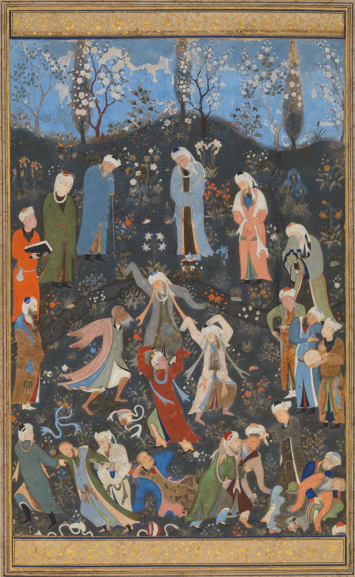
Dance of Sufi Dervishes, Kamal ud-Din Behzad, 1490, The Metropolitam Museum of Arts, Rogers Fund, 1917, 17.81.4
Cycles and circular forms play a significant role in Sufism, where it is believed that existence has a circular structure. This concept is depicted in the drawings of Ibn Arabi. Calligraphy is considered (especially within the context of Iranian culture) the embodiment of the spirit of mysticism in the form of letters and words, and as such, round forms are a prominent feature in this art. Whether in Nastaliq or Shekasteh, Persian calligraphy styles typically exhibit a prevailing roundness, a characteristic inherited from Ta'liq, the precursor to these styles. This trait distinguishes Persian Naskh from its Arabic and Ottoman counterparts. Roundness is also a defining feature of the Maghrebi style. In particular, in Al-Qandusi’s work, this roundness is paired with bold, high-contrast shapes and thin terminuses. The curvilinear forms found in Iranian Nastaliq manuscripts are not distant from the dance of the whirling Dervishes. In the same way that Al-Qandusi’s calligraphy is not detached from his sufi beliefs.
Sufism profoundly influenced the cultural identities of numerous countries, and much like Arabic script it serves as a unifying thread between them, fostering a culture of resistance grounded in tolerance. Different expressions are considered part of reality, with each being inhabiting and understanding it in their own way. Similarly, Arabic script is used to transcribe various languages across the region, as if each language inhabits the script in its own unique manner. Calligraphic styles also vary drastically from China to the Maghreb, while using the same alphabet.
The birth of Roshan
A few years ago in France, I was in the midst of designing this typeface inspired by Sufism, roundness and calligraphy. It was a time when Persian poetry helped keep both me, and my pregnant best friend, grounded. Like me, she struggled constantly with the complexities of French bureaucracy as a foreigner. During her pregnancy, as she navigated administrative institutions and observed their lack of understanding, she realized how opaque, confusing, and obscure the system was. She wanted something entirely different for her child, whom she hadn’t yet discovered the gender of. That’s when she thought of the name Roshan.
Roshan, meaning bright, clear, and enlightened in Persian, refers not only to physical attributes but also to a spiritual state of lucid consciousness. This came to me as a miraculous coincidence while I was working on an Arabic typeface centered around the concept of light. It became immediately clear that this was the perfect name for the font family.
Roshan’s dancing, round forms, seeks to amalgamate features from Persian Naskh and Maghrebi styles (particularly Al-Qandusi). It is a high-contrast display typeface available in five weights, incorporating calligraphic features from both traditions.
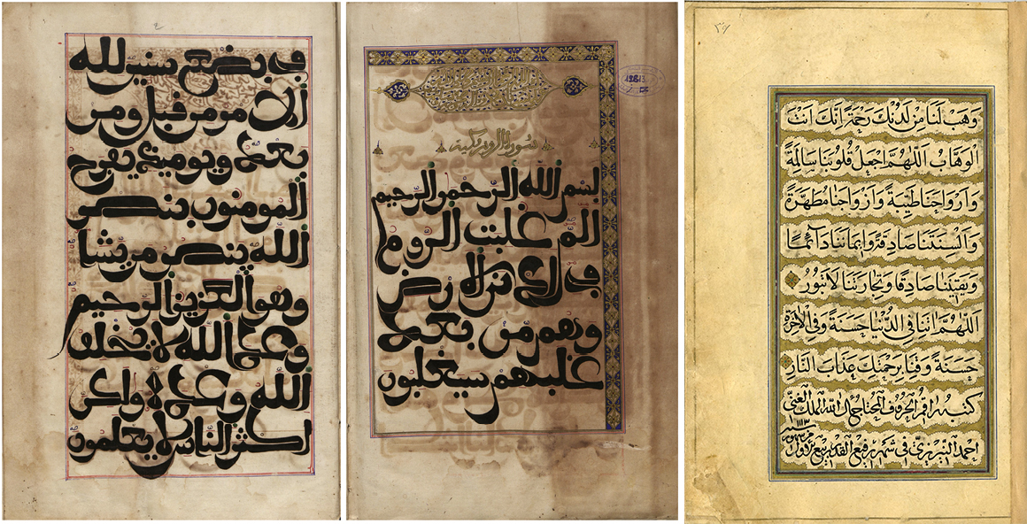
Left: al-Qandūsī’s, Illuminated opening pages of volume 9 of the Qurʾān 12613, Sūra 30, ff. 1b–2a, al-Ḥasaniyya Royal Library Right: Page from the Book of Prayers copied by Ahmad Neyrizi. Naskh script. 20.7 x 14.6 cm. Dated Rabi al-awwal 1113 AH/August 1701 CE. Malek National Library No. 130
In contrast to recent trends in Arabic type design, where loops are often enlarged, Roshan experiments with increasing their whiteness and allowing more light to pass through by opening their counters. This approach aims to maintain loop proportions closer to calligraphic standards. These openings also give Roshan a unique identity and serve as a metaphor that aligns with the concept of the typeface.

Open counters in Roshan
Roshan aims to adhere more closely to Arabic script rules while being aware that computer fonts are typographic representations rather than exact renditions of the Arabic script. To achieve this, Roshan includes many neglected letter combinations, which are either automatically activated or, in some instances, accessible through discretionary ligatures.

Alternative combinations
In high-contrast Arabic typefaces, the thin terminals at the ends of the bowls create white spaces in the line in smaller sizes. Roshan’s solution is its tapered terminals, which enhance legibility in smaller titles and make line composition more consistent. This feature, along with its high contrast, calligraphic references, and open counters, creates a strong visual impact, giving it a unique character. The goal is for this visual impact to complement, rather than overpower, the content.

Latin counterpart
In addition to Arabic, Persian, Urdu, and Kurdish, Roshan supports most of the languages that use the Latin alphabet. Generally, a serif typeface has been the norm when creating a Latin counterpart to an Arabic typeface with contrast. The aim being visual cohesion. However, recognizing the distinct natures of these scripts, Roshan introduces an incised, high contrast typeface for its Latin counterpart. This deliberate visual difference facilitates rapid recognition of each script within bilingual texts, maintaining coherence without overly homogenizing them. Calligraphic details are incorporated into the Latin counterpart to align with the spirit of the Arabic script and avoid the mere replication of curves. The open counters were also introduced to Latin where they align with the nature of the script and the letter ductus.

My understanding of Arabic type has been shaped by various fragments from different places. Persian poetry, twirling dervishes in Lahore surrounded by Nastaliq handmade posters, finding common ground with Maghrebi comrades in France, observing Lebanese street signs, have all contributed to forming my practice. Roshan is the result of a journey that combines elements from various scribe traditions across the region, hoping to act as a thread that connects different languages and cultures through one writing system.